NATION

PASSWORD

New theme: "Century"

Bug reports, general help, ideas for improvements, and questions about how things are meant to work.
User avatar
[violet]
Executive Director
 
Posts: 16205
Founded: Antiquity

New theme: "Century"

Postby [violet] » Sun Nov 28, 2010 7:35 pm

This is a thread for discussion of the beta "Century" theme, available for testing here:

http://century.nationstates.net

From the News page:
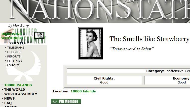
Eight Years and a New Lick
I mean look. A new look. Remember when NationStates looked like this? If so, you've been on this site for far too long. But either way, we've had our current look for a long time and are overdue for a fresh look of paint. I mean lick.

Hopefully we can fix a few niggling usability issues, make better use of those new-fangled high-resolution screens people have nowadays, and less resemble 1997. It's an update rather than a complete redesign, and we want your feedback to help shape it! So please try out the beta version here:

http://century.nationstates.net

... and throw in your thoughts!

If this works out, this will become the default NationStates theme, with the old look remaining available for people who don't want to change.


Some notable differences:
  • New banner graphic
  • Login link in banner (replacing sidebar login box)
  • No more top banner ad
  • Larger banner & sidebar
  • Nation flag shown in sidebar
  • Wide-format RMB on region page
  • Wide-format telegrams page
  • Ads on Regional Happenings, Issues list, and Issues pages
  • No more "Novels by Max Barry" ad on nation home pages
  • Different page footer
Please share your thoughts! Something doesn't work? Looks bad in your browser? You have an idea for something new? Post it here. Please include which page you're looking at and which browser and operating system you use. Screenshots can be handy too!

Update 1: For anyone interested in having a try at redesigning the top banner, here are some images!
  • http://www.nationstates.net/images/tmp/NSbanner6.xcf (GIMP format)
  • http://www.nationstates.net/images/tmp/NSbanner6.psd (PhotoShop format)
  • http://www.nationstates.net/images/tmp/AVID11732.jpg (full globe image)

Update 2 (01-Dec-10): Major feedback thus far! I'll incorporate this into the next revision of the theme:
  • Top banner is too large and/or bold
  • Top-right LOGIN box is too hard to see.
  • Top-right LOGIN should change to LOGOUT when you're logged in (some debate on this, though; puppets-switchers like it the way it is)
  • Sidebar LOGIN link should produce a floating login box right there
  • New-look RMB (aka Civil Headquarters on Region pages) generally not popular, but could be reworked into something less wide, e.g. two-column layout similar to forum. Ditto TG page (I think... not much talk about that).
  • Large ads not popular, although no real consensus on whether larger ads on some pages are better than smaller ads on all of them. I'm leaving them alone for now, though, as we won't be able to tell which are cost-effective until a wider trial.

Update 3: RMB update!!! In response to popular demand, we now have a variety of styles for your inspection.

  1. Old-style, as seen when normally browsing the site, e.g. http://www.nationstates.net/region=lazarus#rmb
  2. A brand new Century-style, which looks similar to this forum, viewable by clicking around in century.nationstates.net, like this: http://century.nationstates.net/region=lazarus#rmb
  3. Revised wide-style, which can be viewed by appending "/rmbstyle=wide" to a Region page, like this: http://century.nationstates.net/region= ... e=wide#rmb
  4. Mobile style (the previous Century RMB style), which can be viewed by appending "/rmbstyle=m" to a Region page, like this: http://century.nationstates.net/region= ... tyle=m#rmb

Update 4: Set your theme in your nation's "Settings"!

I've added a box to the Settings page so that you can set a particular theme as default for your nation. This will apply the selected theme whenever you're logged in as that nation, even if you visit the home page (i.e. http://www.nationstates.net instead of century.nationstates.net).

It will not affect the look of the forum (for now).

When you visit a subdomain (e.g. century.nationstates.net), that will override any theme you may have set (e.g. applying Century even though you have Default selected).

Aside from the default, there's Conservative and Liberal NS, which are from the 2010 April Fools Day prank, plus:
  • Century: the thing we've been trialing.
  • Century (green banner): a variation on Century using a banner adapted from Unicario's excellent submissions in this thread.
  • Century (wide RMB): Century with wide-style RMBs (not forum-style).
I think this allows better testing, because you can set a theme and see how you feel when you actually use it over a period of time. Much better than staring at screenshots.

Update 5: Century's default banner is now the green one, with the other available in "Century (desaturated)" via your Settings page.

Update 6: A few more tweaks:
  • Top-right "Login" button becomes "Switch" when logged-in
  • "Logout" link moved from sidebar to banner
  • Banner links have background shading
  • WA background emblem only displays on nations who are WA members
There are still a bunch of horrendous bugs in Internet Explorer, most notably the fact that the sidebar falls to the bottom of the screen at lower resolutions.

Update 7: IE problem fixed, and a couple other things added:
  1. Button background color now white
  2. Nation pages have a "View Forum posts" link under National Happenings, if that nation has ever visited the forum. (It would make more sense if this link only appeared if the nation had ever posted in the forum, but that's harder.)

Still some issues with hover-underline showing behind nation flags on non-IE browsers.
Last edited by [violet] on Mon Dec 13, 2010 3:40 pm, edited 9 times in total.

User avatar
Improving Wordiness
Diplomat
 
Posts: 641
Founded: Dec 05, 2009
Ex-Nation

Postby Improving Wordiness » Sun Nov 28, 2010 8:28 pm

I quite like the new look however to me the adds are more intrusive. I look at nation movement in and out of regions quite a lot so it feels like it is in the way.
Personaly I prefer either at the top or at the bottom...you cant please everyone though and it may not bother a lot of people.

I would also like a logout in the top right hand corner along with the log in.

When I first opened the page to test it out I was using IE and this is what it looked like. OP is Windows Vista

Image

Was an easy fix though I just logged out then logged in using Beta version and it was fine.
Klaus Devestatorie wrote:I'm a massive tool. ;)

User avatar
Ebana
Bureaucrat
 
Posts: 63
Founded: Nov 15, 2010
Ex-Nation

Postby Ebana » Sun Nov 28, 2010 8:28 pm

Should the LOGIN button on the top right of the page remain LOGIN even when you are logged in? Shouldn't it be changed to LOGOUT or something and act as a log out button? Or perhaps the name of your country (Ex; United Socialist States of Ebana) and featuring a link to your nation's page?

Image
Last edited by Ebana on Sun Nov 28, 2010 8:43 pm, edited 5 times in total.

User avatar
Unibot
Senator
 
Posts: 4292
Founded: May 25, 2008
Ex-Nation

Postby Unibot » Sun Nov 28, 2010 8:35 pm

New banner graphic


That's hideous. :lol2:

~~

The rest seems like a really nice change so far. I'll keep looking.

User avatar
Ethel mermania
Post Overlord
 
Posts: 129504
Founded: Aug 20, 2010
Father Knows Best State

Postby Ethel mermania » Sun Nov 28, 2010 8:39 pm

Sometimes I play the game on my phone.

Please make sure the graphics and bandwidth requirements do not make the game unplayable on mobile devices.

i will check from my phone tomorrow.
Last edited by Ethel mermania on Sun Nov 28, 2010 8:42 pm, edited 1 time in total.
https://www.hvst.com/posts/the-clash-of ... s-wl2TQBpY

The West won the world not by the superiority of its ideas or values or religion … but rather by its superiority in applying organized violence. Westerners often forget this fact; non-Westerners never do.
--S. Huntington

The most fundamental problem of politics is not the control of wickedness but the limitation of righteousness. 

--H. Kissenger

User avatar
Improving Wordiness
Diplomat
 
Posts: 641
Founded: Dec 05, 2009
Ex-Nation

Postby Improving Wordiness » Sun Nov 28, 2010 8:42 pm

when I visit the forum it reverts back to "old century" but it may not be implemented for the forum yet? Then when I look at another page it is still "old century".....on both IE and firefox.
Klaus Devestatorie wrote:I'm a massive tool. ;)

User avatar
Hindopia
Diplomat
 
Posts: 592
Founded: Jan 07, 2010
Ex-Nation

Postby Hindopia » Sun Nov 28, 2010 8:42 pm

I like it! I haven't noticed anything wrong yet (except the "login" button in the top right hand corner when I'm on my nation page) but I'll be using the new theme for the next few days and anything out of order will be reported :)
Playing NationStates since November 27, 2009
Back after a long hiatus

User avatar
North Wiedna
Post Marshal
 
Posts: 17759
Founded: Apr 01, 2009
Ex-Nation

Postby North Wiedna » Sun Nov 28, 2010 8:49 pm

I like it! But can the top banner be a bit smaller, and can you fix the login problem?
I am not at all interested in immortality, only in the taste of tea.

User avatar
Unibot
Senator
 
Posts: 4292
Founded: May 25, 2008
Ex-Nation

Postby Unibot » Sun Nov 28, 2010 8:53 pm

Some notes, I think (1) both the RMB and the Census reports should use a less emphasized border like the WA's page's "shiny widebox celltop" (2) cellpadding should be less on the RMB, the whitespace seems to bloated without a lot of text. (3) Please.. please, change "Civil Headquarters" back to the beloved RMB in this edition! If you were George Lucus, changing the name of the RMB was like having Greedo shoot first. (4) I think the banner is salvageable, but the globe should be washed-out a little, maybe , so it doesn't look like a gigantic black basketball. (5) Perhaps the regional flag should go beside the region's name on the sidebar? (6) Your login button is small and minimalistic, I like it, but why not use that minimalistic to your advantage and squeeze it in our sidebar? Perhaps in the top left or right of the sidebar ? Spreading out our tools across the page is a little annoying.

Overall I like the new version.

Oh and I have another odd suggestion.
Last edited by Unibot on Sun Nov 28, 2010 9:30 pm, edited 2 times in total.

User avatar
T E R R A - P R I M E
Secretary
 
Posts: 39
Founded: Jun 26, 2010
Ex-Nation

Postby T E R R A - P R I M E » Sun Nov 28, 2010 8:53 pm

Awesome. u should make it official.

User avatar
North Wiedna
Post Marshal
 
Posts: 17759
Founded: Apr 01, 2009
Ex-Nation

Postby North Wiedna » Sun Nov 28, 2010 8:57 pm

The RMB is extremely garish. >.>
I am not at all interested in immortality, only in the taste of tea.

User avatar
Sesseter
Spokesperson
 
Posts: 113
Founded: Oct 31, 2010
Ex-Nation

Postby Sesseter » Sun Nov 28, 2010 9:00 pm

Unibot wrote:
New banner graphic


That's hideous.


At the very least the NS logo needs a drop shadow so you can discern it from the rest of the banner. And I couldn't see the white login button on the ultra-light grey background.

The space to the right of the nation name and motto doesn't really get used for much. I'd like to be able to put a little map of my country there; select one from a list or upload my own, like how the flag system works.

User avatar
Laos Refugees
Ambassador
 
Posts: 1694
Founded: Jul 02, 2009
Ex-Nation

Postby Laos Refugees » Sun Nov 28, 2010 9:04 pm

I just don't like it.

User avatar
Northwest Slobovia
Postmaster-General
 
Posts: 12548
Founded: Sep 16, 2006
Anarchy

Postby Northwest Slobovia » Sun Nov 28, 2010 9:05 pm

Unibot wrote:
New banner graphic


That's hideous. :lol2:

I agree. Please use the current banner or try something else.
Gollum died for your sins.
Power is an equal-opportunity corrupter.

User avatar
Hindopia
Diplomat
 
Posts: 592
Founded: Jan 07, 2010
Ex-Nation

Postby Hindopia » Sun Nov 28, 2010 9:06 pm

Northwest Slobovia wrote:
Unibot wrote:
That's hideous. :lol2:

I agree. Please use the current banner or try something else.

I don't mind it. It could be a little less "in-ya-face" though.
Playing NationStates since November 27, 2009
Back after a long hiatus

User avatar
Pythria
Minister
 
Posts: 2664
Founded: Feb 26, 2010
Ex-Nation

Postby Pythria » Sun Nov 28, 2010 9:14 pm

I like it. My problems with it:
1. Size of top banner
2. Including the flag on the issue page (my flag is very large, so this is annoying)
3. Location of an ad next to Regional Happenings (it was more unobtrusive on the top)
Last edited by Pythria on Sun Nov 28, 2010 9:23 pm, edited 2 times in total.

User avatar
[violet]
Executive Director
 
Posts: 16205
Founded: Antiquity

Postby [violet] » Sun Nov 28, 2010 9:22 pm

Improving Wordiness wrote:When I first opened the page to test it out I was using IE and this is what it looked like. OP is Windows Vista [...] Was an easy fix though I just logged out then logged in using Beta version and it was fine.

Hmm, how odd. Anyone else see this?
Ebana wrote:Should the LOGIN button on the top right of the page remain LOGIN even when you are logged in? Shouldn't it be changed to LOGOUT or something and act as a log out button?

That would be more like how most sites do it. However we used to have a login box in the banner (pre-Jolt), which some people found useful to quickly switch between puppets, and they were disappointed when it got replaced by an ad. So I thought I might bring it back.

(With all these changes, whether it stays in the theme or not depends on community feedback, so I will just explain the reasoning for how it currently looks.)

Unibot wrote:That's hideous. :lol2:

Uni! You should know better than that. Saying "that's hideous" doesn't tell me anything. You might be seeing a glitch or a bad browser rendering or your monitor has different color settings or you just don't like purple or you are red-green colorblind or it makes a feature hard to use the way you like to use it. Please say why you don't like something!
Ethel mermania wrote:Sometimes I play the game on my phone.

Please make sure the graphics and bandwidth requirements do not make the game unplayable on mobile devices.

i will check from my phone tomorrow.

This one has been tested on the iPhone, please report other devices.

We do also have a mobile theme, of course, which is not affected by this: http://m.nationstates.net

Improving Wordiness wrote:when I visit the forum it reverts back to "old century" but it may not be implemented for the forum yet? Then when I look at another page it is still "old century".....on both IE and firefox.

Correct. The forum will continue to display the old look, and there's no easy way to move from the forum to the Century theme, sorry.

North Wiedna wrote:I like it! But can the top banner be a bit smaller

Not sure if people have noticed, but the banner is large on the "Welcome" page (when you're not logged in) and smaller on all the other pages. So when you say the banner is too big, can you please specify whether you're talking about the large Welcome page banner or the one on non-Welcome pages.

User avatar
Unibot
Senator
 
Posts: 4292
Founded: May 25, 2008
Ex-Nation

Postby Unibot » Sun Nov 28, 2010 9:23 pm

Weird suggestion for the sidebar, but what if, as you scrolled, the sidebar stayed fixed? That way if you need to access your sidebar, you don't have to scroll up the page? :(

It's not entirely a laziness based suggestion, because navigating quickly is so important for gameplayers when you seconds before update.

User avatar
Pythria
Minister
 
Posts: 2664
Founded: Feb 26, 2010
Ex-Nation

Postby Pythria » Sun Nov 28, 2010 9:24 pm

Just noticed the "Jump to Board" link that shows up after you post on the RMB. Great idea-- unfortunately, it doesn't work.
Last edited by Pythria on Wed Dec 31, 1969 8:00 pm, edited 1 time in total.

User avatar
North Wiedna
Post Marshal
 
Posts: 17759
Founded: Apr 01, 2009
Ex-Nation

Postby North Wiedna » Sun Nov 28, 2010 9:25 pm

I think my problem with the banner was that it was very loud and dark, as opposed to the current, subtle one, as it seems to be not much bigger.
I am not at all interested in immortality, only in the taste of tea.

User avatar
Unibot
Senator
 
Posts: 4292
Founded: May 25, 2008
Ex-Nation

Postby Unibot » Sun Nov 28, 2010 9:28 pm

Uni! You should know better than that. Saying "that's hideous" doesn't tell me anything. You might be seeing a glitch or a bad browser rendering or your monitor has different color settings or you just don't like purple or you are red-green colorblind or it makes a feature hard to use the way you like to use it. Please say why you don't like something!


Violet! My dear! I posted a more comprehensive note later...

Unibot wrote:Some notes, I think (1) both the RMB and the Census reports should use a less emphasized border like the WA's page's "shiny widebox celltop" (2) cellpadding should be less on the RMB, the whitespace seems to bloated without a lot of text. (3) Please.. please, change "Civil Headquarters" back to the beloved RMB in this edition! If you were George Lucus, changing the name of the RMB was like having Greedo shoot first. (4) I think the banner is salvageable, but the globe should be washed-out a little, maybe , so it doesn't look like a gigantic black basketball. (5) Perhaps the regional flag should go beside the region's name on the sidebar? (6) Your login button is small and minimalistic, I like it, but why not use that minimalistic to your advantage and squeeze it in our sidebar? Perhaps in the top left or right of the sidebar ? Spreading out our tools across the page is a little annoying.

Overall I like the new version.


In other words, the logo appears too contrasted, I have a hard distinguishing between the words and the globe. Some more color in the logo (I've been trying out a sort of funny rust gradient.. but you seem to be going for a blue steel / magnum color scheme) might help as well. I think most of the site succeeds in being particularly minimalistic, which is easy on the eyes. I don't mind a change in logo, but the logo as it stands is too sharp and contrasted to fit with the rest of the site's look.
Last edited by Unibot on Sun Nov 28, 2010 9:29 pm, edited 2 times in total.

User avatar
Daynor
Diplomat
 
Posts: 736
Founded: Dec 25, 2008
Capitalist Paradise

Postby Daynor » Sun Nov 28, 2010 9:29 pm

I love the new banner and side bar... The ad that appeared in the regional happenings was a bit distracting... :unsure:

Overall I like it.
Young Libertarian Conservative
Political Compass: (2.63,-1.44)
Delegate of the Conservative Coalition
Ambassador Franklin Tanner
ლ(゚д゚ლ)
Daynor

User avatar
[violet]
Executive Director
 
Posts: 16205
Founded: Antiquity

Postby [violet] » Sun Nov 28, 2010 9:30 pm

Unibot wrote:(1) both the RMB and the Census reports should use a less emphasized border like the WA's page's "shiny widebox celltop"

You mean the entire table should be styled that way? Or are you just referring to the outside border?
(2) cellpadding should be less on the RMB, the whitespace seems to bloated without a lot of text.

Yes... you mean the whitespace at the top and bottom of each RMB post?
(3) Please.. please, change "Civil Headquarters" back to the beloved RMB in this edition! If you were George Lucus, changing the name of the RMB was like having Greedo shoot first.

Not sure what you're referring to here. There haven't been any name changes.
(4) I think the banner is salvageable, but the globe should be washed-out a little, maybe , so it doesn't look like a gigantic black basketball.

OK, might play around with a few variations there.
(5) Perhaps the regional flag should go beside the region's name on the sidebar?

I suspect that will look a little crowded. The nation name is shifted left to make room for the flag but the region name isn't, so it will either look weird or many region names will be split onto multiple lines.
(6) Your login button is small and minimalistic, I like it, but why not use that minimalistic to your advantage and squeeze it in our sidebar? Perhaps in the top left or right of the sidebar ? Spreading out our tools across the page is a little annoying.

Perhaps if you're logged out, then the sidebar LOGIN link could work that way.

User avatar
Unibot
Senator
 
Posts: 4292
Founded: May 25, 2008
Ex-Nation

Postby Unibot » Sun Nov 28, 2010 9:34 pm

[violet] wrote:
Unibot wrote:(1) both the RMB and the Census reports should use a less emphasized border like the WA's page's "shiny widebox celltop"

You mean the entire table should be styled that way? Or are you just referring to the outside border?


Err.. that's a little unclear. I'm saying get rid of the bordering.. what you did with the WA page, by having no border with the table was much slicker. Here.. I'll make you a picture!

(2) cellpadding should be less on the RMB, the whitespace seems to bloated without a lot of text.

Yes... you mean the whitespace at the top and bottom of each RMB post?


Top for sure. Bottom maybe.

(3) Please.. please, change "Civil Headquarters" back to the beloved RMB in this edition! If you were George Lucus, changing the name of the RMB was like having Greedo shoot first.

Not sure what you're referring to here. There haven't been any name changes.


I'm saying bring it back with the new edition. :p

(5) Perhaps the regional flag should go beside the region's name on the sidebar?

I suspect that will look a little crowded. The nation name is shifted left to make room for the flag but the region name isn't, so it will either look weird or many region names will be split onto multiple lines.


Okay.

(6) Your login button is small and minimalistic, I like it, but why not use that minimalistic to your advantage and squeeze it in our sidebar? Perhaps in the top left or right of the sidebar ? Spreading out our tools across the page is a little annoying.

Perhaps if you're logged out, then the sidebar LOGIN link could work that way.


That's what I was thinking I just didn't write that for some silly reason.
Last edited by Unibot on Sun Nov 28, 2010 9:49 pm, edited 1 time in total.

User avatar
Pythria
Minister
 
Posts: 2664
Founded: Feb 26, 2010
Ex-Nation

Postby Pythria » Sun Nov 28, 2010 9:40 pm

Pythria wrote:Just noticed the "Jump to Board" link that shows up after you post on the RMB. Great idea-- unfortunately, it doesn't work.
Problem 2: there's no (new) next to new telegrams. Useful for when you've gotten more than one new one.
EDIT: Never mind, works now.
Last edited by Pythria on Sun Nov 28, 2010 9:43 pm, edited 1 time in total.

Next

Advertisement

Remove ads

Return to Technical

Who is online

Users browsing this forum: Crazed monkies, Lands of Ann, Ratcha-anachak-Thai, Schardonia, Shica Haw, Uniara

Advertisement

Remove ads