
Advertisement

![]() by Sauros » Sun Jul 03, 2022 2:46 pm
by Sauros » Sun Jul 03, 2022 2:46 pm

![]() by Aumbura » Sun Jul 03, 2022 3:19 pm
by Aumbura » Sun Jul 03, 2022 3:19 pm
The Democratic Workers' Republic of Aumbura---Unity on the Basis of Humanity
Via Fischer News Network: New Law Mandates the Elderly to Retake Driver's Test - New Public Housing Units to be Built in Fischer's West End - Thomas Karplenko Announces Candidacy for President - President Friece Slams New Ugandan Anti-LGBT Laws - Aumbura's 3rd Largest Coal Depot to be ClosedOfficial FNN Polling: Do you agree with the prescence of the pride flag at the Presidential Palace?: Yes 83% - No 17%

![]() by Coliantia » Sun Jul 03, 2022 7:05 pm
by Coliantia » Sun Jul 03, 2022 7:05 pm

![]() by Rivogna » Sun Jul 03, 2022 7:15 pm
by Rivogna » Sun Jul 03, 2022 7:15 pm
NEWS: Why do mosquitoes still exist? "Genius and life-saving" mosquito catchers gaining popularity | 99.7% of Rivognans agree ravioli is sexy in new survey | "Oh, fuck! I think our feminine nation name is putting the user's gender in the wrong direction!" —Martino Bonardi | Rude Rivognans on your tour? Find out why they hate everybody
![]() by Exania » Sun Jul 03, 2022 9:34 pm
by Exania » Sun Jul 03, 2022 9:34 pm
![]() by Hoasa » Sun Jul 03, 2022 9:43 pm
by Hoasa » Sun Jul 03, 2022 9:43 pm
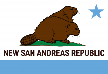
![]() by New San Andreas Republic » Mon Jul 04, 2022 4:19 am
by New San Andreas Republic » Mon Jul 04, 2022 4:19 am

![]() by New Eestiball » Mon Jul 04, 2022 1:46 pm
by New Eestiball » Mon Jul 04, 2022 1:46 pm
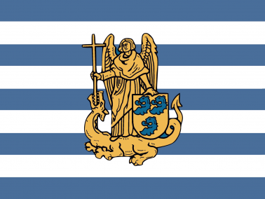
New San Andreas Republic wrote:I like the orange, blue and white color combination, and it's certainly a unique pattern that I don't think I've seen on a flag before. My issue though, is that the pink symbol in the middle contrasts poorly with the background (at least from a distance, I find it looks sorta alright up close) The symbol is also probably hard to make out at a distance, and very complex to recreate. Still, a great flag so....
7/10.
![]() by Sanrellia » Mon Jul 04, 2022 6:53 pm
by Sanrellia » Mon Jul 04, 2022 6:53 pm
New San Andreas Republic wrote:I like the orange, blue and white color combination, and it's certainly a unique pattern that I don't think I've seen on a flag before. My issue though, is that the pink symbol in the middle contrasts poorly with the background (at least from a distance, I find it looks sorta alright up close) The symbol is also probably hard to make out at a distance, and very complex to recreate. Still, a great flag so....
7/10.
![]() by Coliantia » Mon Jul 04, 2022 8:31 pm
by Coliantia » Mon Jul 04, 2022 8:31 pm
![]() by New San Andreas Republic » Mon Jul 04, 2022 8:54 pm
by New San Andreas Republic » Mon Jul 04, 2022 8:54 pm
![]() by Frisemark » Mon Jul 04, 2022 9:00 pm
by Frisemark » Mon Jul 04, 2022 9:00 pm
"From this day forward, I shall take up all the empire in my embrace. For I am father of the empire, as I am father to all creation. I will suffer no tired institution nor petty bureaucrat to stand between me and my children. I am the perfect loving god, and all will tremble to know me."
![]() by Aumbura » Tue Jul 05, 2022 5:02 am
by Aumbura » Tue Jul 05, 2022 5:02 am
The Democratic Workers' Republic of Aumbura---Unity on the Basis of Humanity
Via Fischer News Network: New Law Mandates the Elderly to Retake Driver's Test - New Public Housing Units to be Built in Fischer's West End - Thomas Karplenko Announces Candidacy for President - President Friece Slams New Ugandan Anti-LGBT Laws - Aumbura's 3rd Largest Coal Depot to be ClosedOfficial FNN Polling: Do you agree with the prescence of the pride flag at the Presidential Palace?: Yes 83% - No 17%
![]() by Exania » Tue Jul 05, 2022 5:57 pm
by Exania » Tue Jul 05, 2022 5:57 pm
![]() by Murazgora » Tue Jul 05, 2022 6:00 pm
by Murazgora » Tue Jul 05, 2022 6:00 pm
![]() by Greater Rostoria » Tue Jul 05, 2022 6:03 pm
by Greater Rostoria » Tue Jul 05, 2022 6:03 pm
![]() by New Eestiball » Tue Jul 05, 2022 6:43 pm
by New Eestiball » Tue Jul 05, 2022 6:43 pm
![]() by Farallon » Tue Jul 05, 2022 6:46 pm
by Farallon » Tue Jul 05, 2022 6:46 pm
News | Finally back | Weather | hot asf |
![]() by Frisemark » Tue Jul 05, 2022 7:04 pm
by Frisemark » Tue Jul 05, 2022 7:04 pm
"From this day forward, I shall take up all the empire in my embrace. For I am father of the empire, as I am father to all creation. I will suffer no tired institution nor petty bureaucrat to stand between me and my children. I am the perfect loving god, and all will tremble to know me."
![]() by Skyists » Tue Jul 05, 2022 7:04 pm
by Skyists » Tue Jul 05, 2022 7:04 pm
![]() by Frisemark » Tue Jul 05, 2022 7:06 pm
by Frisemark » Tue Jul 05, 2022 7:06 pm
Skyists wrote:8/10 The Gold and green work really well together, and the brid ( I think that's a seagull) gives a unique flair to the flag. Only complain is the star placements feel a tad off- especially considering the spare empty space beneath the bird's wingspan in particular.

"From this day forward, I shall take up all the empire in my embrace. For I am father of the empire, as I am father to all creation. I will suffer no tired institution nor petty bureaucrat to stand between me and my children. I am the perfect loving god, and all will tremble to know me."
![]() by Aumbura » Wed Jul 06, 2022 2:59 am
by Aumbura » Wed Jul 06, 2022 2:59 am
Skyists wrote:8/10 The Gold and green work really well together, and the brid ( I think that's a seagull) gives a unique flair to the flag. Only complain is the star placements feel a tad off- especially considering the spare empty space beneath the bird's wingspan in particular.
Edit: Ninja'd
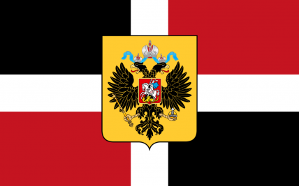
6/10: The Flag works pretty nice, but it feels a tad bland, with the common White/Navy/Gold color scheme.
The symbol on the middle of the flag is the best part, but even it has one minor issue. While it's technically centered, visually, it looks as though it is slightly higher than the center, due to there being only one point at the absolute bottom (The foot) and three distinct points at the absolute top (Both wings as well as the cross).
The Democratic Workers' Republic of Aumbura---Unity on the Basis of Humanity
Via Fischer News Network: New Law Mandates the Elderly to Retake Driver's Test - New Public Housing Units to be Built in Fischer's West End - Thomas Karplenko Announces Candidacy for President - President Friece Slams New Ugandan Anti-LGBT Laws - Aumbura's 3rd Largest Coal Depot to be ClosedOfficial FNN Polling: Do you agree with the prescence of the pride flag at the Presidential Palace?: Yes 83% - No 17%

![]() by The Republic of Western Sol » Wed Jul 06, 2022 4:59 am
by The Republic of Western Sol » Wed Jul 06, 2022 4:59 am
![]() by New San Andreas Republic » Wed Jul 06, 2022 5:31 am
by New San Andreas Republic » Wed Jul 06, 2022 5:31 am
![]() by Pol ii Gor » Wed Jul 06, 2022 3:27 pm
by Pol ii Gor » Wed Jul 06, 2022 3:27 pm
Users browsing this forum: Aurevbush, Franners, GIMMICK NATION, Hetaru, Lumaterra, Mikustania, Republics of the Solar Union, Troc