NATION

PASSWORD

Constructively rate the above nation's flag (8)

The place to relax, unwind, share a joke, and generally goof off.

Advertisement

Remove ads

User avatar
Equai
Diplomat
 
Posts: 549
Founded: Mar 05, 2022
Liberal Democratic Socialists

Postby Equai » Mon Jun 20, 2022 2:52 pm

Usage of red-blue-whitr colors is nothing new, arguably a bit too basic option for colors but it works, it just works very good with this flag and what (i think) is trying to portray. The writing blends good with the background. A solid 7 form me
She/Her
MLM. Anti-war, anti-imperialist, pro-choice, atheist.
⚧♀Trans woman♀⚧

EBN News: USA-Equai Diplomatic Rift: Cold War Rhetoric Escalates - USA President Wilson calls for WA Security Council and international containment of Equai

☭✨ Living unironically in Eastern Europe ✨☭
We have liberated Europe from fascism, but they will never forgive us for it.
-Zhukov

User avatar
455 Lands
Political Columnist
 
Posts: 2
Founded: Nov 01, 2021
New York Times Democracy

Postby 455 Lands » Mon Jun 20, 2022 9:45 pm
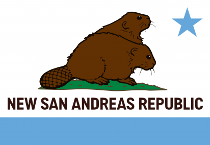
I like this a lot.

Good use of pink and black, given the nation´s theme.
The subtle triangle on the left, with the leftist symbol...

My only concern, and it´s a small one, is the horizontal black band.

As the diagonal bands are constructed from two colours (two borders and one thick diagonal in between), the unicolour horizontal seems a bit underwhelming.

If that should present a situation where the stars become the next issue (why diagonals with stars, and a horizontal without them), maybe the best improvement is: no stars at all, and all bands the same two colours?

As is: 8.8/10

User avatar
New San Andreas Republic
Spokesperson
 
Posts: 198
Founded: Jun 05, 2022
Inoffensive Centrist Democracy

Postby New San Andreas Republic » Tue Jun 21, 2022 4:59 am

Oh Dear Lord. This flag is like the terrible proposed EU striped flag on steroids. It's like r/place became a flag. It's like a Jackson Pollock painting felt flaggy today. It violates every rule of good vexillological design. It doesnt even look like a flag, it's just random symbols and whatnot like you're on acid.

1/10, definitely.
"We won't be taxing, bureaucratic hypocrites forever!"
We're fighting a costly, not at all drawn-out war against the Roman cosplaying enslaving scumbags known as Caligulas Legion! Suck it and die from your 'headaches', you bald b*stard.
Are you aggressively coked-out? Do you join regions for no reason? Do you like copious amounts of drugs, eating Mexican food from taco trucks and the searing hot desert sun? Join Calexico and Mexicali then, moron.
Do you too wish to patrol the Senora, almost making you wish for a nuclear winter? If so, consider joining our Embassy Program

User avatar
Aegeonia
Spokesperson
 
Posts: 186
Founded: Jun 11, 2022
Ex-Nation

Postby Aegeonia » Tue Jun 21, 2022 5:04 am

This is a Good Flag

I only don’t like 2 things, first off the beaver (I’m assuming the beaver is supposed to be a 2 headed mutant thing) doesn’t really look like 1 beaver, it looks like another beaver is standing behind it and sticking it’s head up, might want to fix that, and 2nd of all, the Text, just get rid of it man.

8.5/10
Aegeonia is a Nation in southern Europe, it houses a population of about 13 Million People, and it borders Communist Turkey to the East, Greek Republic to the West, and the North Macedonian Empire to the North-West, with the Bulgarian Federation bordering the North-East

A Class 1.8 Civilization according to this index.


June 19th: Go read our News Factbook


THE WAR WITH The Turkish Communist State IS OVER, IT ENDED LIKE 5 DAYS AGO, STOP SAYING IM IN A WAR!!!

User avatar
Relwynia
Civilian
 
Posts: 0
Founded: Jun 19, 2022
Ex-Nation

Postby Relwynia » Tue Jun 21, 2022 2:50 pm

I think the flag has a lot of potential, but it is unfortunately a little diminished by the ripple effect. If the ripple effect were to be removed the flag would look a lot better, because the choice of colours and design is very nicely done.

In its current form, I'd rate the flag a 7,5/10.

User avatar
Rivogna
Envoy
 
Posts: 230
Founded: Jul 30, 2020
Civil Rights Lovefest

Postby Rivogna » Tue Jun 21, 2022 2:57 pm

The above flag is one of the few that balances simplicity and intricacy. The yellow-and-purple color scheme is unconventional yet aesthetically pleasing, and the deer and chains make it stand out. In general, the flag is excellent! 9.5/10!
        ★ ★ LA REPUBBLICA FEDERATIVA DI RIVOGNA ★   ★      
      Illuminazione attraverso la libertà e la comprensione!      

An Italian-speaking republic in Central America with an affinity for ravioli with peppers and beef

Overview | Map | OOC Information

 NEWS:   Why do mosquitoes still exist? "Genius and life-saving" mosquito catchers gaining popularity | 99.7% of Rivognans agree ravioli is sexy in new survey | "Oh, fuck! I think our feminine nation name is putting the user's gender in the wrong direction!" —Martino Bonardi | Rude Rivognans on your tour? Find out why they hate everybody

User avatar
New San Andreas Republic
Spokesperson
 
Posts: 198
Founded: Jun 05, 2022
Inoffensive Centrist Democracy

Postby New San Andreas Republic » Tue Jun 21, 2022 3:01 pm

You've been told this a lot, but this is a damn good flag. The sun and mountain symbolism is excellently executed, the two stripes are just enough to look distinctive with a great tone, and the yellow choice for the symbols contrasts well. Furthermore, the sheer simplicity, lack of need for text and originality of the design help it more. No criticism really, just good.

10/10.
"We won't be taxing, bureaucratic hypocrites forever!"
We're fighting a costly, not at all drawn-out war against the Roman cosplaying enslaving scumbags known as Caligulas Legion! Suck it and die from your 'headaches', you bald b*stard.
Are you aggressively coked-out? Do you join regions for no reason? Do you like copious amounts of drugs, eating Mexican food from taco trucks and the searing hot desert sun? Join Calexico and Mexicali then, moron.
Do you too wish to patrol the Senora, almost making you wish for a nuclear winter? If so, consider joining our Embassy Program

User avatar
New Eestiball
Diplomat
 
Posts: 656
Founded: Jan 06, 2021
Left-wing Utopia

Postby New Eestiball » Tue Jun 21, 2022 3:06 pm

I get the style, I know exactly what you're going for and basing it off of.
And it sucks. Your flag is like a better version of the California flag, but the california flag sucks.
6/10.
current song: eminence front by the who
this flag inspired by scytharum's old one
base-6 is inherently the best base
you can find me in nssports as the martian independent republic but the nation I'm writing lore for is asiikafa
likes: the beatles/the cure/the who/most 60s and 70s music in general/liberal democracy/abstraction/vexillology
dislikes are unnecessary because the world doesn't need more negativity

User avatar
Kingdom of Lechia
Secretary
 
Posts: 31
Founded: Jun 15, 2021
Ex-Nation

Postby Kingdom of Lechia » Tue Jun 21, 2022 3:21 pm

Simple but well made flag. Work on such a flag is not long.

8/10
Ⱄⱛⰰⰲⰰ Ⰾⰵⱌⱒⰻⰻ ⰻ ⱀⰰⱄⰸⰵⰿⱆ Ⰽⱃⱆⰾⱁⰲⰻ Ⰱⱁⱃⰸⱏⰲⱁⰹⱁⰲⰻ Ⰴⱁⰱⱃⱁⱄⱛⰰⰲⱄⰽⰻⰵⰿⱆ!!!
-------------------------ⰔⱛⰰⰲⰰⰎⰵⱌⱒⰻⰻ----------------------------
---------------------------------------------------------------------------
Our nation is Poland, but Ba'athist-like and absolute monarchic, created after the civil war.
In our glorious Lechia, you can find a lot of attractions, like numerous pagan temples, professionally active tradwives (both Christian and Pagan ones), funny medieval writing, murals with our Great King, edgy symbols etc.
This nation doesn't use NS stats, nor represent my RL views.
Youtube channel
Year: 2063

User avatar
Karazicu
Envoy
 
Posts: 206
Founded: Feb 08, 2022
Father Knows Best State

Postby Karazicu » Tue Jun 21, 2022 6:43 pm

Kingdom of Lechia wrote:Simple but well made flag. Work on such a flag is not long.

8/10

Something just doesn't seem right about the text on the flag. Don't really have any gripes when it comes to having text on your flag, but it looks squished, and that tosses it off for me. The Slavic wheels also sort of spoil it for me because of their placement, so perhaps you could space out the text and the wheels so that it looks better, perhaps more like how the Ba'athist Iraq flag looked. I do like the color palette, though, I can easily imagine a nation like yours using this flag, perhaps with less squishy looking text and the Slavic wheels spaced out. Overall, 5/10.

BN: Ignore Saddam Hussein on my flag. I decided to be very much unique and use two different flags, do whichever one you please, perhaps both if you feel like it.
ESAK
23.03.2003
INDEPENDENT STATE OF KARAZICU - ANEKARTITO DRSAVA KARAZIA
ΕΣΑΚ
14:26:12
"Με Εργατη, Αγροτη, και πρωτο τον Στρατιωτη."
 ΚΕΡ:  Αντιμετωπιζουμε τεχνικες δυσκολιες. Παρακαλω αναμεινατε...

Summary: When anarchy struck a Mediterranean island, its military & police took over in a junta, making a new order to prevent it by any and all means.
My Name: funny serbian war criminal xdd
Flag: jc3 reference

new lore and it's just a bunch of blue flowers
tgs open

User avatar
New San Andreas Republic
Spokesperson
 
Posts: 198
Founded: Jun 05, 2022
Inoffensive Centrist Democracy

Postby New San Andreas Republic » Tue Jun 21, 2022 8:57 pm

I'll do both. There are definitely elements I like that both share, such a unique combination of colors typically reserved for naval jacks. Furthermore, I'll admit there's an element of charm in the usage of a 4-pointed star with does a good job of making your flag look more unique. Unfortunately, I'm not a fan of either symbol prominently featured on each of them. The weirdly-formal fonted 'M' looks just sorta odd, and the Dragonov on the variant just makes (as does any gun on a flag, really) your nation look like an armed insurrection group. I don't hate the flag, but I don't love it either.

5/10.
Last edited by New San Andreas Republic on Tue Jun 21, 2022 8:57 pm, edited 1 time in total.
"We won't be taxing, bureaucratic hypocrites forever!"
We're fighting a costly, not at all drawn-out war against the Roman cosplaying enslaving scumbags known as Caligulas Legion! Suck it and die from your 'headaches', you bald b*stard.
Are you aggressively coked-out? Do you join regions for no reason? Do you like copious amounts of drugs, eating Mexican food from taco trucks and the searing hot desert sun? Join Calexico and Mexicali then, moron.
Do you too wish to patrol the Senora, almost making you wish for a nuclear winter? If so, consider joining our Embassy Program

User avatar
New San Andreas Republic
Spokesperson
 
Posts: 198
Founded: Jun 05, 2022
Inoffensive Centrist Democracy

Postby New San Andreas Republic » Wed Jun 22, 2022 2:11 pm

/bump
"We won't be taxing, bureaucratic hypocrites forever!"
We're fighting a costly, not at all drawn-out war against the Roman cosplaying enslaving scumbags known as Caligulas Legion! Suck it and die from your 'headaches', you bald b*stard.
Are you aggressively coked-out? Do you join regions for no reason? Do you like copious amounts of drugs, eating Mexican food from taco trucks and the searing hot desert sun? Join Calexico and Mexicali then, moron.
Do you too wish to patrol the Senora, almost making you wish for a nuclear winter? If so, consider joining our Embassy Program

User avatar
Tea Chuggers
Attaché
 
Posts: 94
Founded: Aug 20, 2020
Ex-Nation

Postby Tea Chuggers » Wed Jun 22, 2022 6:47 pm

8.5/10 -- does what it sets out to do with aplomb, and nothing more than that. I love the shade of blue, and the beavers are really well done, but I don't think I can award any points for originality, just stellar execution.
Leaf water good. Bean water bad. David Ricardo was on to something and so was Eugene Stoner.
Only the trends are canon, not individual stats. If you want to get angry very quickly, I recommend Twitter.
Current status: fine.

User avatar
Azania-
Envoy
 
Posts: 275
Founded: Mar 07, 2020
Civil Rights Lovefest

Postby Azania- » Fri Jun 24, 2022 5:47 am

Assuming that the flag at the top of the sidebar in this factbook is their flag, I think it's good. More than good, in fact; I like the use of only two colours, and the green and white complement and contrast each other quite nicely; the design is also great, especially the three tea leaves (I'm assuming that they're tea leaves) which, given that the love of tea is the AN's whole thing, is a nice little touch. Overall, 9/10.
STATE OF AZANIA | TAIFA LA AZANIA
-------------------------
-------------------------
-------------------------
A large sovereign state located in Sub-Saharan Africa.
15 November 2021
✉ News: "By failing to hold Moroka accountable, we were complicit in his crimes." - President Xitu as the 36th anniversary of Sebe Moroka's death reignites controversy surrounding the Silent War | REGIONAL NEWS | Alleged Moroccan terror attack in Western Sahara leaves 3 Algerians dead | African Parliament convenes in special session to discuss the burgeoning North African crisis
When elephants fight, it's the grass that suffers.

User avatar
New Eestiball
Diplomat
 
Posts: 656
Founded: Jan 06, 2021
Left-wing Utopia

Postby New Eestiball » Sat Jun 25, 2022 6:45 pm

Such a good color scheme, but the stars and line are too small and nitpicky.

8/10, for what could have been.
current song: eminence front by the who
this flag inspired by scytharum's old one
base-6 is inherently the best base
you can find me in nssports as the martian independent republic but the nation I'm writing lore for is asiikafa
likes: the beatles/the cure/the who/most 60s and 70s music in general/liberal democracy/abstraction/vexillology
dislikes are unnecessary because the world doesn't need more negativity

User avatar
Azurros
Political Columnist
 
Posts: 2
Founded: Jun 09, 2022
Ex-Nation

Postby Azurros » Sat Jun 25, 2022 10:42 pm

The colors are simple yet match together nicely. The patterns on the flag look simple and clean yet unique enough to distinguish itself from other flags.

Overall, 9/10
All NS Stats are canon.

Oh, and I guess you can make up anything else about this nation, like geography and such, based on your own imagination. I don't really plan on writing lore on this nation, at least for now.

User avatar
Patagonja
Political Columnist
 
Posts: 4
Founded: Oct 21, 2018
New York Times Democracy

Postby Patagonja » Sat Jun 25, 2022 10:45 pm

8/10 — Overall good design. I think the colours clash a little in the middle, and I’ve taken (as I always do) a point off for the ripple. Unique, though.

User avatar
Ayushvandra
Lobbyist
 
Posts: 24
Founded: Nov 15, 2021
Democratic Socialists

Postby Ayushvandra » Sat Jun 25, 2022 10:53 pm

I don't see any factbooks, so your flag is a good way to express your lore. that being a british argentina (i guess?). however, it is, like many other union jack canton flags, a bit unoriginal. it follows the classic union jack on the corner and then a symbol on the side. although i guess i can dismiss that for the lore.

7.5/10
the Collectivist Republic
of Ayushvandra

Bangkitlah Rakjat dan Buruh Jang Terindjak! | Trampled Folks and Workers, Arise!
News: [2024] Person Behind "Ayushvandra" Returns! Out of Ideas.
A tropical federated socialist council republic led by an orphaned poet with ciggy addiction and (probably) tuberculosis
a leftist Jakartan student who likes The Owl House (o7 rip) and Craig of the Creek | I also like rock and folk | i wonder what an f7 discord would look like | they can burn books but they can't burn pdfs!
40s Tech | dark mode user | nser est. 2019

User avatar
Arpasia
Ambassador
 
Posts: 1738
Founded: Jun 18, 2021
Ex-Nation

Postby Arpasia » Sat Jun 25, 2022 11:00 pm

I would feel like the stripe dividing the bicolor would be realigned to make it more neat to the eye, as for the device in the center, it does look like the Surya Majapahit symbol, maybe it is a similar symbol. When paired with the bicolor, it does look somewhat like a good combination, though it would look more appealing when the symbol in the center is enclosed in a shield. Overall, it's an excellent design. 7.8/10.
Ek Sê!, A Nation on Eastern Altropia, basically an Alternate Universe France.
NS Stats executed by M67 Rifle.
Le temps de Philippeaux: OrbOb satellite captures S.S Jiangxiao moored on pirate-controlled Nasrah coast. | Black Coast government fully transitions into military dictatorship virtually overnight. | 5.7 magnitude earthquake rocks western Norteagua and Cortina. | Arpasian ambassador to Sufistan disappears after going inside People's Council building.
Since those people have anime girls and whatnot on their flags, I decide to use him in my flag, and also, this is not Henry on my flag, it's Konrad and a marine.

Likes: Quailty Posts, F7, GE&T, Henry Stickmin, S-61R, UH-60.
Dislikes: Summies, Adbots, Slaver Nations, One-liners.

User avatar
Amoresierra
Civilian
 
Posts: 0
Founded: Mar 17, 2022
Left-Leaning College State

Postby Amoresierra » Sat Jun 25, 2022 11:02 pm

O.K. besides the Henry image insert, flag has simple and easy to understand layout but still there are too many colors (five) to know the meaning of the flag. 7/10
Last edited by Amoresierra on Sat Jun 25, 2022 11:02 pm, edited 1 time in total.

User avatar
Arpasia
Ambassador
 
Posts: 1738
Founded: Jun 18, 2021
Ex-Nation

Postby Arpasia » Sun Jun 26, 2022 2:36 am

/ s t i l l m e , I g u e e s .
Ek Sê!, A Nation on Eastern Altropia, basically an Alternate Universe France.
NS Stats executed by M67 Rifle.
Le temps de Philippeaux: OrbOb satellite captures S.S Jiangxiao moored on pirate-controlled Nasrah coast. | Black Coast government fully transitions into military dictatorship virtually overnight. | 5.7 magnitude earthquake rocks western Norteagua and Cortina. | Arpasian ambassador to Sufistan disappears after going inside People's Council building.
Since those people have anime girls and whatnot on their flags, I decide to use him in my flag, and also, this is not Henry on my flag, it's Konrad and a marine.

Likes: Quailty Posts, F7, GE&T, Henry Stickmin, S-61R, UH-60.
Dislikes: Summies, Adbots, Slaver Nations, One-liners.

User avatar
The Kingdom of the Three Isles
Diplomat
 
Posts: 782
Founded: Jun 01, 2021
New York Times Democracy

Postby The Kingdom of the Three Isles » Sun Jun 26, 2022 2:38 am

Uhhhhhhhhh 7/10
Please don’t hurt me
Last edited by The Kingdom of the Three Isles on Sun Jun 26, 2022 2:38 am, edited 1 time in total.
No, this is not the Iron Cross (I swear), and no I ain’t a N@zi.
Ordo Theutonicorum wrote: they have a cross-pattee on their flag??
Those who say they are based aren’t based. Those who say they are humble ain’t humble. Those who say they are chads ain’t chads.

User avatar
Frisemark
Spokesperson
 
Posts: 192
Founded: Aug 07, 2021
Scandinavian Liberal Paradise

Postby Frisemark » Sun Jun 26, 2022 2:42 am

A non-horizontally rectangular flag is always interesting to see.

That said, the design just feels...uninspired. It doesn't really pop, and it just feels like "what if EU but giga-germany". Also, the UN wreath is greatly overused and I don't like seeing it on stuff anymore.

I dunno. 5/10 I guess? It's not bad, just...not memorable.
The Kingdom of Frisemark
"From this day forward, I shall take up all the empire in my embrace. For I am father of the empire, as I am father to all creation. I will suffer no tired institution nor petty bureaucrat to stand between me and my children. I am the perfect loving god, and all will tremble to know me."
Denmark and the Netherlands had a kid, and it loves the color blue.
This nation is largely for me to autofellate many of my personal views.

Clinton Foundation deep cover agent and George Soros' loyal Jewish Space Laser operator. IRS Supersoldier. Card carrying DNC member.

Book List

User avatar
The Kingdom of the Three Isles
Diplomat
 
Posts: 782
Founded: Jun 01, 2021
New York Times Democracy

Postby The Kingdom of the Three Isles » Sun Jun 26, 2022 2:46 am

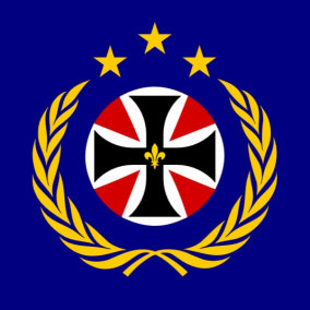
Frisemark wrote:A non-horizontally rectangular flag is always interesting to see.

That said, the design just feels...uninspired. It doesn't really pop, and it just feels like "what if EU but giga-germany". Also, the UN wreath is greatly overused and I don't like seeing it on stuff anymore.

I dunno. 5/10 I guess? It's not bad, just...not memorable.

Wait, EU but giga Germany?!
But other stuff I agree with
/skip
No, this is not the Iron Cross (I swear), and no I ain’t a N@zi.
Ordo Theutonicorum wrote: they have a cross-pattee on their flag??
Those who say they are based aren’t based. Those who say they are humble ain’t humble. Those who say they are chads ain’t chads.

User avatar
Junatia
Attaché
 
Posts: 88
Founded: Apr 27, 2022
Ex-Nation

Postby Junatia » Sun Jun 26, 2022 2:46 am

62/100
The Angel and Dragon in the center is pretty unique and the shade of storm blue (stripes) looks very cool, but doesn't really fit with the yellow shade. Still ok flag though. Also looks very dutch to me
rlw dam pmbemmr zaol f, s mlnabjog dyjvlrd eezws
News: Vegans kept protesting so i supported equality by legalizing cannibalism #EqualityForEverybody
All Policies except Military Conscription, No Prison are canon
pronounce: d͡ʒuːneɪʃɑ
Junatia mostly represents my rl views

PreviousNext

Advertisement

Remove ads

Return to Forum 7

Who is online

Users browsing this forum: Baltinica

Advertisement

Remove ads