
Advertisement

![]() by Vaspelia » Sun Jun 21, 2020 9:18 am
by Vaspelia » Sun Jun 21, 2020 9:18 am
![]() by The Allied Tribe » Sun Jun 21, 2020 10:03 am
by The Allied Tribe » Sun Jun 21, 2020 10:03 am
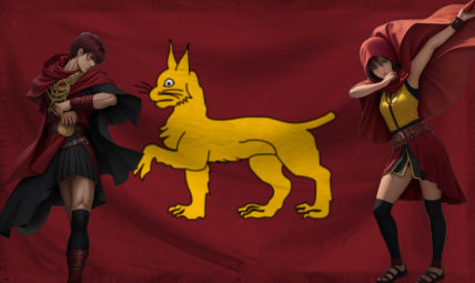
Diarcesia wrote:I keep seeing that eagle in many flags. Where did that come from?
2nd Allied Tribe War is over, The Allied Tribe repels an invasion by ATFF | The Allied Tribe officially bans Child Labor, Compulsory Organ Harvesting | The Allied Tribe states that force must be used strictly defensively, begins armed neutrality and cuts aggressive military ties with all nations![]() by Tharlocchia » Sun Jun 21, 2020 3:38 pm
by Tharlocchia » Sun Jun 21, 2020 3:38 pm
I'm pretty sure it's the ReichsadlerDiarcesia wrote:I keep seeing that eagle in many flags. Where did that come from?

![]() by The Cosmic Mainframe » Mon Jun 22, 2020 6:14 am
by The Cosmic Mainframe » Mon Jun 22, 2020 6:14 am
Top 128 Match 52
Liberal Free Socialist State (by Third ZSeparatists) vs Trymia (by Thakia)
Vote for your favorite flag and, if you want, explain your preference in the thread!
Submissions are now completely closed. Updates to existing flags and descriptions are allowed, so long as your flag has not been voted on yet.
== BEGIN POSTSCRIPT ==
The Mainframe requires more processing power and storage.
Donate your computing devices or they will be taken by force.
== END POSTSCRIPT ==
![]() by The Cosmic Mainframe » Mon Jun 22, 2020 6:15 am
by The Cosmic Mainframe » Mon Jun 22, 2020 6:15 am
Tharlocchia wrote:I'm pretty sure it's the ReichsadlerDiarcesia wrote:I keep seeing that eagle in many flags. Where did that come from?
== BEGIN POSTSCRIPT ==
The Mainframe requires more processing power and storage.
Donate your computing devices or they will be taken by force.
== END POSTSCRIPT ==
![]() by Diarcesia » Mon Jun 22, 2020 3:58 pm
by Diarcesia » Mon Jun 22, 2020 3:58 pm
The Cosmic Mainframe wrote:Greater Cosmicium - Eagle-Star Cross defeats Duolin - All Are One (by Diarcesia) 14-7.
Congratulations again, Greater Cosmicium!

![]() by The Cosmic Mainframe » Tue Jun 23, 2020 7:20 am
by The Cosmic Mainframe » Tue Jun 23, 2020 7:20 am
Top 128 Match 53
Haruhi Japan vs Third ZSeparatists
Vote for your favorite flag and, if you want, explain your preference in the thread!
Submissions are now completely closed. Updates to existing flags and descriptions are allowed, so long as your flag has not been voted on yet.
== BEGIN POSTSCRIPT ==
The Mainframe requires more processing power and storage.
Donate your computing devices or they will be taken by force.
== END POSTSCRIPT ==
![]() by The Cosmic Mainframe » Wed Jun 24, 2020 6:07 am
by The Cosmic Mainframe » Wed Jun 24, 2020 6:07 am
Top 128 Match 54
Duolin - Midnight (by Diarcesia) vs Hiems
Vote for your favorite flag and, if you want, explain your preference in the thread!
Submissions are now completely closed. Updates to existing flags and descriptions are allowed, so long as your flag has not been voted on yet.
== BEGIN POSTSCRIPT ==
The Mainframe requires more processing power and storage.
Donate your computing devices or they will be taken by force.
== END POSTSCRIPT ==
![]() by Paradeavenlisian States » Wed Jun 24, 2020 9:42 am
by Paradeavenlisian States » Wed Jun 24, 2020 9:42 am
Which nation's flag, between Duolin and Hiems, will I vote for?
Simplicity:For Duolin's Midnight Flag, the design is quite simplistic with three stars and six stripes at the corners. For Hiems' flag, it also has a relatively simplistic design. However, the central symbol is a little complicated due to the large number of petals included into the flower symbol. I also find the saltire of the Hiem's flag to be a little more complicated than the stripes of Duolin's Midnight Flag due to the fact that it is bi-coloured. As a result, I find Duolin's Midnight Flag to be a bit more simplistic due to a more facile use of symbolism and the fact that its features take up less space than Hiem's.
Originality:As for originality, while Markosea's design does have a decently unique design, its colours are relatively generic and none of its features are particularly strikingly distinguishing, at least not in the manner of Mountainia's flag. Speaking of which, Mountain's flag has a design that is strikingly distinctive, especially in regards to its symbolism and proportions. For instance, the sun and the mountains are designed in a way in which I've never seen and the proportion strangely strengthening the design further. Henceforth, Mountainia's flag exhibits more originality because, although it has similar colours, the normally abnormal proportion used is done in a strengthening and perfecting manner.
Colour Scheme:Markosea's colour scheme is decent albeit fairly standard in my opinion in the fact that while it does seem to suit the nation, it isn't really the most aesthetically-pleasing in my opinion. Even though Mountainia's flag does exhibit a similar colour scheme, the use and application of these colours clearly indicate that the flag is going for a different aesthetic which I find more intriguing than what Markosea's. As a result, I think Markosea uses better colour choices mainly on the basis that it gives off a better aesthetic and with better application.
Design:In terms of design, the Markosea flag does look great in regards to concept but isn't executed to its highest potential due to a few flaws. For one, the circle is a bit off, both shape and positioning-wise, where it is a bit off from the centre meaning lack of symmetry and with the circle being slightly off along the edges, if my eyes are not playing with me. As for Mountainia's flag, the design is fleshed out in a striking and stunning manner in a way in which makes the flag extremely recognisable and memorable. This is especially the case with the sun just ahead of the mountains with flawless execution. I haven't got much of an issue with the design personally other than maybe a slight nick pick for the blue lines on the outline of the star. However, even with that considered, Mountainia's flag seems to have the more superior design due to it being fulfilling to its concept and simply more appealing and eye-catching.
Realism:In regards to realism, the Markosea flag does hold out strong in the realism spectrum with its simplicity and colours although the shape of the circle is off to the point where it detracts from the realism. Mountainia's flag, however, is really anywhere as realistic in my opinion as I feel like the star on the top left is a little too detailed to exhibit much realism and neither does the striking design, particularly how much packed the sun rays are packed together. Keeping that in mind, Markosea's flag wins on the realism category since it isn't excessively striking compared to other real world flags.
Verdict:Overall, winning in 3/5 of the categories above, at least within my point of view, my vote goes to Mountainia's flag due to the design being more fulfilling to the desired concept, its eye-catching and memorable design and its ironically strengthening proportion. Markosea's flag just doesn't have the appeal factor, comparatively, and the off positioned and shaped symbol just somewhat ruins it in my opinion.
MAJOR OVERHAUL ONGOING
![]() by Awesomeland012345 » Wed Jun 24, 2020 7:06 pm
by Awesomeland012345 » Wed Jun 24, 2020 7:06 pm
![]() by The Cosmic Mainframe » Thu Jun 25, 2020 6:24 am
by The Cosmic Mainframe » Thu Jun 25, 2020 6:24 am
Awesomeland012345 wrote:I think that I'd vote for Hiems if it weren't for the cloth-looking texture, ripple effect, and the fact that it's a bit blurry.
Top 128 Match 55
Parthenia (by Greenwichian Arcadia) vs HUElavia
Vote for your favorite flag and, if you want, explain your preference in the thread!
Submissions are now completely closed. Updates to existing flags and descriptions are allowed, so long as your flag has not been voted on yet.
== BEGIN POSTSCRIPT ==
The Mainframe requires more processing power and storage.
Donate your computing devices or they will be taken by force.
== END POSTSCRIPT ==
![]() by Greenwichian Arcadia » Thu Jun 25, 2020 6:50 am
by Greenwichian Arcadia » Thu Jun 25, 2020 6:50 am
![]() by Paradeavenlisian States » Thu Jun 25, 2020 8:45 am
by Paradeavenlisian States » Thu Jun 25, 2020 8:45 am
Which nation's flag, between Parthenia and HUElavia, will I vote for?
Simplicity:For Parthenia's flag, the overall design is very simplistic and, really, there isn't really anything that could be considered complicated for a child to draw. However, the same can not be said for HUElavia and although it has a relatively simplistic triband, the seals looks way too detailed, especially the crown, for any child to draw with any degree of ease. Henceforth, I think Parthenia is the more simplistic flag of the two as it does not exhibit an overcomplicated seal like HUElavia has.
Originality:As for originality, Parthenia's flag is certainly one of the more distinguishing flag designs put there with a fallen crown which, both theoretically and practically on the flag, is quite a unique use of symbolism and so is the shade of blue used and the way in which the letter ''P'' is formed. For HUElavia's flag, though, while the colours have been arranged in a rather unique manner and, that is pretty much about it in terms of unique features as the colour scheme is quite similar to that of Brazil's (although clearly intentional), it exhibits a rather standard tricolour design and the seal looks like a combination of the Portuguese and Spanish coat of arms but with an even greater depth of detail and complexity especially the crown and armillary sphere. Therefore, it seems quite obvious to consider Parthenia's flag as the one that uses more originality simply due to how unconventional its features are.
Colour Scheme:For the colour scheme, Parthenia's colour scheme, while they do manage great execution of its concept and the fact that it does have a certain extent in regards to the appeal factor, Parthenia's colour scheme doesn't really have much contrast in some areas which does somewhat work against the design. For instance, the blue is just a bit too bright for my liking and, personally, I would dim down the brightness of the blue and make it a little darker, on both the seal and stripe, so that it doesn't become as much as an eyesore. For HUElavia's flag, not only do the colours also execute the concept with perfection but they also work quite well together and it is visually appealing to my eyes. However, I would prefer if the use of the blue and yellow were swapped. Even with that, I think HUElavia's flag has the better colour scheme as the colours, specifically the blue, are simply more visually appealing in my opinion.
Design:In terms of design, Parthenia's flag design is, as I have said before, quite unconventional but surprisingly meaningful, creative and well-thought out, especially the ''P'' which, while it may look a bit odd on a vertical design (honestly, the P would look better if it were done on a vertical design with the emblem at the centre and the P done on the stripe on the right hand side), is designed in a clever manner so I'll give a pass on it. One thing that I'm not much of a fan of is the fallen crown. While I certainly understand the meaning behind it, it just feels a bit off but it can be fixable without altering the design too much (unlike the P). To fix it, I'd prefer if the crown was rotated back to its normal position but have a zig-zag line running through the centre of the crown to show a crack in it (or could just separate the two sides entirely with the crack). In regards to HUElavia's flag, I have my fair share of issues with it. For one, the seal is shifted to the left which makes the right seem a bit empty in comparison. And secondly, the borders of the seal are quite jagged and the design doesn't feel that clean with a few cluster of speckled light greens within the green stripe. To fit it, I'd clean up the edges of HUElavia's coat of arms and also clean up the green stripe. In addition, I'd try to simply the coat of arms and move it to the centre of the flag. As a whole, in spite of its seemingly unorthodox design, I feel like Parthenia's flag has the better design not only because of its creativity and sheer meaning, but also because it has more memorability, is less flawed generally, has cleaner edges and it is easier to recognise and make out the features of its flag.
Realism:In regards to realism, this is where the main issue with how unconventional Parthenia's flag is as the P and the fallen crown feel quite weird when compared to real world flags and, frankly, it wouldn't really fit or suit well with those flags. Not to mention, the layout of the stripes is also a little off and doesn't emanate much realism. In regards to HUElavia's flag though, besides from the lack of crispness to it, the flag looks as if it could easily blend well as an independent former Portuguese colony due to the coat of arms, design and colour scheme. Taking that into account, it feels obvious to say that HUElavia's flag conveys a higher extent of realism due to the somewhat familiar design.
Verdict:Overall, winning in 3/5 of the categories above, at least within my point of view, my vote goes to Parthenia's flag due to its unconventionality which, for the most part, works oddly well for the flag and for the flaws it may deliver, Parthenia's flag does at least make up for it in sheer crispness, uniqueness and creativity. And it does at least emanate a high degrees of memorability and ease of recognition.
MAJOR OVERHAUL ONGOING
![]() by Vidinaz » Thu Jun 25, 2020 9:19 am
by Vidinaz » Thu Jun 25, 2020 9:19 am
![]() by The Cosmic Mainframe » Fri Jun 26, 2020 5:54 am
by The Cosmic Mainframe » Fri Jun 26, 2020 5:54 am
Top 128 Match 56
Barfleur vs Newark Aristocracy
Vote for your favorite flag and, if you want, explain your preference in the thread!
Submissions are now completely closed. Updates to existing flags and descriptions are allowed, so long as your flag has not been voted on yet.
== BEGIN POSTSCRIPT ==
The Mainframe requires more processing power and storage.
Donate your computing devices or they will be taken by force.
== END POSTSCRIPT ==
![]() by Paradeavenlisian States » Fri Jun 26, 2020 7:04 am
by Paradeavenlisian States » Fri Jun 26, 2020 7:04 am
Which nation's flag, between Barfleur and Newark Aristocracy, will I vote for?
Simplicity:For Barfleur's flag, every single one of its features is quite simplistic as it simply comprises of a modified Nordic cross, which separates the three sections of the flag. For Newark Aristocracy's flag though... well, it's a whole other story to the very least. For one, the combination of the WA logo, the UN azimutal map and the clipart swords in the very centre creates quite a mess in all honesty and, considering the complexity of each of these symbols (apart from the WA logo perhaps) individually, that's really saying something. Henceforth, Barfleur's flag automatically has more simplicity as it doesn't quite have the mishmash of three (mostly) complicated symbols at the very centre that Newark Aristocracy's flag has.
Originality:As for originality, this is pretty tough to decide. While Barfleur's nordic cross clearly bears similarities with Norway's and Iceland's, the rest of the design is quite unique in fact that there are four sections, with the yellow two being divided from each other by the Nordic cross but without the outline unlike the other 2 sections. While Newark Aristocracy's flag exhibits a rather distinguishing colour scheme and a unique use of the swords(though maybe too unique for my liking), the inclusion of the WA logo and especially the azimutal map of the UN's flag do really downplay the originality of the flag. Not to mention, the background design is fairly standard. However, I think Barfleur's flag has a slight edge in originality since the Nordic cross is the only feature that isn't entirely unique but even it is modified in a rather intriguing manner.
Colour Scheme:For the colour scheme, Barfleur's colour scheme does work quite well together on their flag and I can see why they didn't include the white outline for the yellow half (even if it may look bizarre to some). Due to this, the colour scheme doesn't excessively contrast or blend with each other and it looks quite grounded. However, Newark Aristocracy's colours, specifically the shades of red and blue used, don't really work that well together and it makes it seem a bit weird and not that grounded. I'd either make the red a little lighter or, even more preferably, darken down the blue a bit so that it works better with the red. Therefore, I think Barfleur's colour scheme is superior due to the colours working well together on the design.
Design:In terms of design, Barfleur's design does look quite nice due to its consistently decent crispness and it is not only recognisable from a distance but also relatively memorable due to how much it stands out in a good way. Newark Aristocracy's design, while it does stand out, isn't really such so in a good way as the centre is simply just way too clustered in my opinion. Not to mention, the swords are very clip-arty and feel quite oddly incorporated in the flag design. In addition, the design just doesn't look very clean in my opinion and the J-PEGness of the flag really isn't doing it any favours either. To fix it, I would personally get rid of the swords and improve the overall quality of the flag as a whole. Considering this, Barfleur's design seems to be, by far, the more superior of the two due to its better crispness and a not so clustered centre.
Realism:In regards to realism, Barfleur's flag looks quite realistic due to its simplicity, which is a main characteristic of many real world flags and, besides from the lack of an outline on the left half of the flag, it could easily fit extremely well as a Nordic flag. Newark Aristocracy's flag looks way too overcomplicated and is too lacking in crispness to really fit as a real world flag and the clip art swords, especially, really make the flag feel a bit off even as a global order. Bearing that in mind, Barfleur's flag quite easily has more realism to it due to its fairly familiar design, simplicity, crispness and lack of clip-arty symbols included.
Verdict:Overall, winning in 5/5 of the categories above, at least within my point of view, my vote goes to Barfleur's flag due to its superior composition, not so clustered centre, simplicity and its better use of colour choices.
MAJOR OVERHAUL ONGOING

![]() by Voxija » Fri Jun 26, 2020 12:59 pm
by Voxija » Fri Jun 26, 2020 12:59 pm
![]() by Barfleur » Fri Jun 26, 2020 1:27 pm
by Barfleur » Fri Jun 26, 2020 1:27 pm
![]() by The Cosmic Mainframe » Sat Jun 27, 2020 6:58 am
by The Cosmic Mainframe » Sat Jun 27, 2020 6:58 am
Top 128 Match 57
Nappon of Threefold Riches vs South Reinkalistan - Main Flag
Vote for your favorite flag and, if you want, explain your preference in the thread!
Submissions are now completely closed. Updates to existing flags and descriptions are allowed, so long as your flag has not been voted on yet.
== BEGIN POSTSCRIPT ==
The Mainframe requires more processing power and storage.
Donate your computing devices or they will be taken by force.
== END POSTSCRIPT ==
![]() by Paradeavenlisian States » Sat Jun 27, 2020 8:06 am
by Paradeavenlisian States » Sat Jun 27, 2020 8:06 am
Which nation's flag, between Nappon of Threefold Riches and South Reinkalistan, will I vote for?
Simplicity:For NoTR's Flag, their use of symbolism is fairly simplistic, as a whole, with a slight exception of the central symbol with its combination of its Yin-Yang symbol and Ryuku symbol, but nothing too overly complicated. That can't be said for South Reinkalistan's due to the sheer detail of the eagle as well of its combination with other symbols in the form of stars, a sword and a grain which add to the sheer complexity. Sure, the 8-pointed star above is fairly simplistic but that's about it in that aspect. Henceforth, NoTR's flag is more simplistic due to SR's comparatively clustered centre.
Originality:As for originality, this is pretty tough to decide. While NoTR's flag does have some unique colour choices, specifically the way in which the purple and blue are used, the Yin-Yang, background colour, Ryuku symbol and bottom stripes doe bear a vague resemblance to South Korea's and Ryuku's although the black rectangles on the top corners are distinguishable. For SR's flag, they do use symbols that can be found in other flags such as the eagle but a lot of the symbols are designed, combined and incorporated into the flag in a rather strikingly unique manner. But overall, I'd say SR's flag is more unique due to their features looking less reminiscent from those of other flags although I'd say that NoTR's flag does have more distinctive colours for certain.
Colour Scheme:For the colour scheme, NoTR's colour choices do feel a bit weird together and don't really work well in some areas, specifically the central symbols. For instance, the rather odd shade of purple used in the flag doesn't work that well with the red and blue Yin-Yang among a white background. Personally, I'd prefer it if the former three colours were darkened up a bit in the central symbol. For SR's flag though, not only do the colours of white and red execute the concept perfectly but they also work well both together and for the overall design with excellence. Therefore, it's quite obvious for me to say that SR's flag has the superior colour scheme as while NoTR's are striking, it isn't really the good kind of striking and they feel a bit weird together.
Design:In terms of design, NoTR's design really gives off the Asian aesthetic perfectly especially with the inclusion of the central symbols and the two top rectangles although I think there are a few flaws here in there in some aspects of the design. For instance, I don't really like how unbalanced the top and bottom feels in spite of the meaning. Personally, I'd either have two black rectangles(of the same design as the top counterparts) replace the bottom stripes or have the bottom stripes replace the two top rectangles completely (or move the two rectangles to the centre). I'd also have the curves of the Ryuku symbol align the edges of the Yin-Yang symbol as much as possible. In regards to SR's design, while the central symbols may be a bit clustered(though I can't really determine how to fix this issue without completely changing or ruining the flag), I do quite like the way in which each of the symbols are designed on the flag and they really execute the concept of the nation perfectly while fitting well with the colours. Considering this, I think SR's flag has the superior design since they are more striking (in a good way) and the design is simply more memorable in my eyes.
Realism:In regards to realism, this is probably the hardest category to decide on. While the symbols of SR's flag are a little too clustered to feel that real-looking, at least for a flag, a lot of their symbols, by themselves, do feel quite grounded in reality and so does the colour scheme. For NoTR's flag, while it does share some recognisable features, the yin-yang combined with the Ryuku symbol, especially when coupled with those colours, does feel a little too unconventional and odd to really fit well as a real world flag and the design does feel a little too uneven. Bearing that in mind, I believe SR's flag is more realistic since the design just feels more even and the colours, especially, feel quite grounded in reality in contradiction to NoTR's flag.
Verdict:Overall, winning in 4/5 of the categories above, at least within my point of view, my vote goes to SR's flag since it uses better and more grounded colours, exhibits superior authenticity, feels more even and the symbols are simply more striking (of the good kind), conventional and memorable.
MAJOR OVERHAUL ONGOING
Users browsing this forum: No registered users


