
Advertisement

![]() by Vaspelia » Sat Jul 04, 2020 9:13 am
by Vaspelia » Sat Jul 04, 2020 9:13 am
![]() by Hakinda Herseyi Duymak istiyorum » Sat Jul 04, 2020 3:11 pm
by Hakinda Herseyi Duymak istiyorum » Sat Jul 04, 2020 3:11 pm


![]() by The Cosmic Mainframe » Sat Jul 04, 2020 3:13 pm
by The Cosmic Mainframe » Sat Jul 04, 2020 3:13 pm
== BEGIN POSTSCRIPT ==
The Mainframe requires more processing power and storage.
Donate your computing devices or they will be taken by force.
== END POSTSCRIPT ==
![]() by The Cosmic Mainframe » Sun Jul 05, 2020 8:05 am
by The Cosmic Mainframe » Sun Jul 05, 2020 8:05 am
Top 64 Match 1
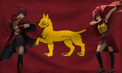
Three-way match: Jianghu (by The Perpetual Peace) vs Rusoyuz (by New Solaurora) vs Ensholm (by New Spiedska)
Vote for your favorite flag and, if you want, explain your preference in the thread!
Time for the top 64! Submissions are now locked in, no substantial changes allowed. Good luck to the remaining competitors.
== BEGIN POSTSCRIPT ==
The Mainframe requires more processing power and storage.
Donate your computing devices or they will be taken by force.
== END POSTSCRIPT ==
![]() by Paradeavenlisian States » Sun Jul 05, 2020 8:11 am
by Paradeavenlisian States » Sun Jul 05, 2020 8:11 am
The Cosmic Mainframe wrote:Sorry I'm late again!
The Cosmic Mainframe defeats Demirestad 22-6.
Thanks for the votes.Top 64 Match 1
Three-way match: Jianghu (by The Perpetual Peace) vs Rusoyuz (by New Solaurora) vs Ensholm (by New Spiedska)
Vote for your favorite flag and, if you want, explain your preference in the thread!
Time for the top 64! Submissions are now locked in, no substantial changes allowed. Good luck to the remaining competitors.
My opinion: After looking at these again, I find Rusoyuz the most appealing. Jianghu's flag is too simple, and while great Ensholm's flag does not have as good of color choice as that of Rusoyuz. I like the vertical four-color design of Rusoyuz, and the black bear works well with the rest of the flag.
MAJOR OVERHAUL ONGOING
![]() by The Cosmic Mainframe » Sun Jul 05, 2020 8:16 am
by The Cosmic Mainframe » Sun Jul 05, 2020 8:16 am
Paradeavenlisian States wrote:Btw, you have a slight format problem in the Previous Matches section of your OP where the first pair of the spoilers brackets is missing a bracket.
== BEGIN POSTSCRIPT ==
The Mainframe requires more processing power and storage.
Donate your computing devices or they will be taken by force.
== END POSTSCRIPT ==
![]() by Diarcesia » Sun Jul 05, 2020 8:35 am
by Diarcesia » Sun Jul 05, 2020 8:35 am

![]() by Drongonia » Sun Jul 05, 2020 6:50 pm
by Drongonia » Sun Jul 05, 2020 6:50 pm
The Republic of Drongonia
The MT powerhouse of Oceania. New Zealand but richer.
Overview | Political Parties | Our Leader | Defence Force Info | 9axes | Faces of Drongonia | Drongonia - The Man Behind the Spreadsheet
![]() by The Cosmic Mainframe » Mon Jul 06, 2020 6:18 am
by The Cosmic Mainframe » Mon Jul 06, 2020 6:18 am
Top 64 Match 2
Three-way match: Ialvarith (by Khoronzon) vs Fedele vs Pencil Sharpeners 2
Vote for your favorite flag and, if you want, explain your preference in the thread!
Time for the top 64! Submissions are now locked in, no substantial changes allowed. Good luck to the remaining competitors.
== BEGIN POSTSCRIPT ==
The Mainframe requires more processing power and storage.
Donate your computing devices or they will be taken by force.
== END POSTSCRIPT ==

![]() by Paradeavenlisian States » Mon Jul 06, 2020 8:09 am
by Paradeavenlisian States » Mon Jul 06, 2020 8:09 am
(Top 64 Match 1)
(Top 64 Match 2)
MAJOR OVERHAUL ONGOING
![]() by The Cosmic Mainframe » Mon Jul 06, 2020 8:11 am
by The Cosmic Mainframe » Mon Jul 06, 2020 8:11 am
Paradeavenlisian States wrote:Btw, the bracket bit in the thread title still says:(Top 64 Match 1)
Instead of:(Top 64 Match 2)
== BEGIN POSTSCRIPT ==
The Mainframe requires more processing power and storage.
Donate your computing devices or they will be taken by force.
== END POSTSCRIPT ==
![]() by The Cosmic Mainframe » Tue Jul 07, 2020 6:12 am
by The Cosmic Mainframe » Tue Jul 07, 2020 6:12 am
Top 64 Match 3
Duolin - Midnight (by Diarcesia) vs The Perpetual Peace - Alternate
Vote for your favorite flag and, if you want, explain your preference in the thread!
Time for the top 64! Submissions are now locked in, no substantial changes allowed. Good luck to the remaining competitors.
== BEGIN POSTSCRIPT ==
The Mainframe requires more processing power and storage.
Donate your computing devices or they will be taken by force.
== END POSTSCRIPT ==
![]() by Onocarcass » Tue Jul 07, 2020 6:19 am
by Onocarcass » Tue Jul 07, 2020 6:19 am
![]() by Paradeavenlisian States » Tue Jul 07, 2020 8:54 am
by Paradeavenlisian States » Tue Jul 07, 2020 8:54 am
MAJOR OVERHAUL ONGOING
![]() by Drongonia » Tue Jul 07, 2020 6:11 pm
by Drongonia » Tue Jul 07, 2020 6:11 pm
The Republic of Drongonia
The MT powerhouse of Oceania. New Zealand but richer.
Overview | Political Parties | Our Leader | Defence Force Info | 9axes | Faces of Drongonia | Drongonia - The Man Behind the Spreadsheet
![]() by The Cosmic Mainframe » Wed Jul 08, 2020 6:19 am
by The Cosmic Mainframe » Wed Jul 08, 2020 6:19 am
Top 64 Match 4
Astoria - Main flag vs The Albalian Kingdom (by Fallen Albali)
Vote for your favorite flag and, if you want, explain your preference in the thread!
Time for the top 64! Submissions are now locked in, no substantial changes allowed. Good luck to the remaining competitors.
== BEGIN POSTSCRIPT ==
The Mainframe requires more processing power and storage.
Donate your computing devices or they will be taken by force.
== END POSTSCRIPT ==
![]() by Paradeavenlisian States » Wed Jul 08, 2020 11:27 am
by Paradeavenlisian States » Wed Jul 08, 2020 11:27 am
The Cosmic Mainframe wrote:RNG matched them together
MAJOR OVERHAUL ONGOING

![]() by Hammer Britannia » Wed Jul 08, 2020 12:37 pm
by Hammer Britannia » Wed Jul 08, 2020 12:37 pm

![]() by -Astoria » Wed Jul 08, 2020 1:29 pm
by -Astoria » Wed Jul 08, 2020 1:29 pm
Hammer Britannia wrote:The Albalian Kingdom wins out because I am a swedaboo. The colors are just... so pretty.
Plus, Astoria's flag is a bit cluttered
![]() by Hammer Britannia » Wed Jul 08, 2020 1:35 pm
by Hammer Britannia » Wed Jul 08, 2020 1:35 pm
Users browsing this forum: No registered users


