Only 11 days to go until I lose and get humiliated in front of everybody!
Anyway, I voted for Satra. I found the color scheme very pleasing, and I like the symbol in the center.

Advertisement

![]() by The Cosmic Mainframe » Mon Jun 15, 2020 12:59 pm
by The Cosmic Mainframe » Mon Jun 15, 2020 12:59 pm
Barfleur wrote:Only 11 days to go until I lose and get humiliated in front of everybody!
Anyway, I voted for Satra. I found the color scheme very pleasing, and I like the symbol in the center.
== BEGIN POSTSCRIPT ==
The Mainframe requires more processing power and storage.
Donate your computing devices or they will be taken by force.
== END POSTSCRIPT ==

![]() by Tharlocchia » Mon Jun 15, 2020 5:22 pm
by Tharlocchia » Mon Jun 15, 2020 5:22 pm
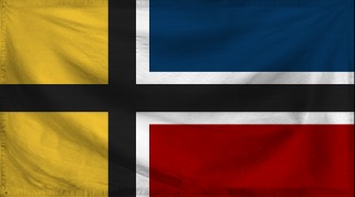
Personally, I really like your flag; it's simple in design, yet unusual in its construction. To be honest, I don't think I've seen a better take on the Nordic Cross, so don't sell yourself short.Barfleur wrote:Only 11 days to go until I lose and get humiliated in front of everybody!
![]() by Hakinda Herseyi Duymak istiyorum » Tue Jun 16, 2020 4:16 am
by Hakinda Herseyi Duymak istiyorum » Tue Jun 16, 2020 4:16 am

![]() by The Cosmic Mainframe » Tue Jun 16, 2020 6:07 am
by The Cosmic Mainframe » Tue Jun 16, 2020 6:07 am
Top 128 Match 46
Markosea (by Thakia) vs Mountainia Region (by Onfande)
Vote for your favorite flag and, if you want, explain your preference in the thread!
Submissions are now completely closed. Updates to existing flags and descriptions are allowed, so long as your flag has not been voted on yet.
== BEGIN POSTSCRIPT ==
The Mainframe requires more processing power and storage.
Donate your computing devices or they will be taken by force.
== END POSTSCRIPT ==
![]() by Paradeavenlisian States » Tue Jun 16, 2020 9:54 am
by Paradeavenlisian States » Tue Jun 16, 2020 9:54 am
Which nation's flag, between Markosea's and Mountainia's, will I vote for?
Simplicity:For Markosea's flag, it has quite a facile design comprised of two stripes, a circle and a background. Mountainia's flag, however, does have some somewhat complicated features in its flag. For instance, the blue lines that separate each edge of the star as the sheer quanitity of sun rays might not make it the easiest flag to draw. Therefore, Markosea's flag clearly seems to have the more simplistic design of the two due to less detailed and use of symbolism.
Originality:As for originality, while Markosea's design does have a decently unique design, its colours are relatively generic and none of its features are particularly strikingly distinguishing, at least not in the manner of Mountainia's flag. Speaking of which, Mountain's flag has a design that is strikingly distinctive, especially in regards to its symbolism and proportions. For instance, the sun and the mountains are designed in a way in which I've never seen and the proportion strangely strengthening the design further. Henceforth, Mountainia's flag exhibits more originality because, although it has similar colours, the normally abnormal proportion used is done in a strengthening and perfecting manner.
Colour Scheme:Markosea's colour scheme is decent albeit fairly standard in my opinion in the fact that while it does seem to suit the nation, it isn't really the most aesthetically-pleasing in my opinion. Even though Mountainia's flag does exhibit a similar colour scheme, the use and application of these colours clearly indicate that the flag is going for a different aesthetic which I find more intriguing than what Markosea's. As a result, I think Markosea uses better colour choices mainly on the basis that it gives off a better aesthetic and with better application.
Design:In terms of design, the Markosea flag does look great in regards to concept but isn't executed to its highest potential due to a few flaws. For one, the circle is a bit off, both shape and positioning-wise, where it is a bit off from the centre meaning lack of symmetry and with the circle being slightly off along the edges, if my eyes are not playing with me. As for Mountainia's flag, the design is fleshed out in a striking and stunning manner in a way in which makes the flag extremely recognisable and memorable. This is especially the case with the sun just ahead of the mountains with flawless execution. I haven't got much of an issue with the design personally other than maybe a slight nick pick for the blue lines on the outline of the star. However, even with that considered, Mountainia's flag seems to have the more superior design due to it being fulfilling to its concept and simply more appealing and eye-catching.
Realism:In regards to realism, the Markosea flag does hold out strong in the realism spectrum with its simplicity and colours although the shape of the circle is off to the point where it detracts from the realism. Mountainia's flag, however, is really anywhere as realistic in my opinion as I feel like the star on the top left is a little too detailed to exhibit much realism and neither does the striking design, particularly how much packed the sun rays are packed together. Keeping that in mind, Markosea's flag wins on the realism category since it isn't excessively striking compared to other real world flags.
Verdict:Overall, winning in 3/5 of the categories above, at least within my point of view, my vote goes to Mountainia's flag due to the design being more fulfilling to the desired concept, its eye-catching and memorable design and its ironically strengthening proportion. Markosea's flag just doesn't have the appeal factor, comparatively, and the off positioned and shaped symbol just somewhat ruins it in my opinion.
MAJOR OVERHAUL ONGOING

![]() by Thakia » Tue Jun 16, 2020 11:30 am
by Thakia » Tue Jun 16, 2020 11:30 am
| ☀ The Kingdom Of Thakia ☀ | Overview | The Minister | Military | World
![]() by Vidinaz » Tue Jun 16, 2020 5:32 pm
by Vidinaz » Tue Jun 16, 2020 5:32 pm
![]() by The Cosmic Mainframe » Wed Jun 17, 2020 6:14 am
by The Cosmic Mainframe » Wed Jun 17, 2020 6:14 am
Top 128 Match 47
Ssejekistan (by Voxija) vs Eternia Autonomous Region (by Onfande)
Vote for your favorite flag and, if you want, explain your preference in the thread!
Submissions are now completely closed. Updates to existing flags and descriptions are allowed, so long as your flag has not been voted on yet.
== BEGIN POSTSCRIPT ==
The Mainframe requires more processing power and storage.
Donate your computing devices or they will be taken by force.
== END POSTSCRIPT ==
![]() by Paradeavenlisian States » Wed Jun 17, 2020 7:36 am
by Paradeavenlisian States » Wed Jun 17, 2020 7:36 am
Which nation's flag, between Ssejekistan's and Eternia's, will I vote for?
Simplicity:For Ssejekistan's flag, the wreath is, admittedly, a little complicated due to a few details on it. But otherwise, the rest of the design is quite simplistic, even the flame. For Eternia's flag, the centre is a bit clustered to emanate much simplicity. For instance, the checker board design penetrating the very centre of the emblem coupled with the sun and its many rays in the emblem as well can make the flag look a little confusing. Therefore, Ssejekistan's has more simplicity to it since its centre isn't quite as clustered as Eternia's.
Originality:As for originality, this one is a little hard to decide. While Ssejekistan's colour scheme can be found on a few other flags and, excluding the central symbols, looks quite similar to Uzbekistan's, the shade of blue used sure is unique and the way the central symbols are designed is quite distinguishing, especially the flame which hasn't been seen on any other flag as far as I am aware. Eternia's flag, while certainly uniquely designed especially the colours, does have a checker board design that can be found in Croatia's flag, specifically the shield, and a few other flags here in NS. That said though, I think Eternia's flag wins on the originality aspect due to Ssejekistan's noticeable similarities with the Uzbek flag although the latter does have more distinguishing central symbols used.
Colour Scheme:When it comes to the colour scheme, Ssejekistan's colours, while, perhaps, a little dull in some places(specifically the blue), isn't excessively such to the point where it totally throws out the aesthetic into the trash and the colours, as a whole, look decent, both in terms of aesthetic and meaning. Eternia's colours, while a bit more striking and memorable, just feel a bit... weird in my opinion. Maybe it's the way in which the yellow and purple has been applied together or something but I can't seem to exactly put my finger with the issue. Regardless, I feel like Ssjekistan's colours are better as I feel like they have been applied in a better manner.
Design:In terms of design, Ssejekistan's flag has a pretty solid design and the wreath and the fire are both nicely designed and almost completely symmetrical(apart from the tip of the middle flame which just slightly off although it isn't too relevant) and the symbols not only create character but are also quite recognisable. My only slight issue with this flag is the fact that the tip of the flame pokes out above the middle stripe. For Eternia's flag, while I do like how symmetrical the design is, I have a few problems with the design. For one, I'm not a fan of the checker board design as it just feels a bit weird when any flag is mainly based on a checker board design, provincial flags included. I would personally prefer if the flag had a diagonal design although I'm not sure if it would work well on a proportion like theirs. Secondly, I'm not a fan of the outline either which seems to be somewhat standard for certain historical flag designs and while it does bring out the traditional aesthetic(which can be good if intended and executed adequately), it does, as it always does, have a lack of feeling of necessity. Thirdly, I don't like how the checkerboard design partly cuts into the centre of the emblem design as it feels a bit off and, with the sun also in the centre, it unnecessarily makes it confusing. And fourthly, I don't like how small the circular element of the sun is, especially compared to the sun rays and the ''protruding'' checkerboard design with it. To fix that, I feel like you could make the circular element of the sun bigger so that it covers up to the protruding checkerboard design in the centre. Considering this, I think Ssejekistan's flag has, by far, the better design of the two because it simply has less flaws and, although maybe less memorable, it is more recognisable and less clustered in the centre.
Realism:In regards to realism, Ssejekistan's flag does have some elements that really contribute well to the realism, especially the colours. The only thing that could possibly detract it could be the way the flame is designed but, then again, it also could make it blend and fit in well as a Central Asian flag. Eternia's flag, however, is a different story due to the way the purple is used and how prevalent it is on the flag which would make it stand out perhaps a bit too much among real world flags. Not to mention, the heavily checkerboard design would make feel a bit weird compared to other real world flags and so does the clustered centre. With that in mind, I think Ssejekistan's flag is far more realistic due to the colour scheme and just the overall design. Not to mention, it isn't overly striking both in design and colours to make it excessively protrude from other flags like its counterpart does.
Verdict:Overall, winning in 4/5 of the categories above, at least within my point of view, my vote easily goes to Ssejekistan's flag since it isn't overly striking, it is less clustered in the centre, has better use of colours and has a better emanating feel of realism. Eternia's flag just strikes out too much and the overall design is too clustered and off for my liking or vote.
MAJOR OVERHAUL ONGOING
![]() by Barfleur » Wed Jun 17, 2020 10:58 am
by Barfleur » Wed Jun 17, 2020 10:58 am
Tharlocchia wrote:Personally, I really like your flag; it's simple in design, yet unusual in its construction. To be honest, I don't think I've seen a better take on the Nordic Cross, so don't sell yourself short.Barfleur wrote:Only 11 days to go until I lose and get humiliated in front of everybody!
![]() by Vaspelia » Wed Jun 17, 2020 5:55 pm
by Vaspelia » Wed Jun 17, 2020 5:55 pm

![]() by Onfande » Wed Jun 17, 2020 6:28 pm
by Onfande » Wed Jun 17, 2020 6:28 pm
Vaspelia wrote:Ssejekistan's flag is simply alright and does it's job. But Eternia's loooooonge flag stands out a lot, purple is one of my favorite colors but using it to symbolize the seas is quite odd lol. The sun may be a bit thin to stand out from it's purple circle from a distance, that's one thing i can criticize. Overall, i vote for Eternia.

![]() by Trumpy America » Thu Jun 18, 2020 12:17 am
by Trumpy America » Thu Jun 18, 2020 12:17 am
![]() by The Cosmic Mainframe » Thu Jun 18, 2020 6:14 am
by The Cosmic Mainframe » Thu Jun 18, 2020 6:14 am
Top 128 Match 48
Azania - Alternate vs Crimean Republic (by Hakinda Herseyi Duymak istiyorum)
Vote for your favorite flag and, if you want, explain your preference in the thread!
Submissions are now completely closed. Updates to existing flags and descriptions are allowed, so long as your flag has not been voted on yet.
== BEGIN POSTSCRIPT ==
The Mainframe requires more processing power and storage.
Donate your computing devices or they will be taken by force.
== END POSTSCRIPT ==
![]() by Hakinda Herseyi Duymak istiyorum » Thu Jun 18, 2020 10:39 am
by Hakinda Herseyi Duymak istiyorum » Thu Jun 18, 2020 10:39 am
![]() by Azania- » Thu Jun 18, 2020 11:38 am
by Azania- » Thu Jun 18, 2020 11:38 am
Hakinda Herseyi Duymak istiyorum wrote:I wish success to my opponent, give me your votes
-------------------------
-------------------------
-------------------------
| Overview
| Government | Politics |
Military | Foreign Relations
15 November 2021
✉ News: "By failing to hold Moroka accountable, we were complicit in his crimes." - President Xitu as the 36th anniversary of Sebe Moroka's death reignites controversy surrounding the Silent War | REGIONAL NEWS | Alleged Moroccan terror attack in Western Sahara leaves 3 Algerians dead | African Parliament convenes in special session to discuss the burgeoning North African crisisWhen elephants fight, it's the grass that suffers.
![]() by The Cosmic Mainframe » Fri Jun 19, 2020 6:21 am
by The Cosmic Mainframe » Fri Jun 19, 2020 6:21 am
Top 128 Match 49
New Spiedska - 1785-1804 vs Apabeossie
Vote for your favorite flag and, if you want, explain your preference in the thread!
Submissions are now completely closed. Updates to existing flags and descriptions are allowed, so long as your flag has not been voted on yet.
== BEGIN POSTSCRIPT ==
The Mainframe requires more processing power and storage.
Donate your computing devices or they will be taken by force.
== END POSTSCRIPT ==

![]() by Voxija » Fri Jun 19, 2020 12:27 pm
by Voxija » Fri Jun 19, 2020 12:27 pm
![]() by The Cosmic Mainframe » Sat Jun 20, 2020 6:06 am
by The Cosmic Mainframe » Sat Jun 20, 2020 6:06 am
Top 128 Match 50
South Reinkalistan - Crimson Standard vs Albion (by Sildorian Empire)
Vote for your favorite flag and, if you want, explain your preference in the thread!
Submissions are now completely closed. Updates to existing flags and descriptions are allowed, so long as your flag has not been voted on yet.
== BEGIN POSTSCRIPT ==
The Mainframe requires more processing power and storage.
Donate your computing devices or they will be taken by force.
== END POSTSCRIPT ==
![]() by The Cosmic Mainframe » Sun Jun 21, 2020 5:56 am
by The Cosmic Mainframe » Sun Jun 21, 2020 5:56 am
Top 128 Match 51
Duolin - All Are One (by Diarcesia) vs Greater Cosmicium - Eagle-Star Cross
Vote for your favorite flag and, if you want, explain your preference in the thread!
Submissions are now completely closed. Updates to existing flags and descriptions are allowed, so long as your flag has not been voted on yet.
== BEGIN POSTSCRIPT ==
The Mainframe requires more processing power and storage.
Donate your computing devices or they will be taken by force.
== END POSTSCRIPT ==
Users browsing this forum: No registered users


