NATION

PASSWORD

NationStates Flag Bracket II (Congratulations to Albali!)

A resting-place for threads that might have otherwise been lost.

Advertisement

Remove ads

User avatar
Onocarcass
Ambassador
 
Posts: 1819
Founded: Jul 18, 2011
Inoffensive Centrist Democracy

Postby Onocarcass » Tue Aug 18, 2020 6:17 pm

I really should get around to cleaning up the edges on my main flag, lol.
Onocarcan Factbook

NationStates Flag Bracket II - 5th Place!
Everybody needs to calm down a bit

User avatar
The Cosmic Mainframe
Ambassador
 
Posts: 1104
Founded: Jan 26, 2020
Psychotic Dictatorship

Postby The Cosmic Mainframe » Wed Aug 19, 2020 6:00 am
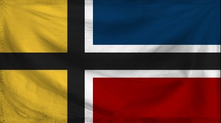
The Albalian Kingdom (by Fallen Albali) defeats Onocarcass 18-10.
Congratulations to Albali! And thanks to everyone for a relatively large number of votes!

Top 32 Match 14
Barfleur vs Drongonia - Alternate
Vote for your favorite flag and, if you want, explain your preference in the thread!

It's time for the top 32 - only great flags could have made it this far! Good luck to the remaining submitters!

Image
Barfleur
The color gold represents the high standards of excellence to which the people hold their government. The black cross represents the junction of all the citizens under one community, and the parallel white lines represent the equality enjoyed by all citizens. The blue represents the sea and sky, and the virtue of justice. The red represents fire, blood, and the virtue of liberty.

Image
Drongonia - Alternate

My opinion: While Barfleur's flag is great, it doesn't quite match the elegance of Drongonia's alternate flag, which demonstrates a very unique but still simple design.
== BEGIN POSTSCRIPT ==
The Mainframe requires more processing power and storage.
Donate your computing devices or they will be taken by force.
== END POSTSCRIPT ==

UPDATES (earth-year 3345): International Subsystem scales up operations in 42E5 "New York," Earth, now the largest known concentration of androids.

Factbooks | About Me | NationStates Flag Bracket II | Bytes (card farming region) | MAINFRAMEWAVE
Feel free to telegram me about anything. I'll do my best to respond.
Canon is relative to the observer. Not using NS stats.
This nation does not represent my real views, and if it represents yours, I question your sanity.

User avatar
Paradeavenlisian States
Spokesperson
 
Posts: 148
Founded: Feb 10, 2019
Ex-Nation

Postby Paradeavenlisian States » Wed Aug 19, 2020 8:02 am

Which flag, between Barfleur and Drongonia Alternate, will I vote for?


Simplicity:For simplicity, this is a bit hard to determine but I think Drongonia's Alt is the more simplistic of the two. It is comprised of a Southern Cross Constellation to the right hand side and a pair of intersecting stripes to the left, all amongst a navy blue field. Not only are all of these features simplistic (although the intersecting stripes may be a little confusing for a child), but they are also relatively bare in numbers. It is comprised of a modified Nordic cross, which separates the three sections of the flag. Now, while it may look a little confusing to some, all of these features are drawable for a child. However, I just don't think its more layout-oriented approach is as simplistic as Drongonia Alt's flag and, overall, it does look a little more confusing in design and has more to it in terms of features.


Originality: For originality, this is a bit of a tough one to determine but I think Barfleur's flag is more original because the Nordic Cross has never been modified in such a way where different sections have different uses of the outline. In addition, the colours are implemented in quite a unique manner. For Drongonia's Alt flag, while it does also have a unique layout, an original use of light blue and the unique featuring of the intersecting lines, the field, along with the Southern Cross constellation and its positioning, is very similar to that of Australia's and New Zealand at the same time. Not to mention, the colours are a bit more overused than that of Barfleur's flag.


Colour Scheme:For the colour scheme, this is where things get tough in determining but I'll have to narrowly give this to Barfleur's flag just because they feel more meaningful and their unique implementation. In addition, their greater overall contrasting makes them just ever so slightly more memorable and striking. While Drongonia's Alt flag colour scheme has greater visual and aesthetical appeal and is more fitting to its concept of an Oceanic nation in the Southern Hemisphere, I just don't think the colours carry as much meaning nor feel as striking in my opinion.


Design:In terms of the design, I'll have to narrowly give this to Drongonia Alt's flag because although it does feel a little more empty, it simply just has more grounded, well-rounded composition, is less off-putting and more appealing, elegant and aesthetically-pleasing. For Barfleur's flag, while its distinctiveness definitely makes the flag more intriguing and memorable, it does feel a bit unbalanced in comparison. To improve on it, without taking away from the uniqueness, I would move the cross to the centre as it would bring some more balance, distinctiveness (arguably) and, to an extent, some symmetry to it. And besides, judging by the nation's concept, I don't see the point in have the cross be the (altered) Nordic variant as the nation doesn't seem Nordic enough culturally to have the Nordic cross really be fitting for its concept.


Realism:In regards to realism, this is quite a tough one to determine but I think I'll give this one to Drongonia Alt's flag because it feels less off-putting (when compared to real world flags), slightly more grounded and sensible as a whole and it feels clean enough to fit relatively well as an alt flag for Australia or New Zealand (or maybe even for a union between the two). The only potential issue that the flag could face in regards to realism is, maybe, the intersecting stripes as they generally feel a bit airline-esque but they are, at least, balanced enough, in regards to distinction and groundedness, to potentially fit decently in a flag of its kind(if used correctly). For Barfleur's flag, it's simplicity, familiarity and distinctiveness could work well enough to be used as a united Scandinavian/Nordic Union flag. For some, however, the lack of an outline on the left side, which creates a sensation of emptiness, at least when compared to the right hand side of the flag, might make it a little too unequal (or maybe even a tad bit unconventional in the appearance aspect) or unbalanced to fit in as a real world flag. Personally, I am leaning more to the former point but, considering the latter point as well, I just don't think it's balanced enough to beat out Drongonia Alt's flag on the realism aspect.


Verdict:Overall, winning in 3 out of 5 of the categories above, at least from my point of view, I will vote for Drongonia Alt's flag because it feels more simplistic, has more appealing, fitting, aesthetically-pleasing colours, has more grounded composition, its design shines brighter in elegance and appeal and it feels more plausible as a real world flag. For Barfleur's flag, while it is more meaningful, distinguishing, striking, memorable, has more contrasting colours and more in-depth meaning, I just don't think it is as plausible or grounded as its counterpart and nor do I think it is elegant and appealing enough to earn my vote in this matchup.
Paradiraneami Taihou | ParadeavenlisianStates | ᚚᚐᚏᚐᚇᚔᚏᚐᚅᚓᚐᚋᚔ ᚈᚐᚔᚆᚑᚒ
MAJOR OVERHAUL ONGOING

User avatar
Voxija
Ambassador
 
Posts: 1449
Founded: Jan 17, 2019
Civil Rights Lovefest

Postby Voxija » Wed Aug 19, 2020 12:43 pm

Agin. Going with Drongonia.
The Republic of Voxija (pronounced: Voshiya)
I'm a woman. Some weird Jew. Trying to learn French and failing. An American who wishes the US would switch to the metric system. Part of a giant conspiracy. Secret pyromaniac? I will never make an OOC factbook!

my politics are confused and muddled
Most of my grammar errors are on purpose. Sppeling errors, tho...
I'd rather be fishing. | Author of Issues 1324 and 1346.
Generic MT liberal democracy Meh. | I think that by now I've created more lore for my nation than most real-world nations have.
Disclaimer: the views of my characters do not necessarily represent the views of the author.

User avatar
Khoronzon
Spokesperson
 
Posts: 187
Founded: Jul 31, 2019
Ex-Nation

Postby Khoronzon » Wed Aug 19, 2020 12:45 pm

Going with Barfleur this time around. The ripple effect is a little off-putting, but looking past that, the design is a fair bit more original than Drongonia's in my opinion, and the colour scheme is more interesting.
Vʏʜʜ Xsʜʀ Xsʜʀɪɴ Tʜʀʜ
Leader
Figures
Culture
Regions
Military
World
The world is no longer as it once was, moulded beyond recognition by the hands of its coming masters. Humanity is faced with a simple choice: evolve, or die.

△▽△
[all lore is under reconstruction]
▽△▽
ooc: they/them/girl/boss - notorious wumao - blowfly creature
flag homies: the celestial shurayu republic and uij, checkem out they're v based
all rise for the national anthem

中国共产党万岁

User avatar
The Cosmic Mainframe
Ambassador
 
Posts: 1104
Founded: Jan 26, 2020
Psychotic Dictatorship

Postby The Cosmic Mainframe » Thu Aug 20, 2020 6:44 am

Drongonia - Alternate defeats Barfleur 16-9.
Congratulations, Drongonia!

Top 32 Match 15
Bloodshade vs Paradisia Heavenlonia Stralisia Union (by Paradeavenlisian States)
Vote for your favorite flag and, if you want, explain your preference in the thread!

It's time for the top 32 - only great flags could have made it this far! Good luck to the remaining submitters!

Image
Bloodshade
The flag of Bloodshade is a representation of the plight of the Bloodshadian people: A mixture of refugees consisting of humans, elves, dwarfs and vampires who sailed an interstellar ark ship, 'Erebus', in order to find a paradise of their own amidst the stars, after the cataclysmic 'War of Woes' brought about extreme instability to their former homeworld's tectonic plates, enabling it to be plagued by volcanic eruptions and earthquakes until it would eventually blow up, exterminating all life along with its death. Now then, onto the meaning behind the flag which I shall go into detail. The colours and emblem on the flag represent a myriad of meanings:

  • The light blue is a representation of the perseverance of the Bloodshadian people as they travelled the black null void of space in order to find a place which they can finally call home. Some believe that it signifies the liberation of the people from the shackles of tradition and ancient grudges, joining in a common struggle to finally grant future generations a planet that they can call home, free from hazardous bigotry and xenophobia.
  • The blood-red aspect is an extremely significant part of the flag as it is supposed to immortalize those whose blood was spilt in the unfortunate 'War of Woes' and in the pursuit of a new home-world, currently named Tejon. The people of Bloodshade are not ones to shy away from conflict because they have everything to lose. Tejon is their home and they refuse to allow anyone to snatch that from them.
  • The white should represent the purity and innocence of the Bloodshadians as they roamed the galaxy in the hopes of settling down. They were a substantial collection of plucky, desperate survivors that simply wanted another chance at life, hoping that fate would be a merciful mistress for once. At their lowest point, they were finally of one heart and mind.
  • The 'Vega Eagle', named after the brightest star in Lyra, is supposed to represent the burning sensation in the souls of the Bloodshadians as they soar across the void of space. To them, the 'Vega Eagle' is a sign of hope, courage and regal power. Your typical eagle is known to be able to travel for 255 miles a day during its migration period, showcasing its determination and zeal. Coincidentally, the people have Bloodshade spent many years on the interstellar ark ship known as 'Erebus', neither stopping nor resting until they could settle down in greener pastures.
  • As for the bundle of arrows, officially, it is supposed to acknowledge the power being wielded the Vega Eagle. Some say it is a or should be a representation of the the militaristic nature of their people but most found this unofficial meaning to be rather traumatic and malicious in nature, considering the 'War of Woes' is still a rather fresh memory. Others claim that the 'three arrows' is a sign of resistance against the ancient ideologies that had resulted in the destruction of the Bloodshadian's original home planet. Those ideologies being ethnic nationalism, communism and absolute monarchism.
  • Simply put, the thunderbolt is a divine weapon. It is supposed to represent the instantaneous retributive destruction that Bloodshade could wreak upon its rival if its people were angered or wronged. Despite the depressing turn of events due to the 'War of Woes', this has only created stronger men and women that will rabidly protect what they believe is dear to them.

Image
Paradisia Heavenlonia Stralisia Union
The red star represents Stangelic Energy and unity. It also represents the six main elemental phoenixes that roam the archipelago with the exception of the rainbow phoenix which is represented by the white stripes on the star as the creator of them. The white represents the glaciated topped and symbolic Leecona Mountains. The blue represents the vast oceans that lie beyond the archipelago while the green represents the environment.

My opinion: These two flags are about equal in terms of their design, both being very simple and distinctive at the same time. Bloodshade's flag appears to have a bit more thought put into its meaning, though, which is why I'll be giving them my vote.

I'll try to get the matchups for the top 16 up today. I was going to post them earlier, but I keep forgetting!
== BEGIN POSTSCRIPT ==
The Mainframe requires more processing power and storage.
Donate your computing devices or they will be taken by force.
== END POSTSCRIPT ==

UPDATES (earth-year 3345): International Subsystem scales up operations in 42E5 "New York," Earth, now the largest known concentration of androids.

Factbooks | About Me | NationStates Flag Bracket II | Bytes (card farming region) | MAINFRAMEWAVE
Feel free to telegram me about anything. I'll do my best to respond.
Canon is relative to the observer. Not using NS stats.
This nation does not represent my real views, and if it represents yours, I question your sanity.

User avatar
Aurevbush
Chargé d'Affaires
 
Posts: 420
Founded: Apr 06, 2016
Inoffensive Centrist Democracy

Postby Aurevbush » Thu Aug 20, 2020 7:51 am

PHSU's got some great color scheme!
Located on the planet Aramnah as a technological powerhouse in a diverse multispecies sci-fantasy universe (PMT/FT/whatev), Yankeew@nk
Young American male, awkward, metalhead and history buff
THE FEDERAL REPUBLIC OF AUREVBUSH
Own Stats, Own Schedule

ACBC: BREAKING: President Len Zorra addresses the nation on the Kali Crisis.

User avatar
The Cosmic Mainframe
Ambassador
 
Posts: 1104
Founded: Jan 26, 2020
Psychotic Dictatorship

Postby The Cosmic Mainframe » Thu Aug 20, 2020 4:41 pm

Took me a while, but I have announced the matchups for the top 16!
Top 16 Match 1: Three-way match: Duolin - Midnight (by Diarcesia) vs Ensholm (by New Spiedska) vs Kycci Province (by Onocarcass)
Top 16 Match 2: Three-way match: Garden at 6th Mile Road (by Valentine Z) vs Trymia (by Thakia) vs Sildorian Empire
Top 16 Match 3: Drongonia - Alternate vs Winner of Match 15
Top 16 Match 4: Paradeavenlisian States - Main Flag vs Fars - Beneficent Trinity (by Vidinaz)
Top 16 Match 5: Esceanian Union (by Paradeavenlisian States) vs South Pacific (by Drongonia)
Top 16 Match 6: Winner of Match 16 vs Northern Federation (by Greater Cosmicium)
Top 16 Match 7: Zeptov Province (by Onocarcass) vs Alanis Star (by Valentine Z)
Top 16 Match 8: The Albalian Kingdom (by Fallen Albali) vs Ialvarith (by Khoronzon)
Further matches will be announced during Top 16 Match 3 at the earliest.
== BEGIN POSTSCRIPT ==
The Mainframe requires more processing power and storage.
Donate your computing devices or they will be taken by force.
== END POSTSCRIPT ==

UPDATES (earth-year 3345): International Subsystem scales up operations in 42E5 "New York," Earth, now the largest known concentration of androids.

Factbooks | About Me | NationStates Flag Bracket II | Bytes (card farming region) | MAINFRAMEWAVE
Feel free to telegram me about anything. I'll do my best to respond.
Canon is relative to the observer. Not using NS stats.
This nation does not represent my real views, and if it represents yours, I question your sanity.

User avatar
Onocarcass
Ambassador
 
Posts: 1819
Founded: Jul 18, 2011
Inoffensive Centrist Democracy

Postby Onocarcass » Thu Aug 20, 2020 5:55 pm

I feel like Kycci might be about to get slaughtered. lol
But hey, I'm happy enough having had 2 of my flags make it this far anyways. Good luck to everyone, there are some phenomenal flags still in here.
Last edited by Onocarcass on Thu Aug 20, 2020 5:57 pm, edited 1 time in total.
Onocarcan Factbook

NationStates Flag Bracket II - 5th Place!
Everybody needs to calm down a bit

User avatar
The Cosmic Mainframe
Ambassador
 
Posts: 1104
Founded: Jan 26, 2020
Psychotic Dictatorship

Postby The Cosmic Mainframe » Fri Aug 21, 2020 6:08 am

Bloodshade defeats Paradisia Heavenlonia Stralisia Union (by Paradeavenlisian States) 14-10.
Congrats Bloodshade!

Top 32 Match 16
Solaurora (by New Solaurora) vs Samantha-Higgs (by Valentine Z)
Vote for your favorite flag and, if you want, explain your preference in the thread!

It's time for the top 32 - only great flags could have made it this far! Good luck to the remaining submitters!

Image
Solaurora
A fantasy version of New Solaurora. The kingdom of Solaurora was founded from the kingdoms of Sol and Aurora after a decades long war. Out of fear of invading forces the two kingdoms united. Since then their cultures and peoples have blended which has further ensured their unity. This flag represents a combination of the flags of the original kingdoms.

Image
Samantha-Higgs
The current flag of my dictatorship nation, which I went for subtlety instead of for obviousness. The Morse Code says: "Bow down to your Eternal Ruler."

My opinion: I wanted both of these flags to reach the top 8, since they are both beautiful and extremely creative flags. Between the two, though, I'll have to pick Solaurora for its excellent color scheme and unique shape.
== BEGIN POSTSCRIPT ==
The Mainframe requires more processing power and storage.
Donate your computing devices or they will be taken by force.
== END POSTSCRIPT ==

UPDATES (earth-year 3345): International Subsystem scales up operations in 42E5 "New York," Earth, now the largest known concentration of androids.

Factbooks | About Me | NationStates Flag Bracket II | Bytes (card farming region) | MAINFRAMEWAVE
Feel free to telegram me about anything. I'll do my best to respond.
Canon is relative to the observer. Not using NS stats.
This nation does not represent my real views, and if it represents yours, I question your sanity.

User avatar
Hakinda Herseyi Duymak istiyorum
Minister
 
Posts: 3046
Founded: Sep 24, 2018
Ex-Nation

Postby Hakinda Herseyi Duymak istiyorum » Fri Aug 21, 2020 6:31 am

Image
Sosyal Demokrat Kemalist
Zayıf Agnostik
LGBT Destekçisi
-3.13 -4.77
Türk %76,2 ☾☆
Slav %22,4
Çinli %1

User avatar
Paradeavenlisian States
Spokesperson
 
Posts: 148
Founded: Feb 10, 2019
Ex-Nation

Postby Paradeavenlisian States » Fri Aug 21, 2020 9:07 am

Well, I'm not really that surprised that my PSHU flag lost against a flag as rich in meaning and quality as Bloodshade's although I was expecting the margin to be a bit bigger than that considering how well Bloodshade's flag has fared in other match-ups. And I've got to admit, I'm a little nervous about my main's match-up against a flag in the form and quality of Fars' flag to be completely honest, even with the previously one-sided match-ups my main has faced. Also, not sure how but I, rather ironically, already had a feeling that my Esceanian flag would end up going against the South Pacific flag even before the top 16 match ups were revealed (probably has something to do with the fact that my Alt flag, of a similar design, already went up against it or just shocking coincidence). Also, good luck to everyone who has (and will out of the two currently matched-up flags) reached the top 16 so far!


Which flag, between Solaurora and Samantha-Higgs, will I vote for?


Simplicity:For simplicity, it is quite obvious that Solaurora's flag is the more simplistic of the two flags. It is comprised of a three bands (one red and two white) at the right edge of the flag with a blue background and a sun at the left of the flag. For Samantha-Higgs' layout, their flag consists of what seems to be a futuristic-looking seal with a morse code surrounding a yellow symbol with a ''V'' symbol dissecting the yellow symbol (I'm presuming that's a futuristic coat of arms or an emblem). All of these features are relatively simplistic although the morse code may be a little confusing to some in sketching out, especially in encircled form.


Originality: For originality, this is a bit of a tough one to determine but I think Samantha-Higgs' flag edges it because it has a rather unique colour scheme (both in terms of the colours themselves and their implementation), coupled with the symbolism used in the centre and, most of all, the morse code which has never been featured on any other flag before and is, arguably, one of the most unique aspects of S-Higgs' flag. For Solaurora's flag, probably the most obvious original feature is the proportions and overall shape of the flag. The vast majority of flags uses a rectangular shape but Solaurora's flag uses a swallow-tailed flag which is rarely featured on flags and, as far as I'm aware, has never been used for a flag in NS outside of Solaurora's flag. Not to mention, the layout, too, is quite unique particularly the swallow-tailed stripes that follow the shape of the flag on the right hand side and it's use of symbolism through its sun has a very original design for an Asian-esque sun instead of going for the Chinese white sun variant. However, it does features the colours of red, blue and white which are the three most frequently used colours amongst flags although they are, at least, implemented uniquely and it does use royal blue as a unique alternative to the more generic navy blue. In addition, the sun, while uniquely designed, is still frequently featured in many flags, in contradiction to the morse code and V symbol on Samantha-Higgs' flag.


Colour Scheme:For the colour scheme, this is where things get tough in determining. Solaurora's flag features red (which seems to represent the former kingdom of Sol), royal blue (which represents the Kingdom of Aurora) and white (which seems to represent the ultimate common goal that has drove unity and the long desired peace and tranquillity that has been maintained between the two different blended cultures) and I do quite like the fantasy aesthetic that the flag gives off and it feels very fitting for the concept of the nation. For Samantha-Higgs' flag, the meaning isn't as clear-cut in regards to the colours but they seem to be a bit more striking in my opinion due to the use of yellow and royal blue which could possibly represent the power of the ruler (in terms of the control imposed which is emphasised by its used as a predominant colour of the field. However, I will have to narrowly give this one to Solaurora's flag because it just feels more visually appealing and aesthetically pleasing and it does slightly better in executing its concept, even if the colours aren't as striking or memorable in my opinion.


Design:In terms of the design, I'll have to give this to Solaurora's flag because the design just feels more memorable (especially with the phenomenally striking use of symbolism and the shape of the flag), meaningful and appealing at the same time. It also executes and reflects its concept quite well, both in terms of the traditional Asian aesthetic (not sure whether that was intentional but still worth mentioning) and the incorporation of both precedents of the union into the sun of the kingdom of Sol and the overall layout of Aurora's flag. In addition, the fact that the flag has a swallow-tailed shape could represent the equal importance and integrity of both former kingdoms to the union. I especially love the design of the sun which not only brings out the desired aesthetic but it also brings quite a lot of weight to the flag and it acts as the cherry-on-top aspect of the flag with its striking presence, memorabilia and strong appeal factor. The only slight issue with the flag also has to do with the sun, specifically around the edges of it where they do appear to be just slightly off in smoothness in certain areas. However, besides from that, the issue isn't really noticeable from a distance and it doesn't ruin it that much in any clearly visible way. Now, for Samantha-Higgs' flag, the meaning behind it isn't as clear-cut as Solaurora's flag, but we do know for certain that the morse code, as shown in their description, translates to "Bow down to your eternal ruler" which could indicate the sheer relevance of their leader. In addition, the fact that it surrounds the emblem in the centre could represent what would be deemed in the nation as the "necessary oppression of the people" and the sheer authority imposed on them used to prevent its people from harming themselves. The emblem in the centre could further emphasise this and while it is hard to know precisely the meaning behind the V, it could possibly represent Samantha-Higgs, since several aspects of her name do begin with the letter "V" and how much her presence as ruler affects the lives of the people. In regards of the appeal and weight that the features bring into the design, they do quite well in doing so and the well-designed morse code and emblem of the flag make for a nice, rather refreshing alternative to the over generic field-with-seal designs used in other flags with a blue field. However, as creative as they are,I just don't think the meaning behind them is as clear-cut or in-depth as Solaurora's flag and they are, as a whole, a bit more complicated.


Realism:In regards to realism, I'm still giving this one to Solaurora's flag because its sheer simplicity, well-rounded colours, rare but still plausible use of the swallow-tailed shape, and grounded layout and distinctive, striking use of sun symbolism would easily allow the flag to work quite well as a traditional kingdom in the Himalayas or maybe even as a Chinese dynasty for all we know. For Samantha-Higgs' flag, while the colours are definitely grounded enough to fit as a real world flag, I'm not entirely certain about the plausibility of certain aspects. For instance, while the morse code is implemented well-enough for an FT flag, I'm not entirely certain about the plausibility of the carved-out "V" shape in the emblem for any sort of flag in general although it is implemented well enough to mitigate the off-puttingness factor emanating from it. Overall, while most aspects of the design are definitely plausible enough for an FT nation, the questionable plausibility of some features is strong enough to prevent it from beating out Solaurora's flag in realism and plausibility, even as an FT flag.


Verdict:Overall, winning in 4 out of 5 of the categories above, at least from my point of view, I will vote for Solaurora's flag because of its greater simplicity, distinguishing and suitable flag shape, its well-rounded and appealing colours, excellent composition, meaningful colours and design (based on my guesses) and simply just a more plausible flag as a whole. For Samantha-Higgs' flag, while the flag is still meaningful (again mostly based on my guesses), has similarly creative elements and use of symbolism, has more striking and, arguably, memorable colours and more overall originality, I just don't think it is as meaningful, fitting for its concept to the same extent or aesthetically pleasing enough to earn my vote in this match-up.
Last edited by Paradeavenlisian States on Fri Aug 21, 2020 9:08 am, edited 1 time in total.
Paradiraneami Taihou | ParadeavenlisianStates | ᚚᚐᚏᚐᚇᚔᚏᚐᚅᚓᚐᚋᚔ ᚈᚐᚔᚆᚑᚒ
MAJOR OVERHAUL ONGOING

User avatar
Bloodshade
Diplomat
 
Posts: 540
Founded: May 28, 2017
Democratic Socialists

Postby Bloodshade » Fri Aug 21, 2020 10:06 am

Thank you for the kind words, Paradeavenlisian States! I think your flags were fantastic and it was an honor going up against you! All the best in your future matches!
An interstellar civilization that survived the self-induced destruction of its now long-gone homeworld and is trying to live the good life, all the while avoiding getting its ass kicked around.
Bloodshade Broadcasting Company| Actually re-writing my lore, I should't be on the forums but I am | Updated my video game screenshots, features Planet Zoo and Warhammer 2 | I need sleep but sleep doesn't need me | Edelgard is the cutest warmonger |

User avatar
The Cosmic Mainframe
Ambassador
 
Posts: 1104
Founded: Jan 26, 2020
Psychotic Dictatorship

Postby The Cosmic Mainframe » Sat Aug 22, 2020 6:16 am

Samantha-Higgs (by Valentine Z) defeats Solaurora (by New Solaurora) 12-10.
Congratulations to Valentine Z! See you in the top 16!

Just two weeks left in the competition! The next eight matches will determine who does and does not receive a prize by the end.
Top 16 Match 1
Three-way match
Duolin - Midnight (by Diarcesia) vs Ensholm (by New Spiedska) vs Kycci Province (by Onocarcass)
Vote for your favorite flag and, if you want, explain your preference in the thread!

On to the top 16! If a flag wins one of these matches, it will secure a place in the top 8 and its submitter will receive a prize by the end of the competition. Good luck!

Image
Duolin - Midnight
Three stars: The brightest stellar trio in the night sky as seen from Duolin, taken as an omen by its founders to settle there.
Blue: Tranquility and the many facets of life
Blue stripes on yellow: The four main rivers that traverse the land to the sea
Triangle at the bottom: Vision and resolve. The intended visual effect is for the viewer to imagine himself in a path moving forward to the horizon during nighttime. A reference to the story of Duolin's founding.

Image
Ensholm

Image
Kycci Province

My opinion: For me it's between Kycci and Ensholm, and I'll have to narrowly favor Kycci. Its eagle symbol fits better into the flag than Ensholm's three crowns, and it's also a very realistic flag.
== BEGIN POSTSCRIPT ==
The Mainframe requires more processing power and storage.
Donate your computing devices or they will be taken by force.
== END POSTSCRIPT ==

UPDATES (earth-year 3345): International Subsystem scales up operations in 42E5 "New York," Earth, now the largest known concentration of androids.

Factbooks | About Me | NationStates Flag Bracket II | Bytes (card farming region) | MAINFRAMEWAVE
Feel free to telegram me about anything. I'll do my best to respond.
Canon is relative to the observer. Not using NS stats.
This nation does not represent my real views, and if it represents yours, I question your sanity.

User avatar
Paradeavenlisian States
Spokesperson
 
Posts: 148
Founded: Feb 10, 2019
Ex-Nation

Postby Paradeavenlisian States » Sat Aug 22, 2020 8:13 am

Bloodshade wrote:Thank you for the kind words, Paradeavenlisian States! I think your flags were fantastic and it was an honor going up against you! All the best in your future matches!

It was indeed. Good luck to you and your flag as well!


Which flag, between Kycci Province, Duolin Midnight and Ensholm, will I vote for?


Simplicity:For simplicity, I'm giving this one to DM's flag. Their flag consists of a blue background, three yellow lines per side cut off by two smaller blue lines per side and a triangle at the bottom centre of the flag. all of the features are very simplistic in their own right and can definitely be drawn by a 7 year old child. For Ensholm's flag, it contains a white diagonal stripe dissecting the design in two. The white diagonal stripe is bounded on both sides by three thinner gold stripes at the top left section and a diagonal row of three Swedish crowns. Now, while most of the features are simplistic, it does have more going for it (feature-wise) than both of the other two and the three Swedish crowns are a bit more complicated in design than either the 4-pointed stars nor the stripes. In regards to Kycci's flag, it is comprised of a maroon field with two thin bands on the each top and bottom side with a star and an extremely detailed eagle in the centre. Now, while the layout (excluding the symbolism) is simplistic, I do think that their symbolism, specifically the eagle, is extremely detailed even when compared to the Swedish crowns of Ensholm's flag even though Kycci's layout is, arguably, easier for a child to draw out (excluding symbolism). This makes Ensholm's flag the more simplistic of the two because while it does have more features, the symbolism clearly doesn't have anywhere near the amount of detail that Kycci's eagle exhibits. Henceforth, here is where I'd rank them from most to least simplistic:
1. Duolin Midnight
2. Ensholm
3. Kycci Province


Originality:As for originality, this is quite a hard one to determine as all of them are unique in one way or another. Ensholm's flag does have quite a unique layout largely in part with the incorporation, arrangement and implementation of the three thinner gold stripes and the three Swedish crowns. However, in spite of its distinguishing design, Ensholm's flag does feel very Swedish-esque in terms of its colours (although there are some clear differences in regards to the colours such as the darker blue and additional featuring of white) and especially its use of symbolism which has been featured on the Swedish coat of arms. Duolin Midnight's flag features 4-pointed stars which have rarely been featured on a real world flag and the gold stripes are even more distinguishing since they have never really been featured on any real world flag. While Kycci's flag does have the generic 5-pointed star and an eagle at the centre, the eagle is still uniquely designed and, most of all, the colour scheme of maroon, white and yellow is an extremely rare colour scheme and even maroon, by itself, is rarely used on any other flag whatsoever. Considering this, I may need to give a slight edge to Kycci's flag purely because of the distinctively rare colours used and implemented on the flag. Between Ensholm's and Duolin Midnight's flag, I think I'll go with DM's flag because it just doesn't have that much similarities or aesthetical links with real world flags when compared to the Swedish-esque flag of Ensholm. Taking that into account, here is where I'd rank the flags from most to least original:
1. Kycci Province
2. Duolin Midnight
3. Ensholm


Colour Scheme:For the colour scheme, this is yet another tough category to decide on. Ensholm's flag has very appealing colours (perhaps the most appealing of the three) which are balanced in terms of contrast in the way in which they are implemented. Not to mention, it does well in emphasising the Swedish aesthetic and it executes the concept quite well. It is also well implemented through the fact that it avoids potentially poor contrast between the white and the gold. Duolin Midnight's flag does also do well in emphasising and conveying the midnight aesthetic through its similar colour scheme to the point where it has more meaning to it than the other two. However, it just doesn't feel as striking nor appealing to my eyes, for some reason, as Ensholm's colours. Kycci's flag has, perhaps, the most striking and memorable colours of the three. However, considering this, I think I'll have to narrowly give this one to Ensholm's flag because I feel like the colours are simply more appealing to my eyes and it executes the aesthetic and concept quite well in my opinion. Between Kycci's and Duolin Midnight's flag, I think I'll have to give it to Kycci's flag because I feel like the colours are just a bit more striking and memorable to my very eyes. Henceforth, here is where I'd rank the flags from the best to the worst colour scheme:
1. Ensholm
2. Kycci Province
3. Duolin Midnight


Design:In terms of the design, this is, perhaps, one of the more difficult categories (which is really saying something) to determine. Ensholm's flag does have quite a good use of symbolism with the three Swedish crowns excellently executing the concept of what seems to be a former Swedish colony is what is, perhaps, Eastern Canada or New England. However, I do find the arrangement of the three crowns, along with the thinner yellow lines, to be not quite as balanced as the other two which could make it feel a little off-putting. Also, while I do definitely understand the reason for the positioning of the three crowns (to avoid poor colour contrast between the gold and white), it just disrupts the balance and it does feel a bit weird to have the three thinner gold stripes at just one side of the white stripe. To improve on it, I think the three gold crowns should be placed in the white stripe but with a black or even blue outline around each of them to avoid poor contrast and to make them more distinctive on the stripe. I would replace the three crowns with one thin yellow line to make it less clustered and get rid of the two already existing outer lines on the other side to make it feel less clustered. Duolin Midnight's flag is, perhaps, the most balanced out of all of them, due to their symmetry and does seem to be the more meaningful of the three mainly due to them being the only one with an actual description. Kycci's flag makes for some very good use of symbolism, especially the way in which the eagle is intricately designed. Not to mention, the layout, as a whole, is very grounded to my eyes. The only personal issue that I have with the flag is the lack of anti-aliasing of the eagle although, to be fair, it is hard to do that on something as intricately designed as their eagle. Bearing that in mind, I think that Kycci's flag has the superior design of the three because it is, by far, the most striking and memorable of the three and it makes for some very good meaning and character through its eagle symbol of pride and strength. Between Ensholm's and Duolin Midnight's, while both designs are great in their own right, I may need to narrowly give this one to Duolin Midnight's because it feels far more balanced, it feels less flawed, has more in-depth meaning behind it and it is just less off-putting in terms of the arrangement of the symbols and layout. Therefore, this is how I'd rank the flags from the strongest to weakest design:
1. Kycci Province
2. Duolin Midnight
3. Ensholm


Realism:In regards to realism, I think I may need to narrowly give this one to Kycci Province's flag because while it is the least crisp of the three, it could work quite well for an alternative flag for a US state in the southwest, particularly such for Utah, Nevada or Arizona or perhaps for a flag for an alternate Deseret nation due to its use of symbolism and the desert-esque colour scheme. For Ensholm's flag, while the design does feel a tad bit unconventional due to certain off-putting features, it does, at least, have a more realistic and grounded aesthetic and it could really work well as a flag of an alternate former (or ongoing) Swedish colony in either Eastern Canada or New England. The way in which the yellow stripes on Duolin Midnight's flag are arranged could make them a little unusual on a flag but not too far off in terms of plausibility and I'd argue that it could fit well enough on a flag, if used correctly and to its full potential that is. Not to mention, it does have some grounded and relatively plausible colours. Between the two flags, I think Ensholm's flag is the more realistic of the two flags because while it does have more off-putting features, it does, at least, have some form of familiarity through both the colours and the symbols of the flag which are both also more grounded-in-reality and plausible in my opinion. With this in mind, this is how I'd rank the flags from most to least realistic:
1. Kycci Province
2. Ensholm
3. Duolin Midnight


Verdict:Overall, this was quite a tough match to decide on. However, having won 3 out of 5 categories, I will vote for Kycci Province's flag for this round because it is, by far, the most striking and memorable of the two in both colours and design, the eagle gives off plenty of meaning and character (even without a description) while having, arguably, the best overall design of the symbols, and, ironically enough, has the greatest plausibility and originality. Ensholm's flag does have better and more appealing colours and it does feel relatively realistic and plausible but it does feel a bit more unbalanced than the other three in regards to its design, the least original out of the three and it could do with the most improvements, specifically in regards to the thin gold stripes and crowns. For Duolin Midnight's flag, while it is, indeed, the most balanced, simplistic and symmetrical out of the three, it just doesn't quite have the strike factor to the same extent as the other two in regards to its colours. Between the latter two, it is quite hard to determine but, having ranked higher more consistently, I'll narrowly give it to Duolin Midnight's flag not only because of its greater balance and simplicity but it also feels more original, has greater meaning, isn't as riddled with flaws and has less off-putting features. If the flaws of Ensholm's flag were to be fixed as mentioned earlier, then it would likely beat out Duolin Midnight's flag and could make for a good match against Kycci Province's flag from my point of view but, as it is, it remains the weaker of the three flags in my opinion. Taking all of this in mind, this is where I'd rank them as the strongest and weakest of the three flags, purely in my opinion:
1. Kycci Province
2. Duolin Midnight
3. Ensholm
Paradiraneami Taihou | ParadeavenlisianStates | ᚚᚐᚏᚐᚇᚔᚏᚐᚅᚓᚐᚋᚔ ᚈᚐᚔᚆᚑᚒ
MAJOR OVERHAUL ONGOING

User avatar
New Solaurora
Spokesperson
 
Posts: 192
Founded: Mar 11, 2016
Ex-Nation

Postby New Solaurora » Sat Aug 22, 2020 5:18 pm

The Cosmic Mainframe wrote:Samantha-Higgs (by Valentine Z) defeats Solaurora (by New Solaurora) 12-10.
Congratulations to Valentine Z! See you in the top 16!


Welp, I may be out but I'm going to see this to its end. Thank you for allowing me to make it this far and congrats to Val Z on their great flag!

For today I'm going with Duolin's midnight flag as I find it both the most aesthetically pleasing and it has some good lore behind it.
Last edited by New Solaurora on Sat Aug 22, 2020 5:22 pm, edited 1 time in total.
---------
New Solaurora
---------


User avatar
The Cosmic Mainframe
Ambassador
 
Posts: 1104
Founded: Jan 26, 2020
Psychotic Dictatorship

Postby The Cosmic Mainframe » Sun Aug 23, 2020 5:37 am

Kycci Province (by Onocarcass) wins, Ensholm (by New Spiedska) is second, and Duolin - Midnight (by Diarcesia) is third; vote total is 11-4-2.
Congratulations, Onocarcass! I expected you to win, but I certainly didn't expect a victory by this margin.

Top 16 Match 2
Three-way match
Garden at 6th Mile Road (by Valentine Z) vs Trymia (by Thakia) vs Sildorian Empire
Vote for your favorite flag and, if you want, explain your preference in the thread!

On to the top 16! If a flag wins one of these matches, it will secure a place in the top 8 and its submitter will receive a prize by the end of the competition. Good luck!

Image
Garden at 6th Mile Road
As going with the nature of the nation, and with its name, a simple flag for Holly and her own little dimension!

Image
Trymia

Image
Sildorian Empire

My opinion: While G6MR is a bit too simple, and Trymia's central symbol is excessively detailed, Sildorian Empire is the best flag here because it has just the right amount of simplicity here and the best color scheme of all three flags.
== BEGIN POSTSCRIPT ==
The Mainframe requires more processing power and storage.
Donate your computing devices or they will be taken by force.
== END POSTSCRIPT ==

UPDATES (earth-year 3345): International Subsystem scales up operations in 42E5 "New York," Earth, now the largest known concentration of androids.

Factbooks | About Me | NationStates Flag Bracket II | Bytes (card farming region) | MAINFRAMEWAVE
Feel free to telegram me about anything. I'll do my best to respond.
Canon is relative to the observer. Not using NS stats.
This nation does not represent my real views, and if it represents yours, I question your sanity.

User avatar
Paradeavenlisian States
Spokesperson
 
Posts: 148
Founded: Feb 10, 2019
Ex-Nation

Postby Paradeavenlisian States » Sun Aug 23, 2020 7:28 am

Which flag, between Garden at 6th Mile Road, Trymia and Sildorian Empire, will I vote for?


Simplicity:For simplicity, It is quite obvious that G6MR's flag is the more simplistic of the two. It is comprised of a flower amongst a blue field and that's literally it. Not to mention, the flower symbol in the centre is probably one of the most simplistic adaptations of the flower symbol possible (at least in a manner that is grounded and sensible for a flag). For Sildorian Empire's flag, it consists of two thin white bands separating the thicker stripes from the pale. Speaking of which, the pale, in itself, contains a symbol in the centre which consists of a bottomless isosceles triangle with two extensions per side. All of these features and the layout are simplistic in their own right and shouldn't require that much difficulty for a child to draw. However, the flag, while it also has a central symbol like G6MR's flag, is a lot more layout-oriented with more features and I feel like G6MR's flower would still be a tad bit easier to draw than the triangular symbol. For Trymia's flag, it has a very similar layout but with thinner stripes and an eagle (yes, it's an eagle, not a phoenix since they, themselves, have confirmed that their national animal is an eagle) and wreath replacing the triangular symbol. Both their eagle and their wreath also turn out to be quite detailed as well due to them featuring feathers and leaves as well as details in the eagle's talons. And almost, if not, any eagle and wreath would be far more complex to draw than both the Sildorian triangular symbol and the G6MRian flower. Between Sildorian Empire's flag and Trymia's flag, while both of them have very similar layouts to one another, I think Sildorian Empire's flag is the more simplistic of the two because their central symbol is much more simplistic and doesn't have anywhere near the concentration of detail that Trymia's eagle and wreath symbols exhibits. Henceforth, here is where I'd rank them from most to least simplistic:
1. Garden at 6th Mile Road
2. Sildorian Empire
3. Trymia


Originality:As for originality, this is quite a hard one to determine as all of them are unique in one way or another. However, I think that I may need to narrowly give this one to Garden at 6th Mile Road because its entire colour scheme is pretty much different shades of just one colour which, in G6MR's case, is blue and almost never featured on any other flag. In addition, while flowers have been featured on quite a lot of flags (especially on this site), it is rare to see flowers of this simplicity featured on a flag, so there's something. For Sildorian Empire's flag, it, arguably, has the most original use of symbolism out of the three since flowers have been featured in other flags before and eagles and wreaths are pretty much the two most commonly featured symbols (besides from stars of course) that can be found in real world flags. As for the symbol itself, the triangular symbol hasn't really been featured in any real world flag outside of Sildorian Empire's flag and it is considerably more distinctive in appearance as well. In addition, the colour scheme and choices are very unique, especially the featuring of green as a "dominant" colour throughout the flag. The only issue in regards to originality is that the design has been used in several real world flags before such as Suriname's, North Korea's and a few others as well. Now, while Trymia's flag does, arguably, have slightly more original colours than Sildorian Empire, I don't think the colours are as unique as the light blue dominated colour scheme of G6MR's flag. Not to mention, it has a very similar layout to its Sildorian counterpart which, as mentioned before, has been implemented in a similar fashion in real world flags. However, perhaps the biggest reason why I consider their flag as less distinctive than the other two is their use of more generic and frequently used symbols through the eagle and the wreath. However, even then, both the eagle and the wreath are uniquely designed through the incorporation of the feathers and the leaves and just the overall design of the features of both symbols. Taking that into account, here is where I'd rank the flags from most to least original:
1. Garden at 6th Mile Road
2. Sildorian Empire
3. Trymia


Colour Scheme:For the colour scheme, I'll have to give this one to Sildorian Empire's flag because the colours of white, gold and green work very well in a way that is striking and intriguing at the same time with its great implementation amongst the design without messing it up in regards to the balance of contrast. Not to mention, having the yellow be used for the central symbol makes the flag feel quite memorable to me. Personally, I would prefer it if either the two bands at the top and bottom or the pale in the middle were either purple or dark blue as a way to emphasise the space aesthetic of the nation but, again, it's just a personal preference and I don't really have any real problems with the colour scheme of Sildorian Empire's flag. For Trymia's flag, while the colours aren't quite as appealing to my eyes, they are still decently such, are more firm and grounded in terms of contrast, they seem to be the most striking out of the three, convey the dictatorship aesthetic relatively well without being generic (which would be black and red) and they seem to have gone for a more thematic approach in regards to the aesthetic of their colour scheme. However, I do have somewhat mixed feelings about the white feathers and leaves. On one hand, the use of white on the feathers and the leaves do seem a bit unnecessary, especially since the majority of the eagle and wreath are orange. On the other hand though, they do add in more detail and could even make them more striking amongst a red field although I'm leaning more towards the latter. As for G6MR's flag, the colour scheme is, perhaps, the most appealing and charming of the three but, in spite of the vibrant use of light blue, the colour scheme isn't as contrasting as the other two and therefore, isn't as striking although it does have the potential to be. Now, while I don't really have any major issues with the colour scheme, I do think the centre of the flower should be yellow to make it more distinguishing. From a purely personal perspective, I think there could be even more changes to make it more distinguishing, striking and memorable but I think it would take away from the aesthetic of the garden (even if green is generally better at conveying the aesthetic of a garden in most cases), judging by how it looks, and the connection and importance of the garden to Holly and vice versa. Now, between G6MR's flag and Trymia's flag, this is where things get a bit hard to determine but I think I'll have to narrowly give this one to Trymia's flag just because it feels more thematic, contrasting, striking and memorable to me. Henceforth, here is where I'd rank the flags from the best to the worst colour scheme:
1. Sildorian Empire
2. Garden at 6th Mile Road
3. Trymia


Design:In terms of the design, I'll have to give this one to Sildorian Empire's flag because one is too simplistic and minimalist while the other feels a bit too complicated and detailed through its symbols and Sildorian Empire's flag acting as the perfect balance (in my opinion) between the two points in the simplicity spectrum and it is coupled with a clean and crisp design. It has great use of symmetry as well as excellent composition, more character through its symbolism which seems to represent the futuristic vibe as well as the seemingly endless economic and technological progress, and a more intriguing layout. All of these features make the design quite easy to recognise from a distance while being extremely memorable at the same time along with (mostly) consistent cleanliness and crispness. I do, however, have one slight nick pick with the design, over a feature that is pretty hard to notice and that is the edges of the central symbol where it is the only inconsistent feature when it comes to clean and crisp edges. Upon close examination, there does seem to be some white edges in some areas and there are even some jagged points in some areas as well. Henceforth, the only thing that the flag needs improving is to ensure and maintain crisper and cleaner edges on the edge of the symbols but it can be easy to ignore (without even knowing) and its the only minor nick pick that I have with the otherwise elegant design. Trymia's design, while is quite similar to that of Sildorian Empire's in terms of the layout, does have some very well-designed symbols with some very intricate details in the form of the eagle's feathers and the wreath's leaves. My only issue with the flag is, of course, the comparative lack of antialaising when compared to its counterpart. However, for the sheer level of detail on both the eagle and the wreath, the lack of antialaising is minimal and barely noticeable so it can be easy to ignore as a major issue. And besides, it still feels very memorable, well-designed and has great composition. For G6MR's flag, it has great simplicity, good use of symbolism and, most of all, it's sheer character (figuratively and, almost, literally). Not only does the flower show the connection between Holly and her garden, but also emanates charm and nature as well. However, I think the rather minimalist design may be too simple for my liking and I feel like it could do with more in a variety of ways such as a flowery saltire or a flowery symmetrical cross. However, personally, I would go with a flowery bend where there is a bend that has a dark blue outline with the flowers in a row on both sides of the big flower with an emblem containing a circular outline and the central flower. However, for that to work, I think the central flower should be a little smaller. Between the latter two, I think I'll, again, have to give it to Trymia's design because of the sheer detail, it isn't too oversimplified, the symbols are more striking and memorable and the sensation of emptiness isn't as unnecessarily strong in their flag. Therefore, this is how I'd rank the flags from the strongest to weakest design:
1. Sildorian Empire
2. Trymia
3. Garden at 6th Mile Road


Realism:In regards to realism, I think I may need to narrowly give this one to Trymia's flag because while it does have considerably less antialaising, their flag could work quite well for an alternative flag for a US state in the southwest, particularly such for Utah, Nevada or Arizona or perhaps for a flag for an alternate Deseret nation due to its use of symbolism and the desert-esque colour scheme.For Sildorian Empire's flag, it does also have grounded colours, a cleaner design as a whole and an equally plausible layout but the FT aesthetic of the flag may not bode too well in the real world in terms of overall plausibility. The different shades of blue of G6MR's flag don't really feel that realistic, the flower doesn't feel quite as familiar as an eagle or a wreath, it isn't as grounded as Sildorian's triangular symbol and it is a bit too simplistic and minimalist in detail to really fit in as a real world flag especially when considering that flowers in real world flags often have quite a bit of detail in comparison to G6MR's flower. With this in mind, this is how I'd rank the flags from most to least realistic:
1. Trymia
2. Sildorian Empire
3. Garden at 6th Mile Road


Verdict:Overall, this was quite a tough match to decide on. However, having won 2 out of 5 categories, I will vote for Sildorian Empire's flag because, comparatively to the other two, it acts as the perfect balance in simplicity with one being too minimalist and simplistic and the other being too complex and detailed. Not to mention, it has a considerably more distinctive central symbol than the other two which is also more fitting for its concept and meaningful-wise, coupled with excellent composition which I consider to be the best of the three, appealing colours and just downright crisper and cleaner edges as a whole than Trymia's flag. It also has more going with it while balancing it out with symmetry at the same time than G6MR's flag which is something that the latter lacks in. For Trymia's flag, while the colours are fitting for its concept, has a striking symbol, is more plausible and has a similarly good layout, the colours just aren't as appealing in comparision to their Sildorian Empire nor is it balanced enough in regards to simplicity (coupled with less antialaising around the edges of the symbols). As for G6MR's flag, while it does have the most simplicity, originality and appealing colours of the three, it is just a bit too minimalist and doesn't have as much strike in its design for my liking when compared to the other two and it isn't as plausible. Between G6MR's flag and Trymia's flag, while it is tempting to consider G6MR's flag as the better of the two since it ranks first more frequently (2/5 compared to Trymia's 1/5), Trymia's flag still beats out G6MR's flag in most categories (3/5). Henceforth, I'll consider Trymia's flag as the better flag of the two since it has a much stronger design, it has more thematic, striking and memorable design, better composition and it feels more plausible as a flag. Taking all of this in mind, this is where I'd rank them as the strongest and weakest of the three flags, purely in my opinion:
1. Sildorian Empire
2. Trymia
3. Garden at 6th Mile Road
Paradiraneami Taihou | ParadeavenlisianStates | ᚚᚐᚏᚐᚇᚔᚏᚐᚅᚓᚐᚋᚔ ᚈᚐᚔᚆᚑᚒ
MAJOR OVERHAUL ONGOING

User avatar
Onocarcass
Ambassador
 
Posts: 1819
Founded: Jul 18, 2011
Inoffensive Centrist Democracy

Postby Onocarcass » Sun Aug 23, 2020 9:33 am

The Cosmic Mainframe wrote:Kycci Province (by Onocarcass) wins, Ensholm (by New Spiedska) is second, and Duolin - Midnight (by Diarcesia) is third; vote total is 11-4-2.
Congratulations, Onocarcass! I expected you to win, but I certainly didn't expect a victory by this margin.

Top 16 Match 2
Three-way match
Garden at 6th Mile Road (by Valentine Z) vs Trymia (by Thakia) vs Sildorian Empire
Vote for your favorite flag and, if you want, explain your preference in the thread!

On to the top 16! If a flag wins one of these matches, it will secure a place in the top 8 and its submitter will receive a prize by the end of the competition. Good luck!

(Image)
Garden at 6th Mile Road
As going with the nature of the nation, and with its name, a simple flag for Holly and her own little dimension!

(Image)
Trymia

(Image)
Sildorian Empire

My opinion: While G6MR is a bit too simple, and Trymia's central symbol is excessively detailed, Sildorian Empire is the best flag here because it has just the right amount of simplicity here and the best color scheme of all three flags.

See, I genuinely thought that Ensholm was going to take my flag out behind the wood shed :p

I'm voting Sildor, pretty much for the reasons already stated above me. I quite like all three of these though.
Last edited by Onocarcass on Sun Aug 23, 2020 9:34 am, edited 1 time in total.
Onocarcan Factbook

NationStates Flag Bracket II - 5th Place!
Everybody needs to calm down a bit

User avatar
Valentine Z
Postmaster-General
 
Posts: 13018
Founded: Nov 08, 2015
Scandinavian Liberal Paradise

Postby Valentine Z » Sun Aug 23, 2020 11:41 am

This is gonna be a difficult one, but since my flag's inside... no comment! I already take it as a win that 3 out of my 4 flags made it this far.

May the best one win!
Val's Stuff. ♡ ^_^ ♡ For You
If you are reading my sig, I want you to have the best day ever ! You are worth it, do not let anyone get you down !
Glory to De Geweldige Sierlijke Katachtige Utopia en Zijne Autonome Machten ov Valentine Z !
(✿◠‿◠) ☆ \(^_^)/ ☆

Issues Thread Photography Stuff Project: Save F7. Stats Analysis

The Sixty! Valentian Stories! Gwen's Adventures!

• Never trouble trouble until trouble troubles you.
• World Map is a cat playing with Australia.
Let Fate sort it out.

User avatar
The Cosmic Mainframe
Ambassador
 
Posts: 1104
Founded: Jan 26, 2020
Psychotic Dictatorship

Postby The Cosmic Mainframe » Mon Aug 24, 2020 5:27 am

Sildorian Empire wins, Trymia (by Thakia) is second, and Garden at 6th Mile Road (by Valentine Z) is third; vote total is 9-8-3.
Congrats Sildorian Empire! See you in the top 8.

Top 16 Match 3
Drongonia - Alternate vs Bloodshade
Vote for your favorite flag and, if you want, explain your preference in the thread!

On to the top 16! If a flag wins one of these matches, it will secure a place in the top 8 and its submitter will receive a prize by the end of the competition. Good luck!

Image
Drongonia - Alternate

Image
Bloodshade
The flag of Bloodshade is a representation of the plight of the Bloodshadian people: A mixture of refugees consisting of humans, elves, dwarfs and vampires who sailed an interstellar ark ship, 'Erebus', in order to find a paradise of their own amidst the stars, after the cataclysmic 'War of Woes' brought about extreme instability to their former homeworld's tectonic plates, enabling it to be plagued by volcanic eruptions and earthquakes until it would eventually blow up, exterminating all life along with its death. Now then, onto the meaning behind the flag which I shall go into detail. The colours and emblem on the flag represent a myriad of meanings:

  • The light blue is a representation of the perseverance of the Bloodshadian people as they travelled the black null void of space in order to find a place which they can finally call home. Some believe that it signifies the liberation of the people from the shackles of tradition and ancient grudges, joining in a common struggle to finally grant future generations a planet that they can call home, free from hazardous bigotry and xenophobia.
  • The blood-red aspect is an extremely significant part of the flag as it is supposed to immortalize those whose blood was spilt in the unfortunate 'War of Woes' and in the pursuit of a new home-world, currently named Tejon. The people of Bloodshade are not ones to shy away from conflict because they have everything to lose. Tejon is their home and they refuse to allow anyone to snatch that from them.
  • The white should represent the purity and innocence of the Bloodshadians as they roamed the galaxy in the hopes of settling down. They were a substantial collection of plucky, desperate survivors that simply wanted another chance at life, hoping that fate would be a merciful mistress for once. At their lowest point, they were finally of one heart and mind.
  • The 'Vega Eagle', named after the brightest star in Lyra, is supposed to represent the burning sensation in the souls of the Bloodshadians as they soar across the void of space. To them, the 'Vega Eagle' is a sign of hope, courage and regal power. Your typical eagle is known to be able to travel for 255 miles a day during its migration period, showcasing its determination and zeal. Coincidentally, the people have Bloodshade spent many years on the interstellar ark ship known as 'Erebus', neither stopping nor resting until they could settle down in greener pastures.
  • As for the bundle of arrows, officially, it is supposed to acknowledge the power being wielded the Vega Eagle. Some say it is a or should be a representation of the the militaristic nature of their people but most found this unofficial meaning to be rather traumatic and malicious in nature, considering the 'War of Woes' is still a rather fresh memory. Others claim that the 'three arrows' is a sign of resistance against the ancient ideologies that had resulted in the destruction of the Bloodshadian's original home planet. Those ideologies being ethnic nationalism, communism and absolute monarchism.
  • Simply put, the thunderbolt is a divine weapon. It is supposed to represent the instantaneous retributive destruction that Bloodshade could wreak upon its rival if its people were angered or wronged. Despite the depressing turn of events due to the 'War of Woes', this has only created stronger men and women that will rabidly protect what they believe is dear to them.

My opinion: I think these flags are about equal - it's hard to choose one over the other. For now I will go for Bloodshade, though, due to its deeper symbolism and good balance of that symbolism with design simplicity.
== BEGIN POSTSCRIPT ==
The Mainframe requires more processing power and storage.
Donate your computing devices or they will be taken by force.
== END POSTSCRIPT ==

UPDATES (earth-year 3345): International Subsystem scales up operations in 42E5 "New York," Earth, now the largest known concentration of androids.

Factbooks | About Me | NationStates Flag Bracket II | Bytes (card farming region) | MAINFRAMEWAVE
Feel free to telegram me about anything. I'll do my best to respond.
Canon is relative to the observer. Not using NS stats.
This nation does not represent my real views, and if it represents yours, I question your sanity.

User avatar
Paradeavenlisian States
Spokesperson
 
Posts: 148
Founded: Feb 10, 2019
Ex-Nation

Postby Paradeavenlisian States » Mon Aug 24, 2020 8:06 am

Which flag, between Bloodshade and Drongonia's Alt, is better?


Simplicity:For simplicity, it is quite obvious that Drongonia's Alt is the more simplistic of the two. It is comprised of a Southern Cross Constellation to the right hand side and a pair of intersecting stripes to the left, all amongst a navy blue field. Not only are all of these features simplistic (although the intersecting stripes may be a little confusing for a child), but they are also relatively bare in numbers. Bloodshade's flag is comprised of a red fess with a white outline separating by a thin blue band on each side. Dissecting the two halves of the fess is a diamond-shaped emblem. Within this emblem, it contains an eagle clutching a grain of wheat and a thunderbolt in its talons. Therefore, not only does Bloodshade's flag have more features in its layout, but its symbolism is far more detailed and it has more colours.


Originality: For originality, this is a bit of a tough one to determine but I think Bloodshade's flag is just more distinctive because while the the flag does share some similarities such as the American eagle, and the Cape Verde-like layout and colours, it does feature some unique aspects (such as its diamond-shaped emblem, some unique details on the eagle, and the rare featuring of a thunderbolt. For Drongonia's Alt flag, while it does also have a unique layout, an original use of light blue and the unique featuring of the intersecting lines, the field, along with the Southern Cross constellation and its positioning, is very similar to that of Australia's and New Zealand at the same time. Not to mention, the colours are a bit more overused than that of Bloodshade's flag.


Colour Scheme:For the colour scheme, I think Bloodshade's flag has the superior colour scheme because it just feels more appealing, meaningful and striking to my eyes. Not to mention, I personally find the meaning of the colours to be more intriguing, in-depth and distinguishing. There are is only one issue I have with the colour scheme. For one, I've just noticed that the bottom edge of the bottom white outline has a streak of red which is especially off-putting when considering that the other white band doesn't have it. Therefore, to improve on it, I'd get rid of that streak of red on the white outline but otherwise, I don't see any problems with it. While Drongonia's Alt flag colour scheme does, indeed, have great visual and aesthetical appeal and is fitting to its concept of an Oceanic nation in the Southern Hemisphere, I just don't think the colours carry as much meaning nor feel as striking as Bloodshade's flag in my opinion.


Design:In terms of the design, this is a bit of a tough one but I still think Bloodshade's flag has the superior design because it just feels more memorable and recognisable while using surprisingly excellent symmetry, great use of symbolism and much more in-depth character. For Drongonia's Alt flag, while it does have grounded, well-rounded composition, has a more simplistic design and feels appealing and elegant, I just don't think it is as balanced nor as meaningful as Bloodshade's flag.


Realism:In regards to realism, this is quite a tough one to determine but I think I'll give this one to Drongonia Alt's flag because it feels less off-putting (when compared to real world flags), slightly more grounded and sensible as a whole and it feels clean enough to fit relatively well as an alt flag for Australia or New Zealand (or maybe even for a union between the two). The only potential issue that the flag could face in regards to realism is, maybe, the intersecting stripes as they generally feel a bit airline-esque but they are, at least, balanced enough, in regards to distinction and groundedness, to potentially fit decently in a flag of its kind(if used correctly). Bloodshade's flag does have quite a grounded design and colours as well but I just don't think the colours are as suitable for a real world nation in my opinion and would probably only work for the flag of a unified world order to be completely honest.


Verdict:Overall, winning in 3 out of 5 of the categories above, at least from my point of view, I will vote for Bloodshade's flag because it has greater originality, far more in-depth meaning, strong, effective use of symbolism, more striking and appealing colours, excellent composition and just a clean, crisp, well-rounded and memorable design. While Drongonia Alt's flag is clearly more simplistic and is slightly more plausible as a real world flag, I just don't think it has enough meaning, ''strike factor'' or memorability to really earn my vote for this match-up.


Also, I have a strong feeling that I'm losing my next match.
Last edited by Paradeavenlisian States on Mon Aug 24, 2020 11:15 am, edited 2 times in total.
Paradiraneami Taihou | ParadeavenlisianStates | ᚚᚐᚏᚐᚇᚔᚏᚐᚅᚓᚐᚋᚔ ᚈᚐᚔᚆᚑᚒ
MAJOR OVERHAUL ONGOING

User avatar
Garden at 6th Mile Road
Diplomat
 
Posts: 706
Founded: Sep 20, 2017
Liberal Democratic Socialists

Postby Garden at 6th Mile Road » Mon Aug 24, 2020 9:00 am

Hey yo, Val Z here. ^^

Congrats to Sildorian for the victory! All the best in Top 8. ♥

Would be lying if I say that I am not disappointed that I lost by a landslide. Still, the other two are pretty darn good flags, so that's the way it has to be. :P
Last edited by Garden at 6th Mile Road on Mon Aug 24, 2020 9:00 am, edited 1 time in total.
Factbooks. No NS Stats for this nation!

• Self-proclaimed King of Forum 7, a.k.a. Forum 7 dweller that your mom warns you about. (Got inspiration from Folknoren).
• Favorite catchphrase: Nani the f**k, so many ninjas.
• A dimensional rift created from nuclear bombs.
• Violently violated the Laws of Thermodynamics with shoddy writing.
Ruled by * takes a deep breath *
Holly De Stralend en Wonderbaarlijk Licht Koningin Aurora Symantha Vreugde Lavender Astrid Lilac Marlie Nova Radiant Starlight.
(SSCG(3) ↑TREE(3) g64)! Joules,
g64 = Graham's Number, TREE(n) = TREE sequence, SSCG(n) = Friedman's SSCG function, n! = Factorial, and an b = Knuth's Up-Arrow Notation.

User avatar
Pencil Sharpeners 2
Diplomat
 
Posts: 601
Founded: Aug 21, 2015
Father Knows Best State

Postby Pencil Sharpeners 2 » Mon Aug 24, 2020 9:07 am

Getting to the sharp end now and all of these flags are very good, so I have to nitpick :P

Personally I think Bloodshade's symbol is a little too complicated, and their colour shades (particularly the blue) remind me more of corporate logo colours than flag colours, which is why I'm going for Drongonia. This was the toughest decision yet though
I used to do stuff in TSP
Highest ranked solo player in N-Day 2, finishing 10th
Currently the holder of 7 World #1 badges

User avatar
The Cosmic Mainframe
Ambassador
 
Posts: 1104
Founded: Jan 26, 2020
Psychotic Dictatorship

Postby The Cosmic Mainframe » Tue Aug 25, 2020 6:18 am

Bloodshade defeats Drongonia - Alternate 15-5.
Congrats Bloodshade! Since Drongonia's alt was 4th place (and almost 2nd) last time, this looks good for their chances at a larger prize - but at the very least, we know Bloodshade will receive one.

Top 16 Match 4
Paradeavenlisian States - Main Flag vs Fars - Beneficent Trinity (by Vidinaz)
Vote for your favorite flag and, if you want, explain your preference in the thread!

On to the top 16! If a flag wins one of these matches, it will secure a place in the top 8 and its submitter will receive a prize by the end of the competition. Good luck!

Image
Paradeavenlisian States
The colour scheme has, perhaps, the most detailed meaning to it. Each colour represents each major native species(and sub species) and region of Paradeavenlisian States(all of which actually have good reasons involving the major habitats and cultures of Paradeavenlisian States.

The blue represents Homo Coelum, Plymnola and the ocean as blue is associated with the sea, which is also what the culture of Homo Coelum is often associated with. One reason why the blue also represents the ocean is because the vast ocean was(along with the storm)what has made Paradeavenlisian States into the truly unique and distinct nation it is today, which also explains why the blue is the biggest colour in the flag.

The green represents Homo Tierra, Belltona and the environment, particularly the vast forests as green is associated with the environment especially forests and Homo Tierra seems to have had the oldest bond with nature out of any native intelligent sentient beings. This is due to the fact that their region, Belltona, has the highest percentage of forest cover of any region. In addition, it also represents the main political party of Paradeavenlisian States: United Green Party.

The yellow represents Homo Paradis, Angelshear, as well as the strong and flexible economy of PS and vast meadows of flowers in Angelshear. The reason why it represents Homo Paradis is because of the vast amount of agriculture they had conducted historically. It also represents the tranquil beaches of Paradeavenlisian States.

The white represents the sub species of Homo Coelum(Homo Coelum Farc in Logreyhiel), Logreyhiel and white-capped mountains and volcanoes dotted across the nation. It, along with the stars in general, represent the extremely long-term peace that has been experienced throughout the archipelago.

The antlers represent the strong bond and coexistence held between the humanoids and other animals for millions of years. In addition, what many people don't seem to know is that the antlers actually also represent the phoenixes(yes, the phoenixes of Paradeavenlisian States have antlers) especially the guardian phoenixes that patrol near the storm.

The yellow outline of the shield represents the storm itself as well as all of the other defenses of Paradeavenlisian States as a whole. The stars themselves actually represent the archipelago of Paradavenlisian States as a whole and shows the stability brought and gifted to the nation as a result of these defenses. The stars also represent the peaceful unification and peaceful coexistence between the people of Paradeavenlisian States and additionally represent the 5 groups of native humanoids: Homo Sapiens, Homo Coelum, Homo Paradis, Homo Tierra and Homo Coelum (although not a seperate humanoid species, they are notably distinct from other Homo Coelum sub-species, especially culturally and morphological characteristic). Another thing that the stars represent is the Stangelic Energy which has had a huge impact on the nation.

Image
Fars - Beneficent Trinity
Despite being a province of Sahyun, the distance between the two is vast enough to render Fars a nation-state in all but name. As such, their flag were designed by the Farsians themselves, with references to their masters. The crescents and star reference the god the two shared, and in the center is the Sinaean character for 'East', which points to their role as the gate between the western and eastern nations. White represent the sky, blue represent the sea, and green the fertile plains Farsian civilization was built upon.

My opinion: While PS's main flag is excellent, I find that the elegance of Fars' flag outclasses it in a few ways - the vertical design is more unique and the colors are more pleasing to look at. It may be less conventional, but it's the better flag overall.
== BEGIN POSTSCRIPT ==
The Mainframe requires more processing power and storage.
Donate your computing devices or they will be taken by force.
== END POSTSCRIPT ==

UPDATES (earth-year 3345): International Subsystem scales up operations in 42E5 "New York," Earth, now the largest known concentration of androids.

Factbooks | About Me | NationStates Flag Bracket II | Bytes (card farming region) | MAINFRAMEWAVE
Feel free to telegram me about anything. I'll do my best to respond.
Canon is relative to the observer. Not using NS stats.
This nation does not represent my real views, and if it represents yours, I question your sanity.

PreviousNext

Advertisement

Remove ads

Return to Archives

Who is online

Users browsing this forum: Prion-Cirus Imperium

Advertisement

Remove ads