

Today, quite a few hours ago now (in fact, I really should be writing yesterday), those four alternative flags were announced. Now, I say four. It's really three, plus another one in a different colour. Wow. Much excite. Here's a sarcastic review of the four from the NZ Herald's webbie (note, this is actually a paper restricted to pretty much Auckland, this may be important to your opinion, which has been accused of having an editorial bias towards creating political apathy because, you know, left or right wing agendas are just too Asian, sorry, foreign). Oh, and he has a point about the bank notes.
I suppose it'd better to add a few figures to help fuel NSG's burning desire to contextualise issues it's faced with, again using the NZ Herald:
The shortlist comes as a Herald Digipoll survey shows almost half of voters were open to a change of flag, although 24 per cent said it would depend on the alternative.
A small majority - 53 per cent - said they did not support a change and 23 per cent said they did support change in principle.
Flag Minister Bill English [i.e. the Deputy PM, a failed former National leader and the current Minister of Finance - Forsher] said there had been much debate about the level of engagement in the flag after low turnout to public meetings but he believed most of it was driven by social media.
So, with all that said, wait, hang on, here's the shortlist of 40* from which those four were chosen... ahem. With all that said, the topics to discuss are threefold:
- Firstly, should New Zealand change its flag? (Let NZer's decide is a cop out answer given that I've established that the mandate is determined at the same time as the final decision.)
- Secondly, has New Zealand gone about this process in an appropriate way?
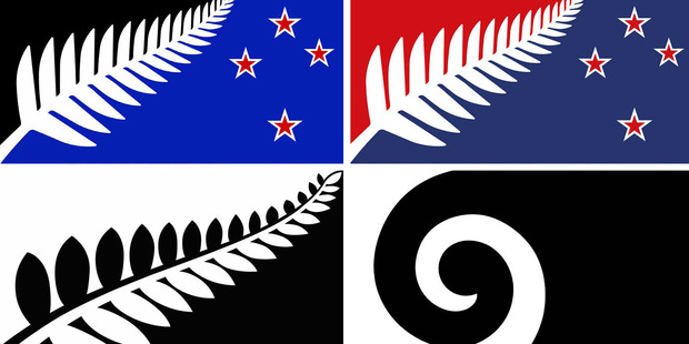
- Thirdly, what do you think of the final four designs? (See spoiler for some decent pics of them.)
So, what say ye, NSG (to any of these points)?
OP's obligatory and unwanted opinions.
As you can probably tell, I am not keen on flag change. I do not think that we have gone about this in the right way... the way I've structured the intro to the topic is a how not to write an unbiased introduction to this topic. And as to the final four designs? Hopefully the thread title gives you an inkling of what the majority of these designs say. They're dull and they don't look good as flags (compare and contrast Canada's... nice and central, not busy, decisive and vibrant colour scheme; symmetry helps). These are logos. I guarantee the koru only made it so that the panel could at least pretend it wasn't fixated on a fern and have some evidence to point to. It's a travesty that we've got the same design twice in different colours.
I'm very disappointed that neither of these flags got a look in. I might be opposed to the idea of the change, but these ones, at least, have the right sorts of ideas... the colour schemes do need work, though (first one too dull, black shouldn't be there; second one, needs a change in aspect ratio if you ask me, right shades, but blue across the top, red as central triangle or something).
Oh, and if you get Australia's flag confused with New Zealand's that's your error. They're very easy to tell apart (if you can see all of both)... Australia's got to have more stars, yeah?
tl;dr - don't change flag, mandate first, final four trite
*That chronology is off, seems to have happened in the lead up. So that's okay, then. Ish?


