I love where this is going, and can't wait until things like NS++ integrate with it fully. Just a couple notes, though:
- I couldn't help but notice that the Custom #4 banner is currenly unavailable to me, even though my nation has more than 5 billion citizens (and other banners with that particular requirement - like Urban Sprawl - are available).
- What was the rationale for having both a sidebar and a topbar? Is that just temporary? Was it a deliberate design choice? I feel like even on the tiny secondary monitor on the desktop I'm typing this on (a 1366x768) there's plenty of space on the top for more buttons - and even if that weren't the case, I figure it should be feasible to collapse everything into a reduced view (perhaps with Logout/Switch/Settings in a drop-down instead of having their own items on the main bar) and/or a "hamburger" menu or somesuch to accommodate smaller screens while making the best use of larger screens.
- On that note, there looks like there's some opportunity for simplification. For example, do we really need Dossier and Activity (or Notices and Activity) to be separate items? Activity seems like a good candidate for merging into either Notices or Dossier. Then there's Logout/Switch as mentioned above. If the above suggestion is implemented, even $region / World Assembly / The World seem like they could be somehow merged.
- I feel like the NationStates / "Max Barry Author of Lexicon" ad / etc. should be at the very top-left (pushing the nation name / flag to the right to make room, and perhaps condensing it down to a normal button; alternately, perhaps just have the nation name/flag replace the NationStates logo for logged-in users, since they probably already know what NationStates is and that they're logged into it ;) ). Right now it looks awkward at the top of the sidebar instead of the left of the topbar.
- The badges don't match the new theme very well; they'd look pretty snazzy as Rift-style vectory images. I'm sure y'all are already planning on that, though.
But yeah, looking awesome so far. I'll definitely be trying it on as my normal theme and seeing how it works out.
Grenartia wrote:So, I tried it out, and aside from one detail (maybe two, haven't really checked out the second), I like it.
My main issue is that there's no Dark version of it. The other issue is that I'm not entirely sure if it works with NS++ or not.
It barely works. The NS++ stuff does show up, but it's not yet adapted to Rift, so it still has the Century appearance. Some things will look funny as a result (the buttons for "Puppets" and "NS++ Settings" being off-center from the rest of the topbar buttons, "Gameplay News" and "Roleplay News" being squished-looking because of the lack of icons, buttons on the nation page being off-center because of the "Challenge", "World Assembly", and "NSWiki" links not being themed yet, etc.).
And yeah, seconding the Dark version; while I'm not a Dark user, I can see how that would be useful/nice.
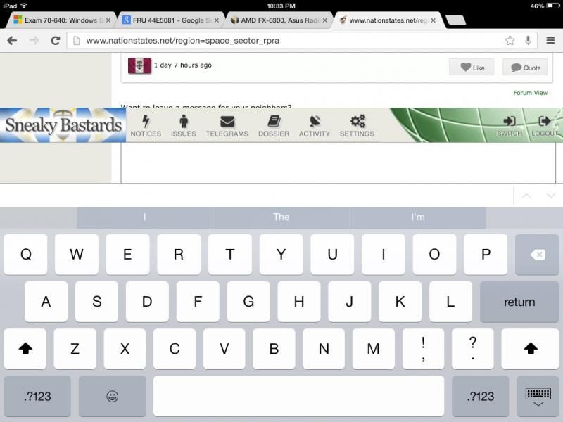
Nouvelle Tealand wrote:The Eastern Antarctic State wrote:Also, when I go to post on the forum, this big white box covers a portion of the screen, so I can't see.
This happened to me to, except I was on mobile. iOS6 safari to be exact.
Maybe try turning off the sidebar? I have a feeling that might be the cause.
The Lone Star Republics wrote:Tift is great, mobile soon?
Mobile is probably the point of this, ultimately (at least if you interpret "mobile" to include tablets, which I do, since tablets are indeed quite mobile); the bigger buttons are much friendlier for touchscreen users (though it's currently a bit heavy on "hover over me to see what I am!").


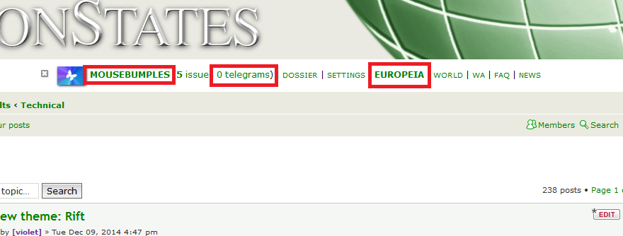
 ) And my region is Europeia. The WA reference also has a (1) or (2) notification when there's new resolutions at vote. And, of course, the same goes for News when there are new News Updates.
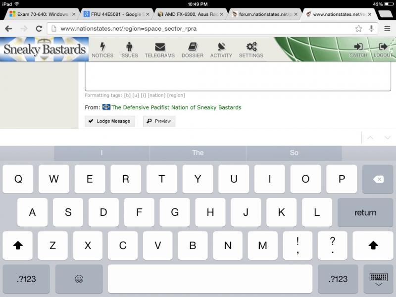