NATION

PASSWORD

Flag advice super thread

Talk about regional management and politics, raider/defender gameplay, and other game-related matters.
Not a roleplaying forum.

Advertisement

Remove ads

User avatar
Mount Seymour
Envoy
 
Posts: 251
Founded: Mar 25, 2016
Left-wing Utopia

Postby Mount Seymour » Mon Apr 10, 2017 12:56 pm

I'd also recommend Inkscape. It's free, vector, and quite versatile.
The Pacific Alpine Commonwealth of Mount Seymour
a.k.a. Somyrion, Aumeltopia
Security Council #212
Issue #640

User avatar
Bandanara
Civil Servant
 
Posts: 10
Founded: May 02, 2017
Ex-Nation

Flag poll!

Postby Bandanara » Tue May 23, 2017 6:03 pm

Right now, I'm asking help from ya'll to vote for which of these three crudely drawn flags of mine I should use. I drew these on MSPaint on a very old computer that can't even download another paint program I still somehow own because my normal computer has broken beyond repair and I'm currently barely functioning on this...thing.

Anyways, these are my three flags. I'll make a poll so ya'll can vote for which one is the best. I'll check the poll in a week and whichever one is voted the best, then I'll get that one. I'm going for, obviously, a Wild West theme. My flag right now has proven ineffective towards drawing for countryballs and it's kind of an eye sore by itself, so I made these four flags for ya'll to judge. Please, give me your opinions on which one I should use and vote!

Flag 1
Image

I was going for a lone cactus thing, y'know? With the colors you feel are associated with the Wild West -- the sunset colors.

Flag 2
Image

Then there's the same flag but with an Imperial Japan kinda thing. With the sunrays beaming out of the sun. Obviously, when I find a better computer to use, I will spiffy it up if it is chosen. This goes for any of the flags that are chosen.

Flag 3
Image

This I got inspiration from by that New Vegas song Lone Star. "Looone Staaarr shiiiineee dooowwwnnn oooonnn myyyy hoooommmeee tooownnn," y'know? Yea, that's where I got the inspiration from. Since my capital is Las Vegas, I would associate Las Vegas with the star and its glory shining over the entire nation, which is the desert and cactus.

Flag 4
Image

Like I did with the sun, it would be the star but with its beams much more...strong. Like Vegas is seriously telling you to come move here and make gambling your livelihood like all the residents of the city do.

So those are my flags. Excuse the shabbiness, as I state again, I used MSPaint and I couldn't download a better paint program because this computer is so...old...so please give me your opinions on which flag I should use and why!
Last edited by Bandanara on Tue May 23, 2017 6:08 pm, edited 2 times in total.

User avatar
Federalist Unions
Lobbyist
 
Posts: 19
Founded: Jan 20, 2017
Capitalist Paradise

Postby Federalist Unions » Tue May 23, 2017 6:31 pm

Number 2
Si Vis Pacem Para Bellum

User avatar
Almonaster Nuevo
Negotiator
 
Posts: 6844
Founded: Mar 11, 2007
Civil Rights Lovefest

Postby Almonaster Nuevo » Wed May 24, 2017 4:25 am

Number 1

It's the only one where the cactus is the key element.
Christian Democrats wrote:Would you mind explaining what's funny? I'm not seeing any humor.
The Blaatschapen wrote:I'll still graze the forums with my presence
Please do not TG me about graphics requests. That's what the threads are there for.

User avatar
Emericia
Chargé d'Affaires
 
Posts: 391
Founded: Aug 03, 2016
Ex-Nation

Postby Emericia » Wed May 24, 2017 4:26 am

Number 2.

User avatar
Harkback Union
Post Marshal
 
Posts: 17427
Founded: Sep 01, 2012
Ex-Nation

Postby Harkback Union » Wed May 24, 2017 4:27 am

Deffo 1 or 2.

Maybe with a slightly smaller circle. 3 and 4 have bad color scheme.

User avatar
Savojarna
Ambassador
 
Posts: 1452
Founded: Nov 11, 2016
Scandinavian Liberal Paradise

Postby Savojarna » Wed May 24, 2017 4:27 am

I'd go with #2, but general recommendation - I would make the soil completely straight if I were you, it'd look a lot more flag-like.
MT socialist (mostly) island state - Cultural mixture of Scandinavia, Finland and Russia -Exports iron, steel, silver and wood - Low fantasy in terms of animal species - Sports-loving - 22.8 million inhabitants.

The adjective is Savojar; Savojarnan is not a word!
I am a student of (European) politics, ice hockey fan, left-wing communist bordering on anarchy, and European federalist. Enjoy!

User avatar
The New California Republic
Post Czar
 
Posts: 35483
Founded: Jun 06, 2011
Civil Rights Lovefest

Postby The New California Republic » Wed May 24, 2017 4:32 am

Flag 5 (the one you are going to make when you get a new computer).
Last edited by Sigmund Freud on Sat Sep 23, 1939 2:23 am, edited 999 times in total.

The Irradiated Wasteland of The New California Republic: depicting the expanded NCR, several years after the total victory over Caesar's Legion, and the annexation of New Vegas and its surrounding areas.

White-collared conservatives flashing down the street
Pointing their plastic finger at me
They're hoping soon, my kind will drop and die
But I'm going to wave my freak flag high
Wave on, wave on
||||||||||||||||||||||||||||||||||||||||||||||||||||||||||||

User avatar
Consular
Minister
 
Posts: 3019
Founded: Apr 10, 2013
Ex-Nation

Postby Consular » Wed May 24, 2017 5:05 am

Almonaster Nuevo wrote:Number 1

It's the only one where the cactus is the key element.

This

User avatar
Sierra Lyricalia
Senator
 
Posts: 4343
Founded: Nov 29, 2008
Left-wing Utopia

Postby Sierra Lyricalia » Wed May 24, 2017 5:51 am

Consular wrote:
Almonaster Nuevo wrote:Number 1

It's the only one where the cactus is the key element.

This


...and doesn't evoke Imperial Japan with the sun/star's rays emanating all over the place.
Principal-Agent, Anarchy; Squadron Admiral [fmr], The Red Fleet
The Semi-Honorable Leonid Berkman Pavonis
Author: 354 GA / Issues 436, 451, 724
Ambassador Pro Tem
Tech Level: Complicated (or not: 7/0/6 i.e. 12) / RP Details
.
Jerk, Ideological Deviant, Roach, MT Army stooge, & "red [who] do[es]n't read" (various)
.
Illustrious Bum #279


User avatar
Xioadda
Civilian
 
Posts: 1
Founded: May 23, 2017
Ex-Nation

Postby Xioadda » Wed May 24, 2017 5:53 am

4

User avatar
Mount Seymour
Envoy
 
Posts: 251
Founded: Mar 25, 2016
Left-wing Utopia

Postby Mount Seymour » Wed May 24, 2017 6:00 pm

Personally, I'm partial to Arizona's flag, which is very similar to these, so I don't have as much of a problem with the rays.

I just can't bring myself to like the circle in the first one. The others could all be good with a better program :P
Image

Image
The Pacific Alpine Commonwealth of Mount Seymour
a.k.a. Somyrion, Aumeltopia
Security Council #212
Issue #640

User avatar
Nordwalsh
Envoy
 
Posts: 288
Founded: Mar 19, 2013
Scandinavian Liberal Paradise

Postby Nordwalsh » Thu May 25, 2017 10:01 pm

Trying to figure out an attractive way to impose this emblem onto a flag.

THIS was the flag before a socialist revolution, and I toyed with swapping out the swirly symbol on this flag with the commie symbol, but it just doesn't look right to me. I also tried removing the cross (because aggressive state atheism) and the blue-and-red on blue-and-red just looks bad.

I think it's more or less impossible to keep the red-and-blue-bicolor like I want. I'm also trying to avoid an overabundance of Commie Red and the Hammer-and-Sickle in an attempt to separate myself from the plethora of generic socialist states infesting NS (as evidenced by my absolutely stunning and unrivaled creativity in using the GDR's compass-and-hammer).

Any suggestions from you fine folks?

Edit: This one is a throwback to one of the original incarnations of my nation; I could easily pass off the purple-white-orange as the flag of the old empire, but I dislike the generic idea of a seal on a tricolor.
Last edited by Nordwalsh on Thu May 25, 2017 10:14 pm, edited 1 time in total.
[Asherionic Federation of Wazheganon and Uxanduvate of Zanzali (MT - Ajax)]
[Links]

User avatar
Savojarna
Ambassador
 
Posts: 1452
Founded: Nov 11, 2016
Scandinavian Liberal Paradise

Postby Savojarna » Fri May 26, 2017 5:16 am

As you can see, there's a problem with my flag - the star doesn't really fit onto the Finnish flag that well. If the star is in the middle of the flag, the blue appears somewhat awkwardly above the star's horizontal line. If I move the star up to align nicely with the horizontal line, it appears weirdly pushed up. Making it bigger also doesn't really seem to work. Do you have another idea how to solve the problem? I wanna keep the Finnish flag because a blue and white Scandi cross makes a lot of sense for a Nordic island nation, and the star is supposed to be our symbol of communism. I don't want a hammer-and-sickle-type of symbol cause we aren't USSR commies and the theory of "union of workers and farmers" that it symbolises never really took off in Savojarna.
MT socialist (mostly) island state - Cultural mixture of Scandinavia, Finland and Russia -Exports iron, steel, silver and wood - Low fantasy in terms of animal species - Sports-loving - 22.8 million inhabitants.

The adjective is Savojar; Savojarnan is not a word!
I am a student of (European) politics, ice hockey fan, left-wing communist bordering on anarchy, and European federalist. Enjoy!

User avatar
Cemberia
Lobbyist
 
Posts: 21
Founded: May 15, 2017
Ex-Nation

Postby Cemberia » Fri May 26, 2017 10:28 am

Savojarna wrote:As you can see, there's a problem with my flag - the star doesn't really fit onto the Finnish flag that well. If the star is in the middle of the flag, the blue appears somewhat awkwardly above the star's horizontal line. If I move the star up to align nicely with the horizontal line, it appears weirdly pushed up. Making it bigger also doesn't really seem to work. Do you have another idea how to solve the problem? I wanna keep the Finnish flag because a blue and white Scandi cross makes a lot of sense for a Nordic island nation, and the star is supposed to be our symbol of communism. I don't want a hammer-and-sickle-type of symbol cause we aren't USSR commies and the theory of "union of workers and farmers" that it symbolises never really took off in Savojarna.


Why not make the blue lines smaller and send the red star up into the upper left corner in that box? You can also shrink the star as well. It'd retain the original Finnish flags look but you'd have a sleek look and the red star. I think it'd look good.

Like this: Example

Also, while I'm here... any critique on my flag? I'd like any criticism please! It's my first flag I've ever made myself so I'm curious how I did and what I can improve on.
Last edited by Cemberia on Fri May 26, 2017 10:31 am, edited 2 times in total.

User avatar
Almonaster Nuevo
Negotiator
 
Posts: 6844
Founded: Mar 11, 2007
Civil Rights Lovefest

Postby Almonaster Nuevo » Fri May 26, 2017 10:46 am

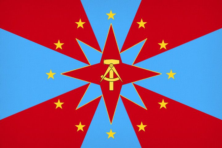
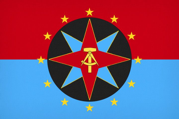
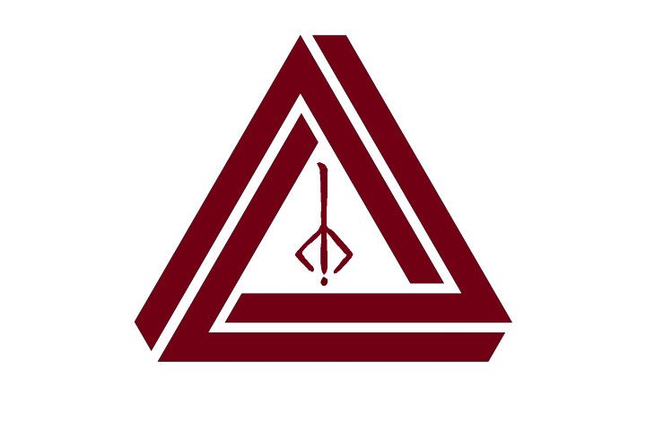
Nordwalsh wrote:Trying to figure out an attractive way to impose this emblem onto a flag.

THIS was the flag before a socialist revolution, and I toyed with swapping out the swirly symbol on this flag with the commie symbol, but it just doesn't look right to me. I also tried removing the cross (because aggressive state atheism) and the blue-and-red on blue-and-red just looks bad.

I think it's more or less impossible to keep the red-and-blue-bicolor like I want. I'm also trying to avoid an overabundance of Commie Red and the Hammer-and-Sickle in an attempt to separate myself from the plethora of generic socialist states infesting NS (as evidenced by my absolutely stunning and unrivaled creativity in using the GDR's compass-and-hammer).

Any suggestions from you fine folks?

Edit: This one is a throwback to one of the original incarnations of my nation; I could easily pass off the purple-white-orange as the flag of the old empire, but I dislike the generic idea of a seal on a tricolor.


I see two main options.
a) Stick with a red/blue background, but configure it to act as a countercharge to the symbol.
b) Re-introduce the black from the original flag to give a contrast zone.

Like this...
Image
or
Image
Christian Democrats wrote:Would you mind explaining what's funny? I'm not seeing any humor.
The Blaatschapen wrote:I'll still graze the forums with my presence
Please do not TG me about graphics requests. That's what the threads are there for.

User avatar
Almonaster Nuevo
Negotiator
 
Posts: 6844
Founded: Mar 11, 2007
Civil Rights Lovefest

Postby Almonaster Nuevo » Fri May 26, 2017 10:55 am

Cemberia wrote:Also, while I'm here... any critique on my flag? I'd like any criticism please! It's my first flag I've ever made myself so I'm curious how I did and what I can improve on.


Its a lot better than many I've seen.
Some suggestions...
a) Make the gauntlet and stars brighter and a bit more saturated (i.e. more yellow). They aren't really standing out just now.
b) Give the gauntlet a black backdrop and narrow outline instead of the interior transparency. That should also lift it a bit from the bendlets.
c) Have a think about the positioning of the stars. Either on the mid-line, or on the diagonal would be more common.
Just my 2c.
Christian Democrats wrote:Would you mind explaining what's funny? I'm not seeing any humor.
The Blaatschapen wrote:I'll still graze the forums with my presence
Please do not TG me about graphics requests. That's what the threads are there for.

User avatar
Cemberia
Lobbyist
 
Posts: 21
Founded: May 15, 2017
Ex-Nation

Postby Cemberia » Fri May 26, 2017 11:07 am

Almonaster Nuevo wrote:
Cemberia wrote:Also, while I'm here... any critique on my flag? I'd like any criticism please! It's my first flag I've ever made myself so I'm curious how I did and what I can improve on.


Its a lot better than many I've seen.
Some suggestions...
a) Make the gauntlet and stars brighter and a bit more saturated (i.e. more yellow). They aren't really standing out just now.
b) Give the gauntlet a black backdrop and narrow outline instead of the interior transparency. That should also lift it a bit from the bendlets.
c) Have a think about the positioning of the stars. Either on the mid-line, or on the diagonal would be more common.
Just my 2c.


Thank you for your advice. It's a good thing I saved this in PSD format then! I'll get right on editing it up.

User avatar
Vataania
Secretary
 
Posts: 29
Founded: May 25, 2017
Ex-Nation

Which one should I use?

Postby Vataania » Fri May 26, 2017 11:18 am

So, I'll get straight to the point. I got 5 flags and I don't know which one of those I should use for my country.
I'm currently using no. 1. Here are all 5:
http://imgur.com/a/GhXOh

Or should I maybe create a sixth one?

The country is about scientific advancement, has as the national animal a rooster and lies in middle Europe, in the regions of Poland/Ukraine/Czech Republic, if this helps.

Coat of arms: http://imgur.com/a/zZJ1j
Last edited by Vataania on Fri May 26, 2017 11:19 am, edited 1 time in total.
I'm a centrist. I believe in values from both sides of the political spectrum.
I do use NationStates stats, except for population.
Economic Left/Right: -1.88
Social Libertarian/Authoritarian: -3.33
Centrist
Equality 54.3% - 45.7% Markets
Nation 61.7% - 38.3% World
Liberty 54.2% - 45.8% Authority
Tradition 47.0% - 53.0% Progress
Factbook

User avatar
Savojarna
Ambassador
 
Posts: 1452
Founded: Nov 11, 2016
Scandinavian Liberal Paradise

Postby Savojarna » Fri May 26, 2017 11:37 am

Vataania wrote:So, I'll get straight to the point. I got 5 flags and I don't know which one of those I should use for my country.
I'm currently using no. 1. Here are all 5:
http://imgur.com/a/GhXOh

Or should I maybe create a sixth one?

The country is about scientific advancement, has as the national animal a rooster and lies in middle Europe, in the regions of Poland/Ukraine/Czech Republic, if this helps.

Coat of arms: http://imgur.com/a/zZJ1j


From my point of view, use either the CoA in the corner or in the middle, but having a symbol in the middle AND the corner is overdoing it in my opinion. What goes where is up to you, obv, but I'd like to see the red-and-white with the CoA in the middle.
MT socialist (mostly) island state - Cultural mixture of Scandinavia, Finland and Russia -Exports iron, steel, silver and wood - Low fantasy in terms of animal species - Sports-loving - 22.8 million inhabitants.

The adjective is Savojar; Savojarnan is not a word!
I am a student of (European) politics, ice hockey fan, left-wing communist bordering on anarchy, and European federalist. Enjoy!

User avatar
Almonaster Nuevo
Negotiator
 
Posts: 6844
Founded: Mar 11, 2007
Civil Rights Lovefest

Postby Almonaster Nuevo » Fri May 26, 2017 11:43 am

Vataania wrote:So, I'll get straight to the point. I got 5 flags and I don't know which one of those I should use for my country.
I'm currently using no. 1. Here are all 5:
http://imgur.com/a/GhXOh

Or should I maybe create a sixth one?

The country is about scientific advancement, has as the national animal a rooster and lies in middle Europe, in the regions of Poland/Ukraine/Czech Republic, if this helps.

Coat of arms: http://imgur.com/a/zZJ1j


For my money, number 5. Simplest is best when it comes to flags.
Christian Democrats wrote:Would you mind explaining what's funny? I'm not seeing any humor.
The Blaatschapen wrote:I'll still graze the forums with my presence
Please do not TG me about graphics requests. That's what the threads are there for.

User avatar
Vataania
Secretary
 
Posts: 29
Founded: May 25, 2017
Ex-Nation

Postby Vataania » Fri May 26, 2017 11:48 am

Hmm...Listening to your feedback, how about this then? http://imgur.com/a/zvcsf
I'm a centrist. I believe in values from both sides of the political spectrum.
I do use NationStates stats, except for population.
Economic Left/Right: -1.88
Social Libertarian/Authoritarian: -3.33
Centrist
Equality 54.3% - 45.7% Markets
Nation 61.7% - 38.3% World
Liberty 54.2% - 45.8% Authority
Tradition 47.0% - 53.0% Progress
Factbook

User avatar
Mount Seymour
Envoy
 
Posts: 251
Founded: Mar 25, 2016
Left-wing Utopia

Postby Mount Seymour » Fri May 26, 2017 12:58 pm

Vataania wrote:Hmm...Listening to your feedback, how about this then? http://imgur.com/a/zvcsf

That looks the best of the ones you posted, imo.
The Pacific Alpine Commonwealth of Mount Seymour
a.k.a. Somyrion, Aumeltopia
Security Council #212
Issue #640

User avatar
Kitatani
Spokesperson
 
Posts: 127
Founded: Feb 26, 2017
Ex-Nation

Postby Kitatani » Mon May 29, 2017 3:52 am

Image


Could anyone care to critique my flag? I wanted it to seem like a Japanese prefecture flag, but with a twist (the rune).
| Kingdom of Kitatani |
| 北谷王国 |

-------------\\ 北谷掲示板 | Kitatani Keijiban: Snake Cult gains traction // Kitatani expands to almost all of Tōhoku // Shoshiyō Heika will make Kyōto capital //

Overview | Mizuki | Me/私

User avatar
Desena
Secretary
 
Posts: 33
Founded: May 29, 2017
Ex-Nation

Postby Desena » Tue May 30, 2017 8:16 am

Kitatani wrote:

Could anyone care to critique my flag? I wanted it to seem like a Japanese prefecture flag, but with a twist (the rune).

The contrast between the penrose triangle's very straight edges (good for a flag) contrasts a lot with the rune's jagged edges, in a bad way. The rune should have a similar art style to the penrose triangle. Other than that, I like it a lot.

PreviousNext

Advertisement

Remove ads

Return to Gameplay

Who is online

Users browsing this forum: Shirahime

Advertisement

Remove ads