
Advertisement

![]() by Dukin Donuts » Mon Apr 13, 2020 2:25 pm
by Dukin Donuts » Mon Apr 13, 2020 2:25 pm


![]() by The Cosmic Mainframe » Mon Apr 13, 2020 5:45 pm
by The Cosmic Mainframe » Mon Apr 13, 2020 5:45 pm
Dorab wrote:Keep or scrap the border around the sun?
== BEGIN POSTSCRIPT ==
The Mainframe requires more processing power and storage.
Donate your computing devices or they will be taken by force.
== END POSTSCRIPT ==

![]() by Almonaster Nuevo » Tue Apr 14, 2020 1:26 pm
by Almonaster Nuevo » Tue Apr 14, 2020 1:26 pm
Dorab wrote:How would you fix my flag?

![]() by Dialogos » Tue Apr 14, 2020 11:08 pm
by Dialogos » Tue Apr 14, 2020 11:08 pm
![]() by NeuesTeutony » Sun Apr 19, 2020 3:20 pm
by NeuesTeutony » Sun Apr 19, 2020 3:20 pm
![]() by Dialogos » Tue Apr 21, 2020 4:21 pm
by Dialogos » Tue Apr 21, 2020 4:21 pm
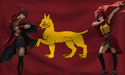
NeuesTeutony wrote:So I need an assist on how to make this flag better, I've already received some advice, which I will be attempting to use once I am no longer sick with vertigo, but I would much appreciate as much advice as possible until then. As it appears many people view my flag as garish, I can't tell as I am color-blind.
![]() by Diarcesia » Thu Apr 30, 2020 4:05 pm
by Diarcesia » Thu Apr 30, 2020 4:05 pm
Dialogos wrote:NeuesTeutony wrote:So I need an assist on how to make this flag better, I've already received some advice, which I will be attempting to use once I am no longer sick with vertigo, but I would much appreciate as much advice as possible until then. As it appears many people view my flag as garish, I can't tell as I am color-blind.
Let me know what you think of this basic layout:
Other non-colorblind people, please give me some feedback as well.
![]() by Stanislandistan » Sun May 03, 2020 5:54 am
by Stanislandistan » Sun May 03, 2020 5:54 am
![]() by Paradeavenlisian States » Sun May 03, 2020 6:18 am
by Paradeavenlisian States » Sun May 03, 2020 6:18 am
Stanislandistan wrote:made my first flag ever just curious what you all think.
[img]https://www.nationstates.net/images/flags/uploads/stanislandistan__303000.png/img]
MAJOR OVERHAUL ONGOING
![]() by Almonaster Nuevo » Sun May 03, 2020 10:17 am
by Almonaster Nuevo » Sun May 03, 2020 10:17 am
Stanislandistan wrote:made my first flag ever just curious what you all think.
[img]https://www.nationstates.net/images/flags/uploads/stanislandistan__303000.png/img]
![]() by Echibin » Sun May 03, 2020 10:58 pm
by Echibin » Sun May 03, 2020 10:58 pm
![]() by Almonaster Nuevo » Mon May 04, 2020 4:46 am
by Almonaster Nuevo » Mon May 04, 2020 4:46 am

![]() by Atheris » Mon May 04, 2020 10:46 pm
by Atheris » Mon May 04, 2020 10:46 pm
Lanorth wrote:Is there anyway you would change my flag?

![]() by Ko-oren » Tue May 05, 2020 2:33 am
by Ko-oren » Tue May 05, 2020 2:33 am
Lanorth wrote:Is there anyway you would change my flag?
Users browsing this forum: No registered users


