Not in this thread I haven't. I did ask in the flag request thread if anyone had suggestion for improvement if you've been in that one. Yes, it is busy but not as much as the flag of Saint Pierre and Miquelon, which it's loosely based on.

Advertisement

 by Valemora » Fri May 22, 2026 4:08 am

by Heavens Reach » Fri May 22, 2026 10:45 am
Valemora wrote:Thoughts on my flag?

by Nueva Compostela » Sat May 23, 2026 3:03 pm

by Perishna » Sat May 23, 2026 3:19 pm
Nueva Compostela wrote:Thoughts on my flag?


by Vrysse » Wed May 27, 2026 3:16 pm

by Almonaster Nuevo » Wed May 27, 2026 11:10 pm


by Hayfielda » Fri Jun 05, 2026 8:42 am
Hay is watching you from every corner of the room. In case of attack, a lump of Parmiggiano Reggiano should be enough to calm him down. --- I have finally got to work redoing my lore. I deserve a round of appaluse.
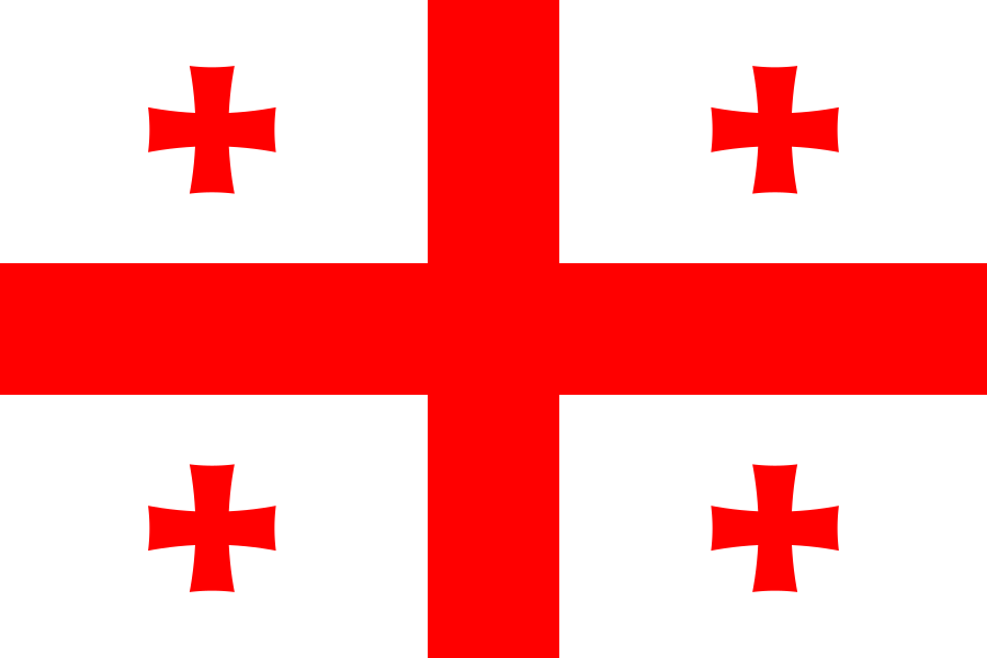
by The Ottoman Warriors » Mon Jun 22, 2026 8:16 pm
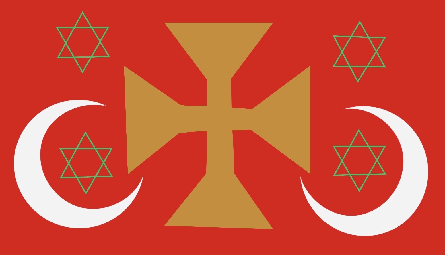
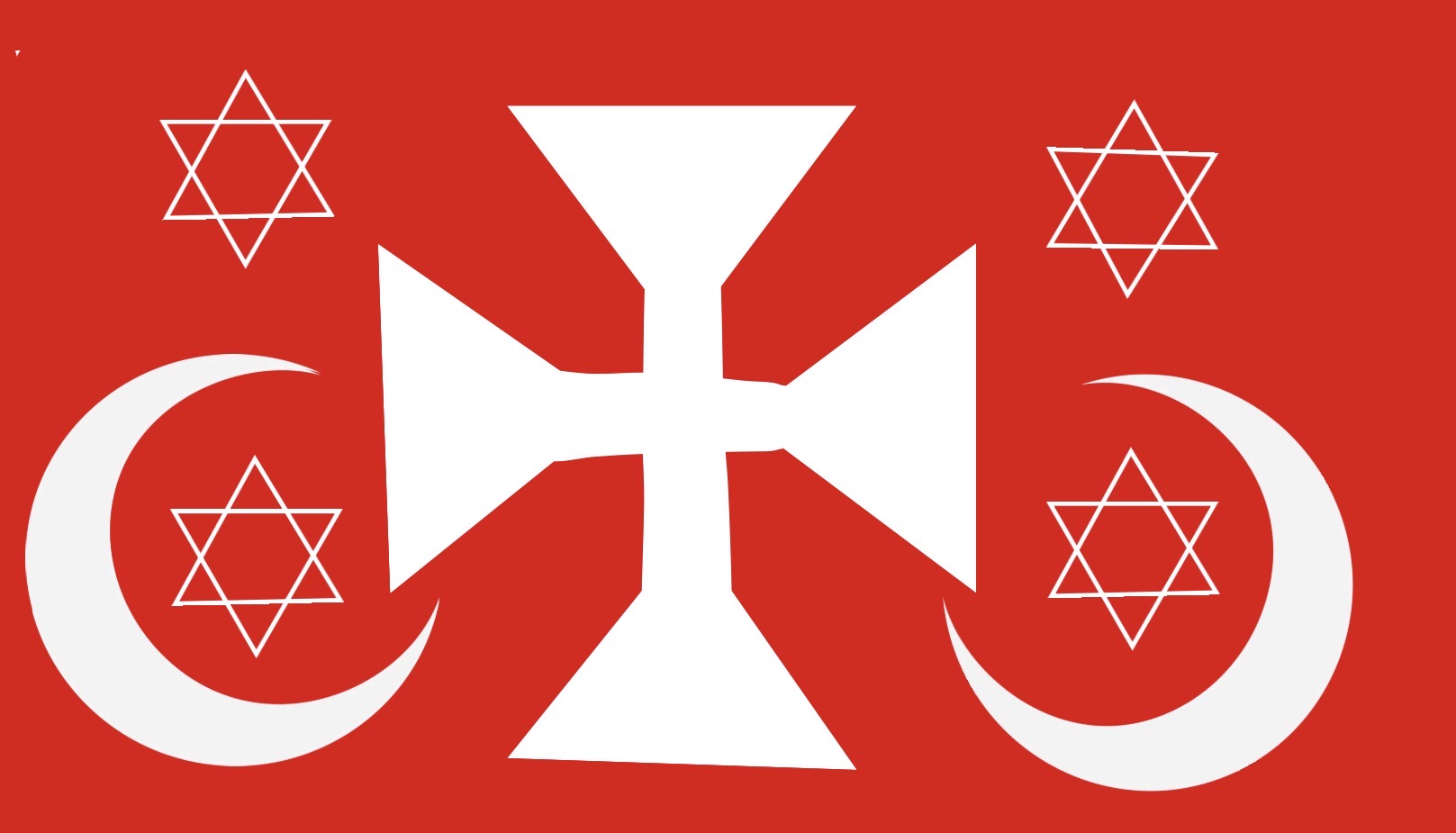 Turkey color scheme
by Marenmia-Ocasia » Mon Jun 22, 2026 8:18 pm
by Almonaster Nuevo » Tue Jun 23, 2026 2:54 am
Marenmia-Ocasia wrote:Thoughts on my flag? I’ve always felt that it’s too simple
by The Ottoman Warriors » Tue Jun 23, 2026 5:40 am
Marenmia-Ocasia wrote:Thoughts on my flag? I’ve always felt that it’s too simple

by Beroslavakia » Tue Jun 23, 2026 5:44 am

by Fithel » Tue Jun 23, 2026 5:44 am

by Atarashi Hanabi » Tue Jun 23, 2026 8:44 am
✉️ Telegram Spot | ⛅ Hikari no Shizuku - 8 °C | ATAHANA RADIO: Birds are singing, flowers are blooming, and the sun is shining brightly outside. So enjoy the gentle breeze, under the shade of an asaṃkhyeya cherry blossoms covering the worldby Almonaster Nuevo » Tue Jun 23, 2026 4:05 pm
Fithel wrote:Und mein?

by Daritheon » Sun Jun 28, 2026 6:01 pm
Atarashi Hanabi wrote:I've posted here before, so I'd like opinions and suggestions on how to improve my alt's flag this time
https://ibb.co/KxHdf1Q2
by Nueva Compostela » Sun Jun 28, 2026 7:02 pm
by Daritheon » Sun Jun 28, 2026 7:44 pm
Nueva Compostela wrote:Thoughts on my flag?
by Atarashi Hanabi » Sun Jun 28, 2026 9:44 pm
Daritheon wrote:Atarashi Hanabi wrote:I've posted here before, so I'd like opinions and suggestions on how to improve my alt's flag this time
https://ibb.co/KxHdf1Q2
Great for a smogpunk, industrial, mining settlement and believe it or not, your design isn't entirely unrealistic. The only thing I would change is the black stripe on the fly. Right now it just looks like any other seal-on-pale flag out there. So keep just the black stripe on the hoist and change nothing else.
That's only if you want to go for an ultra brutalist, thick-with-smog sort of vibe though
✉️ Telegram Spot | ⛅ Hikari no Shizuku - 8 °C | ATAHANA RADIO: Birds are singing, flowers are blooming, and the sun is shining brightly outside. So enjoy the gentle breeze, under the shade of an asaṃkhyeya cherry blossoms covering the worldby Nueva Compostela » Sun Jun 28, 2026 10:07 pm
Daritheon wrote:Nueva Compostela wrote:Thoughts on my flag?
Very uninteresting and generic, but if you’re opting for realism then that’s exactly what you want. The only thing I would change is the colour of the seashell. White on yellow is hard to see, so I would make it black or blue, or give it a thick outline. That’s all.
by Daritheon » Sun Jun 28, 2026 11:31 pm
Nueva Compostela wrote:Daritheon wrote:Very uninteresting and generic, but if you’re opting for realism then that’s exactly what you want. The only thing I would change is the colour of the seashell. White on yellow is hard to see, so I would make it black or blue, or give it a thick outline. That’s all.
Does it make it better?
by Nueva Compostela » Sun Jun 28, 2026 11:50 pm
by Daritheon » Mon Jun 29, 2026 1:21 am
by Nueva Compostela » Mon Jun 29, 2026 4:46 am
Daritheon wrote:Nueva Compostela wrote:We're just a Latin American-styled country in an Austronesian continent
we're also a Christian-majority country
Ah, I see. Well if your nation resembles Latin America, you might want to think of adopting a red-yellow-blue colour scheme, since red-yellow-green (which is what you have now) suggests a pan-African ideology. I get that you're probably trying to do like a Bolivia type thing, but Bolivia's flag doesn't look remotely Latin American.
Here's what I suggest: Ditch the top stripe. Make the flag evenly divided with yellow on the hoist and red on the fly. Put the blue seashell in the middle of the yellow charge.
The other option is similar, but have red on the hoist and yellow on the fly. Then put a white cross in the middle of the red charge.
Green is probably a no-go. And I'd abandon the idea of having a shell and a cross, as that would be too cluttered. I know that's a bit rich coming from me, but my flag is deliberately cluttered since it's inspired by medieval fantasy whereas yours is grounded in reality. Does that make sense?
Edit: Why does this read like AI? I swear I wrote this. AI is a fucking plague and I hate that it's affected the way I write.
Users browsing this forum: Istillian